Spatial data in R: Making a map
SCII205: Introductory Geospatial Analysis / Practical No. 2
Alexandru T. Codilean
Last modified: 2025-06-14
![]()
Introduction
Handling geospatial data in R is both powerful and accessible thanks to a growing ecosystem of packages. One of the most popular packages for working with vector data is sf (short for “simple features”), which makes spatial data behave like regular data frames with an additional geometry column. Additionally, packages like terra help manage raster data.
Resources
Both sf and terra are described in detail below. Aditional information is also available here:
- The Geocomputation with R book.
- The sf package documentation.
- The terra package documentation.
The sf package for vector data
One of the crown jewels in R’s geospatial toolkit is the sf package. The name of the package stands for “simple features,” referring to the standardised way of representing geometries (points, lines, and polygons) as defined by the Open Geospatial Consortium (OGC). Here’s what makes sf especially appealing:
Adherence to the Simple Features Standard
Standardised Data Model: Implements the OGC Simple Features standard, which ensures compatibility and consistency when representing spatial vector data.
Interoperability: This standardization facilitates easier integration with other GIS software and spatial data formats.
Intuitive Data Structures and API
Data Frame Integration: Spatial data is stored in data frames (with a dedicated geometry column), making it straightforward to combine spatial and non-spatial data.
Tidyverse Compatibility: The design is consistent with the tidyverse ecosystem, allowing the use of familiar data manipulation verbs (e.g., from dplyr) directly on spatial objects.
Efficient and Robust Spatial Operations
Underlying Libraries: sf leverages well-established libraries like GEOS, GDAL, and PROJ, which results in robust performance for geometric operations, spatial joins, buffering, and coordinate transformations.
Performance: Many spatial operations are implemented in C/C++ through these libraries, ensuring efficiency even with complex or large datasets.
Versatility in Data Input/Output
- Support for Multiple Formats: The package can read and write various spatial data formats (e.g., shapefiles, GeoJSON, KML, PostGIS databases), which is crucial for interoperability with different data sources and GIS platforms.
Rich Set of Geospatial Tools
Spatial Analysis Capabilities: Provides functions for spatial querying, manipulation, and analysis, enabling users to perform operations such as spatial joins, intersections, and unions with relative ease.
Visualization: Works seamlessly with visualization packages like ggplot2, allowing for effective mapping and data presentation.
Active Community and Continuous Development
Ongoing Improvements: The package is actively maintained and frequently updated, which means it benefits from both community feedback and ongoing enhancements.
Extensive Documentation: Comprehensive guides, vignettes, and tutorials are available, making it easier for users to learn and apply the package in various spatial analysis tasks.
The terra package for raster data
While sf shines with vector data, handling raster data (grid-based data like satellite imagery or digital elevation models) is streamlined by the terra package. The terra package is a modern, efficient tool for working with raster (grid-based) data in R. It was developed as a successor to the older raster package and offers improved performance and a more intuitive interface:
Enhanced Performance and Efficiency
Memory Management: terra is designed to handle large datasets more efficiently by processing data on disk when possible, which minimises the need to load entire datasets into memory.
Speed: Optimised algorithms and a modern code base (often leveraging C++ through Rcpp) contribute to faster execution of spatial operations.
Unified Framework for Spatial Data
- Raster and Vector Support: Terra provides a consistent interface for both raster and vector data, streamlining workflows that require manipulation and analysis of different spatial data types.
Modern and Intuitive API
User-Friendly Functions: The API has been refined to be more consistent and easier to use compared to older packages. This results in a smoother learning curve and more straightforward code for common spatial operations.
Improved Functionality: Enhanced functions cover a wide range of tasks such as data manipulation, transformation, resampling, and extraction, making it versatile for various spatial analyses.
Better Integration with Geospatial Libraries
GDAL/PROJ Integration: terra interfaces effectively with external geospatial libraries like GDAL and PROJ, which improves support for various file formats and coordinate reference system transformations.
Scalability: These integrations help ensure that terra can handle complex and large-scale geospatial processing tasks reliably.
Active Development and Community Support
Ongoing Improvements: terra is actively maintained, ensuring compatibility with new spatial data standards and continuous performance improvements.
Community Resources: There is growing documentation and community support (e.g., tutorials, vignettes) that help users transition from older tools and solve complex spatial problems.
Install and load packages
Install the sf and terra packages:
We will also install two additional packages that provide example geospatial data from the Geocomputation with R book. We will use some of this data below.
install.packages("spData")
install.packages("spDataLarge", repos = "https://geocompr.r-universe.dev")
After installation, load the packages:
Making a basic map
Vector data
Mapping with base R functionality
In the next example, we illustrate some basic functionality using the
world dataset provided by the spData
package, and use this data to produce some simple maps.
world is an sf object containing
spatial and attribute columns, the names of which are returned by the
function names()
##  [1] "iso_a2"    "name_long" "continent" "region_un" "subregion" "type"
##  [7] "area_km2"  "pop"       "lifeExp"   "gdpPercap" "geom"
The world sf object is basically an R
data frame consisting of a geometry column (i.e., the last
column named “geom”) that represents the actual spatial data, and ten
attribute columns (e.g., “iso_a2”, “name_long”, “continent”, …)
that represent the attribute data attached to each geometry entity
(e.g., a country polygon) contained in the dataset.
Given that, sf loads the world dataset
as an R data frame, the same R functions can be used on this data as on
any regular tabular R data frame. In addition, the sf
package also expands the capability of existing base R functions, such
as for example the plot() function (more on this
below).
We can print the first rows of the data using the head()
function:
Note how the geometry column (geom) shows only
<S3: sfc_MULTIPOLYGON> which denotes the type of
feature geometry that the data represents. In this case we are dealing
with a set of polygons; the actual coordinates of the points that make
up the polygons are not visible to the head() function.
The most common sf feature geometry types are the following (see also the sf documentation page):
POINT: zero-dimensional geometry containing a single point, defined by a pair of X,Y coordinatesLINESTRING: sequence of points connected by straight, non-self intersecting line pieces; one-dimensional geometryPOLYGON: geometry with a positive area (two-dimensional); sequence of points form a closed, non-self intersecting ring; the first ring denotes the exterior ring, zero or more subsequent rings denote holes in this exterior ringMULTIPOINT: set of points; a MULTIPOINT is simple if no two points in the MULTIPOINT are equalMULTILINESTRING: set of linestringsMULTIPOLYGON: set of polygonsGEOMETRYCOLLECTION: set of geometries of any type except GEOMETRYCOLLECTION
To plot the data, we can use the base R plot()
function:
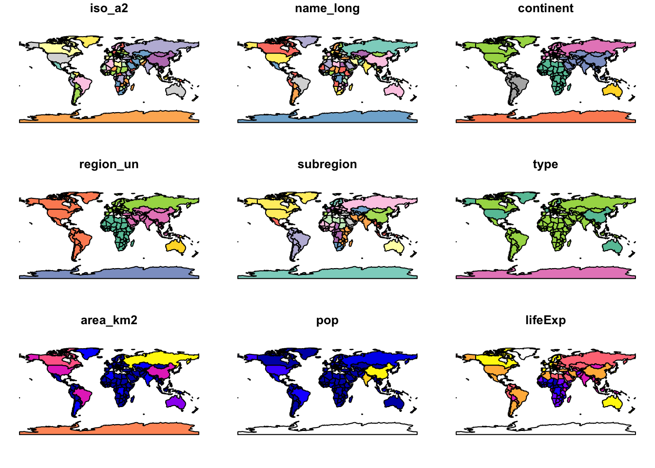
Note that instead of creating a single map by default for geographic
objects, as most GIS programs do, the plot() function
produces a map for a set of variables in the dataset (in this case nine
variables out of ten present).
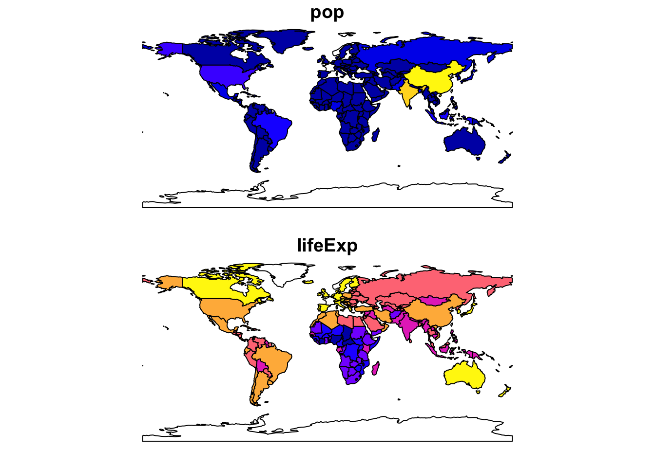
To plot a map showing only life expectancy, for example, we need to specify the relevant column:
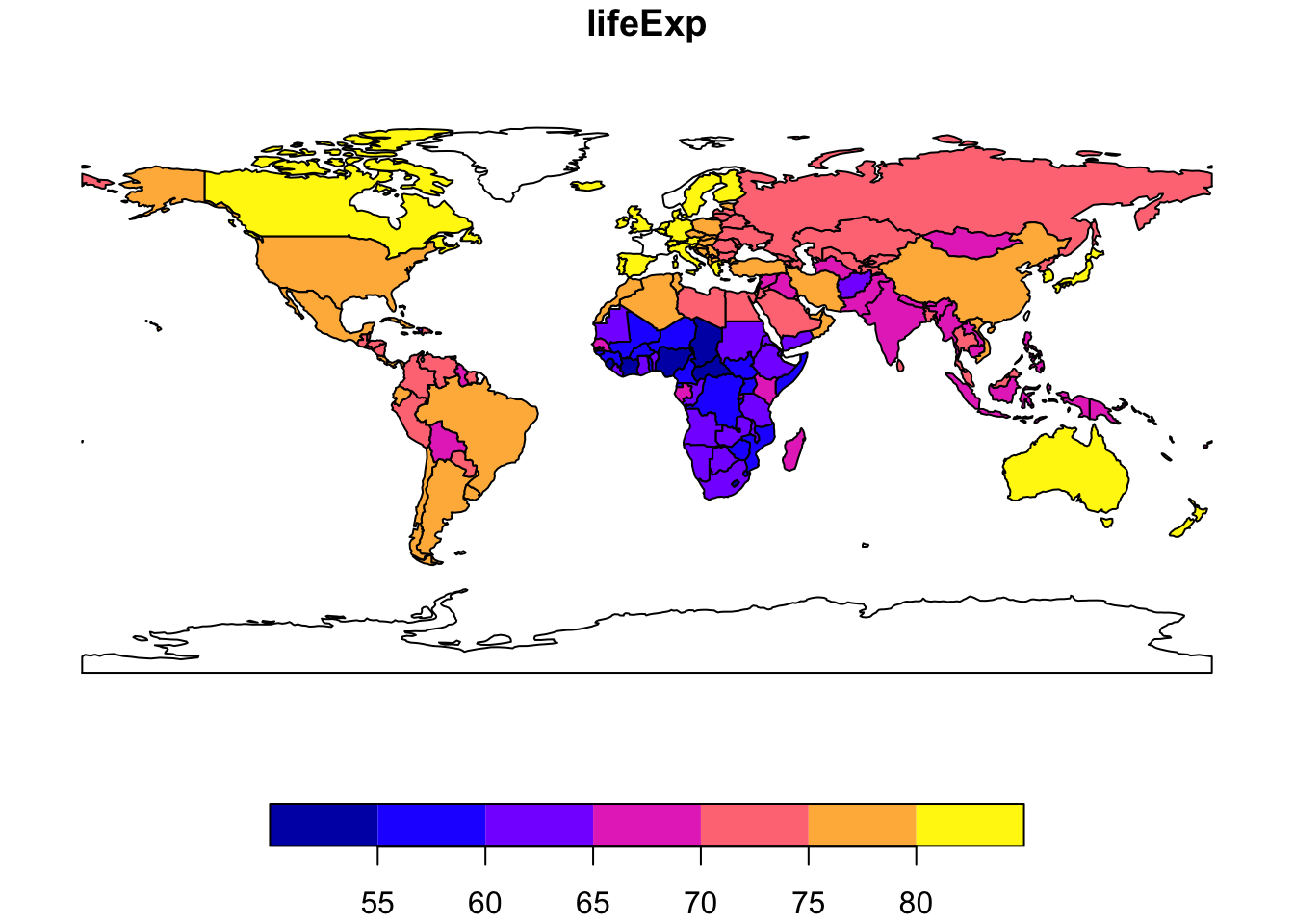
To map more than one attribute field:
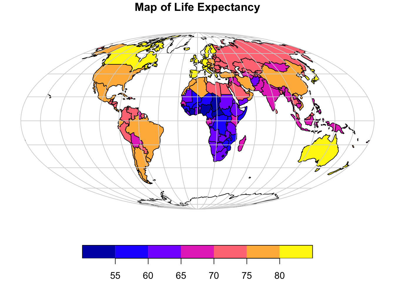
The above maps are not very aesthetically pleasing, however, R allows for further customisation.
In the next example, we first transform the data to a more appropriate projected coordinate system (a list of available projections and how to call them in R is provided here), add a latitude and longitude grid that we also project to the same coordinate system, and add a more appropriate title:
# Project data to Mollweide projection
world_proj = st_transform(world, crs = "+proj=moll")

# Plot continents
plot(world_proj["lifeExp"],
     reset = FALSE,                     # Use when map has a key
     main = "Map of Life Expectancy",   # Title of map
     key.pos = 1)                       # 1 bottom, 2 left, 3 top, 4 right, or NULL

g = st_graticule()                        # Create lat/long grid
g = st_transform(g, crs = "+proj=moll")   # Project to Mollweide
plot(g$geometry,
     add = TRUE,       # required to add as new layer to map
     col = "lightgray"
     )
Mapping with ggplot2
The above map is more aesthetically pleasing, however, it is still missing key elements such as a scale bar and a north arrow. To add these elements we need to use the ggplot2 package together with another package called ggspatial. The latter is a framework for interacting with spatial data using ggplot2 as a plotting backend.
Install ggplot2 and ggspatial. Although we have used ggplot2 in Practical no. 1, and so this package should already be installed, we will re-install just in case:
Load the ggplot2 and ggspatial packages:
Example 1: Reproducing the Life Expectancy map
Now we recreate the above life expectancy map using ggplot2:
p <- ggplot(data = world_proj) +
  # Plot the spatial polygons with a fill aesthetic (this will create a legend/key)
  geom_sf(aes(fill = lifeExp), color = "gray70", size = 0.1) +

  # Use a the viridis color scale with a title for the legend
  # See https://ggplot2.tidyverse.org/reference/ for more color scale options
  scale_fill_viridis_c(name = "Life Expectancy") +

  # Add a scale bar at the bottom left (bl) with a width hint (adjust as needed)
  annotation_scale(location = "bl", width_hint = 0.2) +

  # Add a north arrow at the bottom left with some padding
  # Different styles are available:
  # https://paleolimbot.github.io/ggspatial/reference/index.html
  annotation_north_arrow(location = "bl", which_north = "map",
                           pad_x = unit(-0.3, "cm"), pad_y = unit(0.9, "cm"),
                           style = north_arrow_minimal) +

  # We reproject the data to Aitoff projection
  coord_sf(crs = st_crs("+proj=aitoff")) +

  # Add titles and axis labels
  labs(title = "World Map of Life Expectancy",
       subtitle = "Including a scale bar, north arrow, and graticules") +

  # Use a minimal theme and adjust grid lines for better visibility of graticules
  theme_minimal() +
  theme(panel.grid.major = element_line(color = "gray80", linetype = "dashed"),
        legend.position = "right")  # Adjust legend position if desired

# Print the map
print(p)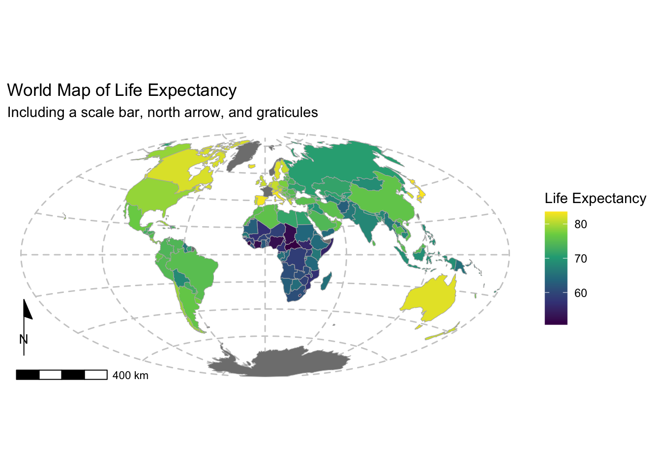
The map now includes a scale bar and north arrow. It also includes a more informative colour bar.
Example 2: Joining and mapping external attribute data
The spData package provides a non-spatial dataset
(i.e., regular R data frame) called coffee_data. It has
three columns: name_long, the names of major
coffee-producing nations, and coffee_production_2016 and
coffee_production_2017, contain estimated values for coffee
production in units of 60-kg bags in each year.
Because coffee_data and world include a
common field (namely, name_long), it is relatively
straightforward to join the two together and “add”
coffee_data to the map. To perform a join we will use the
dplyr package.
Load the tidyverse as this will attach the
dplyr package. We have installed the
tidyverse library of packages in the previous
practical, however if this is not installed, run
install.packages("tidyverse") prior to issuing the
library() command.
dplyr has multiple join functions including:
- Inner join:
inner_join(): only keeps observations fromxthat have a matching key iny. Unmatched rows in either input are not included in the result.
- Outer joins:
left_join(): keeps all observations inxright_join(): keeps all observations inyfull_join(): keeps all observations inxandy
For our purposes, we will perform a left_join:
# Join world and coffee_data using the name_long common field
world_coffee = left_join(world, coffee_data, by = join_by(name_long))

# Print available fields in world_coffee
names(world_coffee)
## [1] "iso_a2" "name_long" "continent"
## [4] "region_un" "subregion" "type"
## [7] "area_km2" "pop" "lifeExp"
## [10] "gdpPercap" "geom" "coffee_production_2016"
## [13] "coffee_production_2017"Note in the above that two new columns were added to the
world spatial data frame.
Next we will use ggplot2 to make a map showing coffee production in 2017, recycling the code from the previous map:
p <- ggplot(data = world_coffee) +   # change to world_coffee

  geom_sf(aes(fill = coffee_production_2017), color = "gray70", size = 0.1) +
  scale_fill_viridis_c(name = "Coffee Production") +

  annotation_scale(location = "bl", width_hint = 0.2) +
  annotation_north_arrow(location = "bl", which_north = "map",
                           pad_x = unit(-0.3, "cm"), pad_y = unit(0.9, "cm"),
                           style = north_arrow_minimal) +
  coord_sf(crs = st_crs("+proj=aitoff")) +

  # Change titles and axis labels
  labs(title = "World Map of Coffee Production in 2017",
       subtitle = "Estimated coffee production in units of 60-kg bags") +

  theme_minimal() +
  theme(panel.grid.major = element_line(color = "gray80", linetype = "dashed"),
        legend.position = "right")  # Adjust legend position if desired

# Print the map
print(p)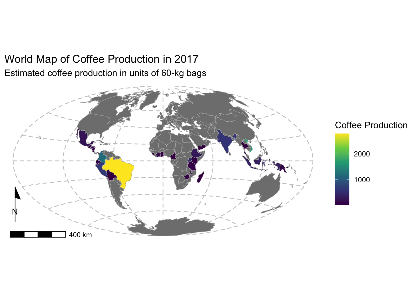
Raster data
Next we will produce a simple world map showing the distribution of mean annual precipitation. The data is provided as a GeoTIFF raster with a resolution of 10 arc minutes (roughly 10 \(km\)) and is using latitude/longitude WGS84 coordinates. Values are in \(mm\). The data was downloaded from WorldClim.
Load the data and display using the base R plot()
function:
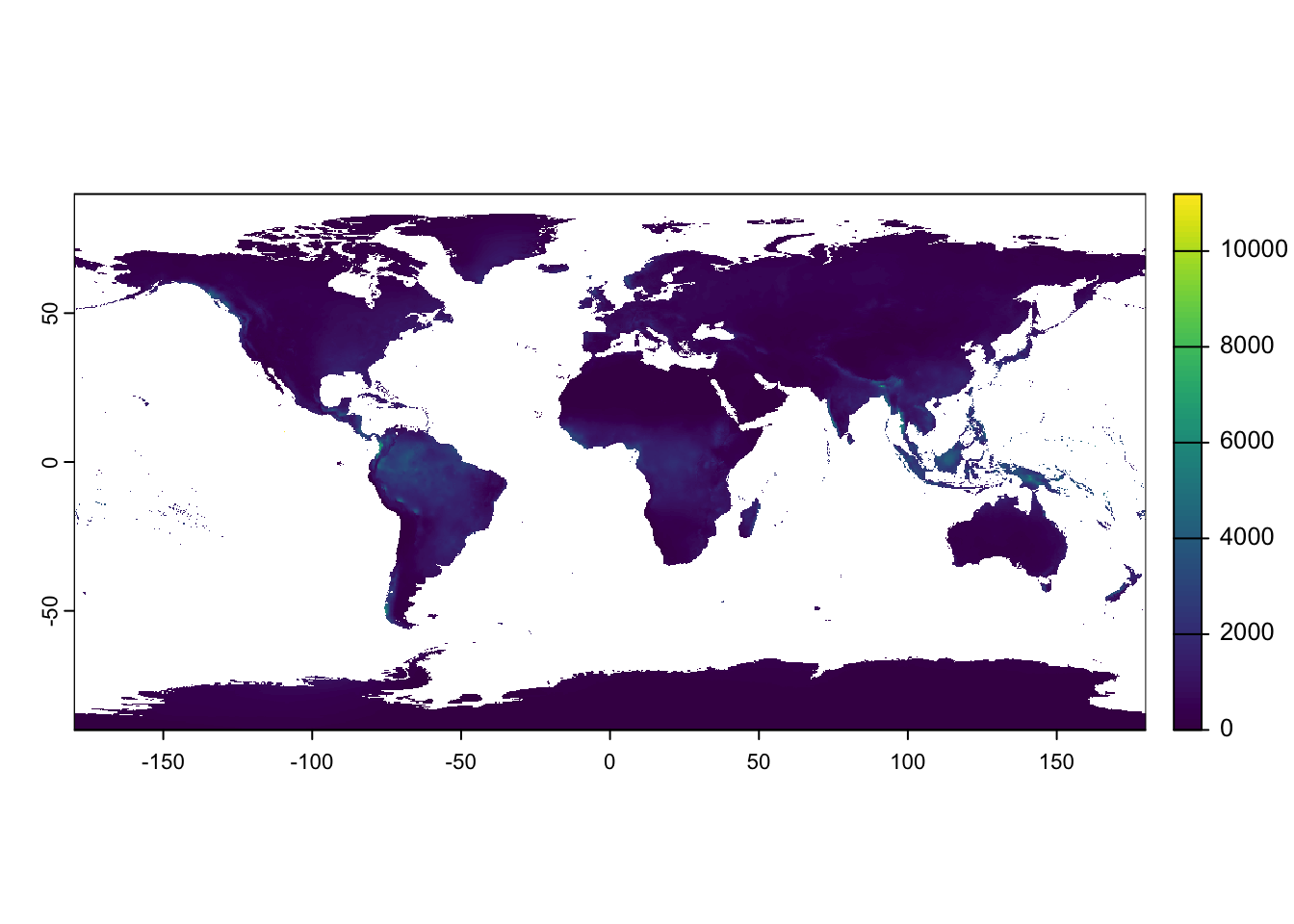
Unlike with vector data in the sf package, where the map projection could be modified on the fly, with rasters, the data needs to be reprojected prior to plotting.
Project the rainfall raster using the project() function
in terra:
rain_proj <-
   project(rain,                 # Project the rain raster
           "+proj=aitoff",       # Define output projection
           method = "bilinear",  # Define resampling method
           res = 10000,          # Specify output resolution in metres (i.e., 10 km)
           mask=TRUE)            # Set to TRUE to mask out areas outside the input extent

# Plot the projected raster
plot(rain_proj)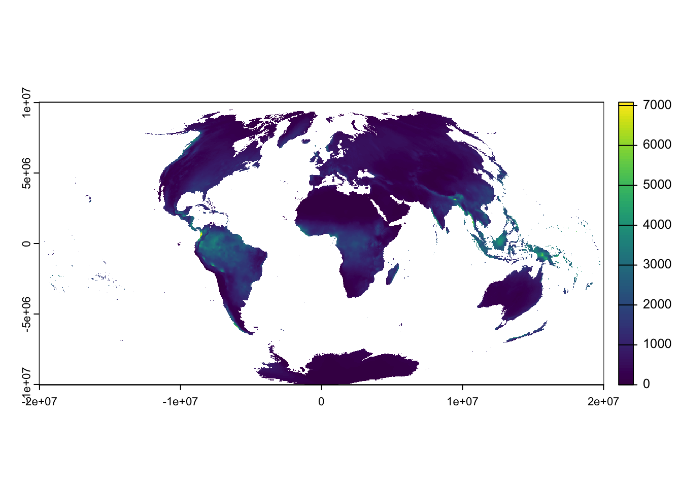
Example 1: Global map of Mean Annual Precipitation
Use the projected rainfall raster (rain_proj) to create
a map with ggplot2. We will recycle code used
above:
# Convert the reprojected raster to a data frame for ggplot2,
# including x and y coordinates
rain_df <- as.data.frame(rain_proj, xy = TRUE)

p <- ggplot(data = rain_df) +

  # Plot the raster with a fill aesthetic (this will create a legend/key)
  geom_raster(aes(x = x, y = y, fill = annual_precipitation)) +

  scale_fill_viridis_c(name = "Precipitation [mm]", # Name on the color scale
                       trans = "sqrt",        # Apply transformation to strech colours
                       option = "mako",       # Select colour map to use
                       direction = -1) +      # Flip colours

  annotation_scale(location = "bl", width_hint = 0.2) +
  annotation_north_arrow(location = "bl", which_north = "map",
                         pad_x = unit(-0.3, "cm"), pad_y = unit(0.9, "cm"),
                         style = north_arrow_minimal) +

  # Define the coordinates of the graticule grid
  coord_sf(crs = st_crs("+proj=aitoff")) +

  labs(title = "World Map of Mean Annual Precipitation",
       subtitle = "Source: WorldClim (https://www.worldclim.org)") +

  theme_minimal() +
  theme(panel.grid.major = element_line(color = "gray80", linetype = "dashed"),
        legend.position = "right",
        axis.title.x = element_blank(),  # Do not show x axis title
        axis.title.y = element_blank(),  # Do not show y axis title
        )

# Print the map
print(p)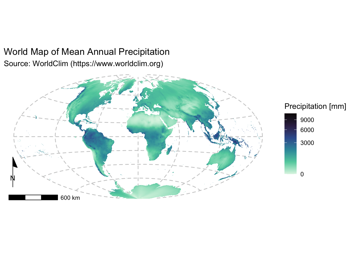
Example 2: Regional map of annual precipitation
To produce a regional map, we first need to crop the rainfall raster
to the bounding boxes of the desired area of interest. We can do this
using the crop() function in terra:
# Define a new extent (xmin, xmax, ymin, ymax)
# Use the units of the input raster, in this case degrees
new_extent <- ext(90, 180, -50, 10)

# Crop using new extent
rain_aus <- crop(rain, new_extent)

# Plot the cropped raster
plot(rain_aus)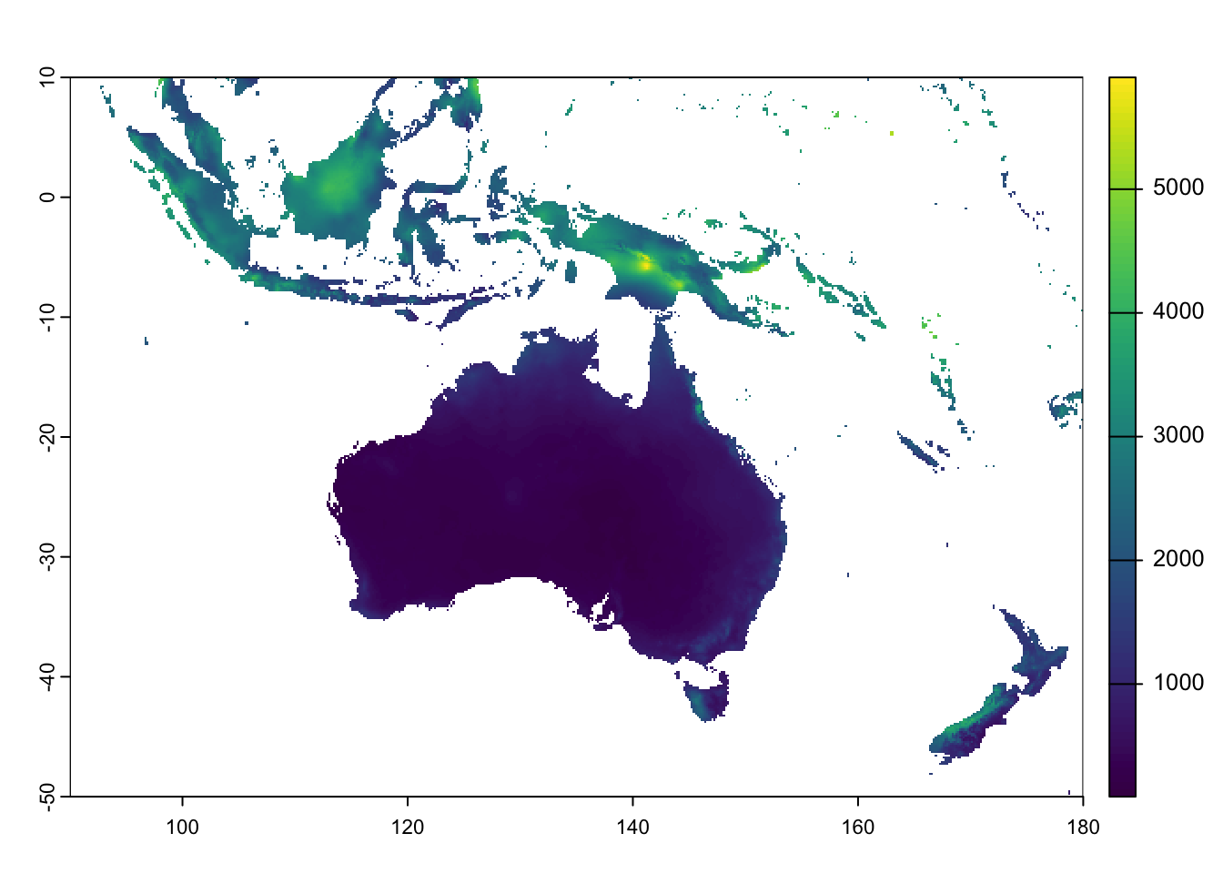
Next, project the cropped raster:
rain_aus_proj <- project(rain_aus,
              # The Albers Equal Area projection needs additional options:
              # +lat_1=<value> - First standard parallel
              # +lat_2=<value> - Second standard parallel
              # +lon_0=<value> - Central meridian/longitude of origin
                "+proj=aea +lat_1=0 +lat_2=-30 +lon_0=135",
                method = "bilinear",
                res = 10000,
                mask=TRUE)

# Plot the projected raster
plot(rain_aus_proj)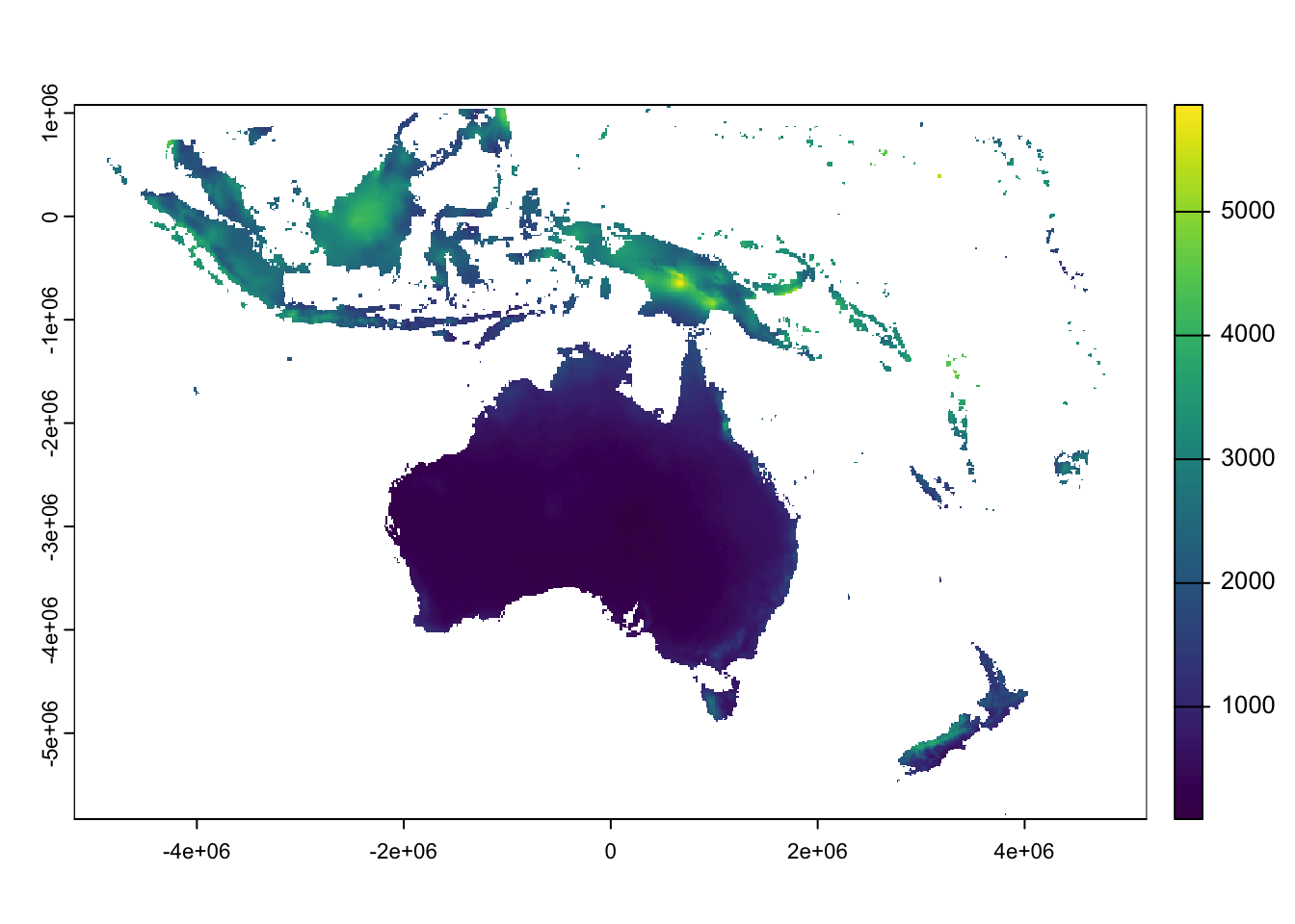
Once more we recycle and adapt the code used above:
rain_df <- as.data.frame(rain_aus_proj, xy = TRUE)

p <- ggplot(data = rain_df) +
  geom_raster(aes(x = x, y = y, fill = annual_precipitation)) +

  scale_fill_viridis_c(name = "Precipitation [mm]",
                       trans = "sqrt",
                       option = "mako",
                       direction = -1) +

  annotation_scale(location = "bl", width_hint = 0.2) +
  annotation_north_arrow(location = "bl", which_north = "map",
                           pad_x = unit(-0.3, "cm"), pad_y = unit(0.9, "cm"),
                           style = north_arrow_minimal) +

  # Modify projection information to match data
  coord_sf(crs = st_crs("+proj=aea +lat_1=0 +lat_2=-30 +lon_0=130")) +

  labs(title = "Regional Map of Mean Annual Precipitation",
       subtitle = "Source: WorldClim (https://www.worldclim.org)") +
       scale_y_continuous(breaks = seq(-50, 10, 10)) + # Set y grid interval manually
       scale_x_continuous(breaks = seq(80, 180, 20)) + # Set x grid interval manually

  theme_minimal() +
  # Change linewidth and linetype (options: solid, longdash, dashed, dotted)
  theme(panel.grid.major =
               element_line(color = "gray80", linewidth = .3, linetype = "dotted"),
        legend.position = "right",
        axis.title.x = element_blank(),  # Do not show x axis title
        axis.title.y = element_blank(),  # Do not show y axis title
        )

# Print the map
print(p)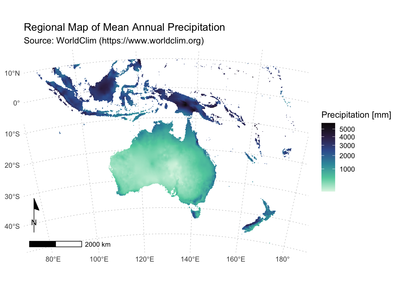
Making maps with tmap
The tmap package in R is a comprehensive tool for creating thematic maps that elegantly combines simplicity with powerful features. Its design is inspired by the “grammar of graphics”, a concept popularised by the ggplot2 package, which encourages building visualizations through layering. This approach makes tmap both intuitive and flexible for users who want to represent spatial data with custom aesthetics and multiple layers.
- Comprehensive documentation on the tmap package is available here.
- For a more gentle introduction see Chapter 9 from Geocomputation with R, available here.
Key features
Layered Mapping Approach:
- tmap begins with the spatial object using the
tm_shape()function, after which you can sequentially add layers. Each additional function (e.g.,tm_polygons(),tm_lines(),tm_dots(),tm_text()) adds a new layer of visualization, similar to how ggplot2 works with the+operator. This makes it straightforward to combine various types of geospatial information on one map.
Static and Interactive Modes:
Static Maps: Perfect for creating publication-quality figures, these maps are rendered as images.
Interactive Maps: Using a simple mode switch (
tmap_mode("view")), tmap leverages the leaflet package to produce interactive maps, allowing features like zooming and panning.
Customization and Layout Control:
- tmap provides a wide array of functions to
fine-tune the appearance of maps. With functions like
tm_layout(),tm_legend(),tm_compass(), andtm_scale_bar(), you can adjust titles, legends, map frames, and additional annotations to enhance readability and presentation.
Integration with Spatial Data Formats :
- tmap works seamlessly with spatial data objects, especially those created with the sf and terra packages. This compatibility makes it easy to visualise complex geospatial datasets without additional preprocessing.
Install and load tmap
Install the development version of tmap from the r-universe repository, which is updated more frequently than the CRAN version:
This should also install the leaflet package that we will use to create some interactive maps later.
Load terra and leaflet:
Lastly, we will also load some data from the spDataLarge package, provided with the Geocomputation with R book (see above):
Adding layers to a map
Like ggplot2, tmap separates
between input data and aesthetics (i.e., how data is visualised).
Therefore each input dataset can be ‘mapped’ in a range of different
ways including location on the map (defined by data’s geometry), color,
and other visual variables. The basic building block is
tm_shape() (which defines input data: a vector or raster
object), followed by one or more layer elements such as
tm_fill() and tm_borders().
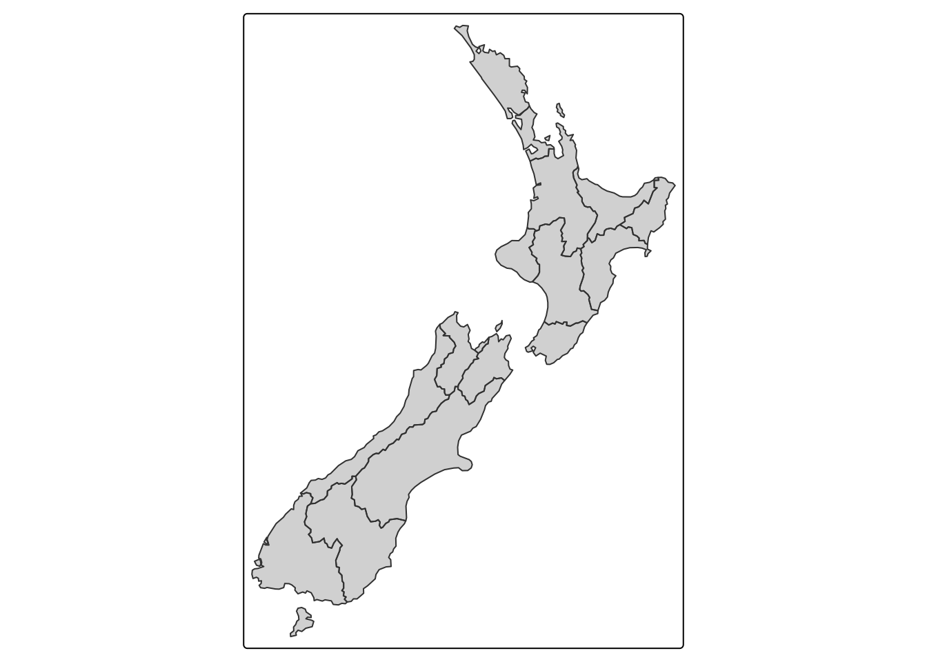
Below we plot the nz shape (representing regions of New
Zealand) loaded from spDataLarge displaying both the outline
and the fill of the polygon features:
To only display a portion of the data (i.e., to zoom in on the map), we first need to define the bounding box of our area of interest. The next chunk of code zooms in on the map and only displays the north island of New Zealand:
# Define bounding box
nz_region =
  st_bbox(c(xmin = 172, xmax = 179,   # X coordinates
            ymin = -42, ymax = -34),  # Y coordinates
          crs = st_crs(4326))         # Define coord. system; 4326: WGS84 lat/long

tm_shape(nz, bbox = nz_region) +  # Add bounding box
  tm_fill() +
tm_borders() 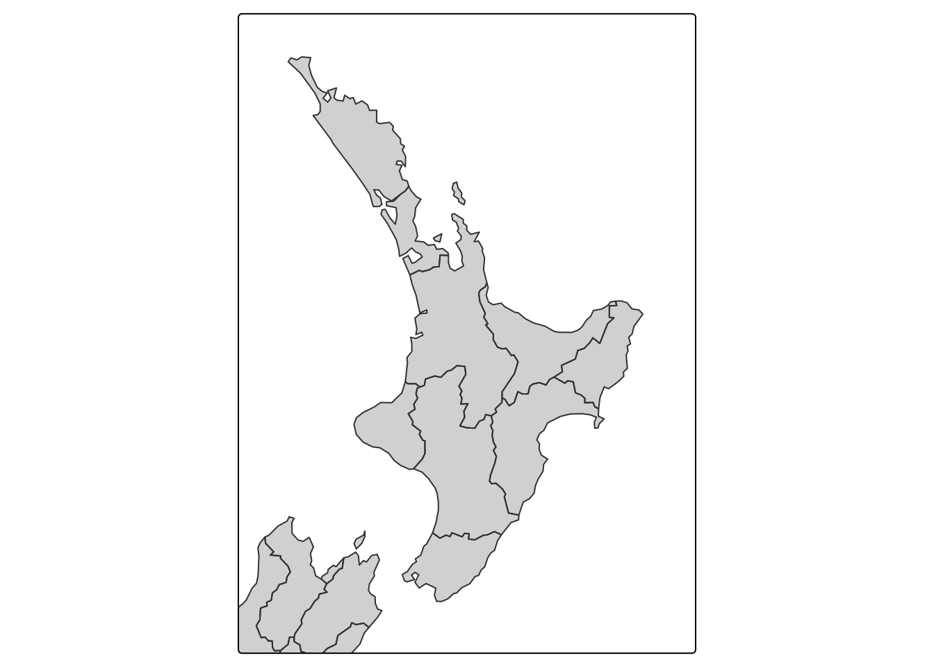
The above plot demonstrates the default aesthetic settings for
tmap. Gray shades are used for tm_fill()
layers and a continuous black line is used to represent lines created
with tm_borders(). It is, of course, possible to override
these default aesthetic settings.
There are two main types of map aesthetics: those that change with
the data and those that are constant. Unlike ggplot2,
which uses the helper function aes() to represent variable
aesthetics, tmap accepts a few aesthetic arguments,
depending on a selected layer type:
fill: fill color of a polygoncol: color of a polygon border, line, point, or rasterlwd: line widthlty: line typesize: size of a symbolshape: shape of a symbolfill_alphaandcol_alpha: fill and border colour transparency
To map a variable to an aesthetic, pass its column name to the corresponding argument, and to set a fixed aesthetic, pass the desired value instead. Below we modify the colours used for the border and fill. First, lets inspect the data:
## [1] "Name"          "Island"        "Land_area"     "Population"
## [5] "Median_income" "Sex_ratio"     "geom"
We can see that nz is an sf object and
includes six non-geometry columns. Print the first few rows of the data
frame:
Below we plot the nz sf object, with
borders coloured red and using dotted lines, and with polygons coloured
using data from the Population column and the default
tmap colour palette with class breaks set using the
quantile method:
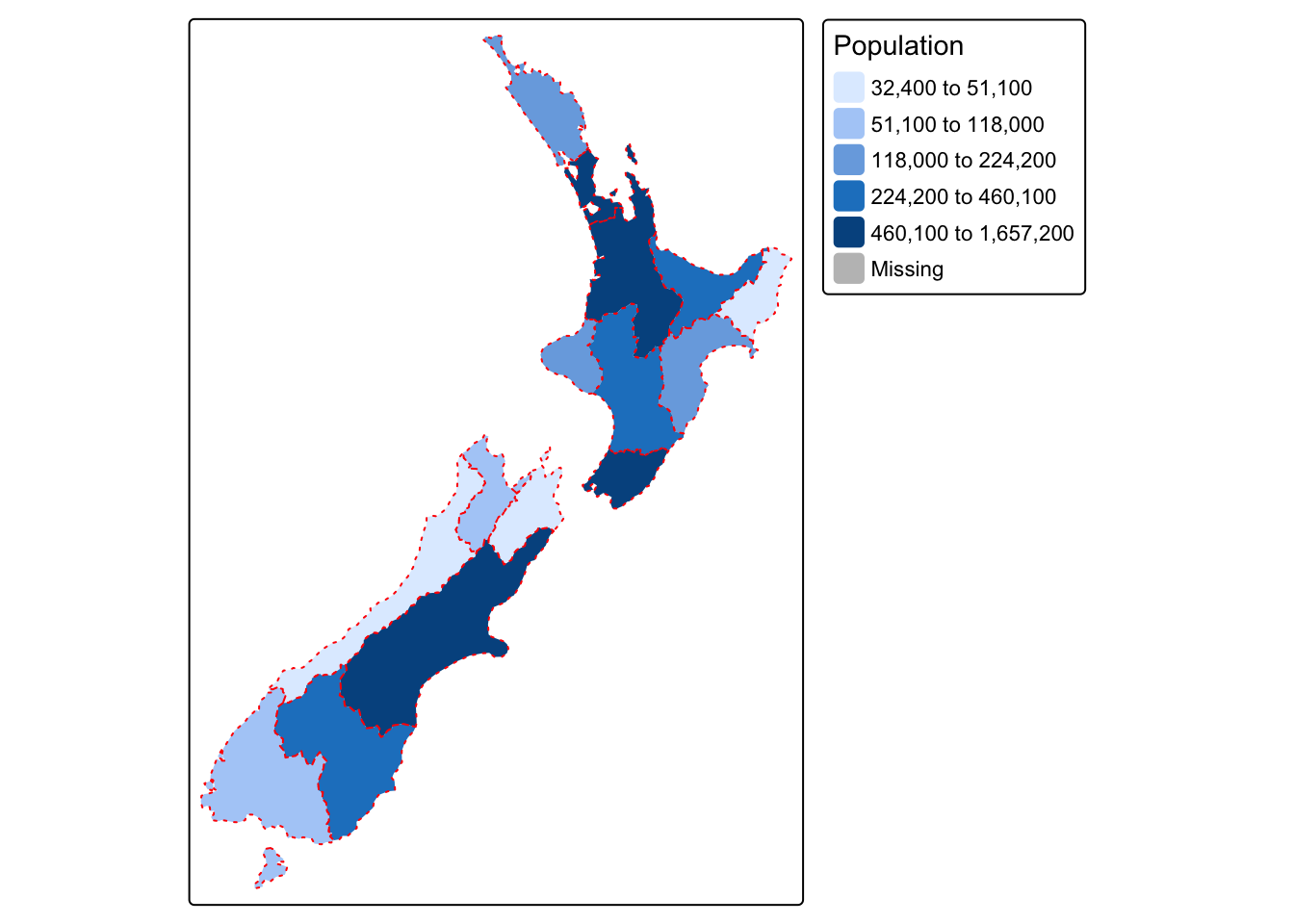
Main options for defining the method used for setting class breaks are:
style = "pretty": creates breaks that are whole numbers and spaces them evenlystyle = "equal": divides input values into bins of equal range and is appropriate for variables with a uniform distributionstyle = "quantile": ensures the same number of observations fall into each categorystyle = "jenks": identifies groups of similar values in the data and maximises the differences between categoriesstyle = "log10_pretty": a common logarithmic (the logarithm to base 10) version of the regular pretty style used for variables with a right-skewed distribution
Defining map objects
A useful feature of tmap is its ability to store
objects representing maps. The code chunk below demonstrates this by
saving the nz sf object plotted earlier
using default border and fill as an object class tmap:
# Create tmap object called map_nz
map_nz <- tm_shape(nz) + tm_fill() + tm_borders()

# Identify object type
class(map_nz)
## [1] "tmap"The new object, map_nz can be plotted later, for example
by adding other layers (as shown below) or simply running
map_nz in the console, which is equivalent to
print(map_nz).
New shapes can be added with + tm_shape(new_obj), where
new_obj represents a new spatial object (data layer) to be
plotted on top of preceding layers. When a new shape is added in this
way, all subsequent aesthetic functions refer to it, until another new
shape is added. This syntax allows the creation of maps with multiple
shapes and layers.
In the next code chunk we use the function tm_raster()
to plot a raster layer of elevation values (with col_alpha
set to make the layer semi-transparent). We save this layer as a
tmap object. Then add region borders using
+ tm_borders():
# Create object showing raster with custom palette and class breaks
map_nz_elev <- tm_shape(nz_elev) +
      tm_raster(col_alpha = 0.7, palette = "terrain", style = "fisher")

# Add borders from nz shape
map_nz2 <- map_nz_elev +
     tm_shape(nz) + tm_borders()

# Show map
map_nz2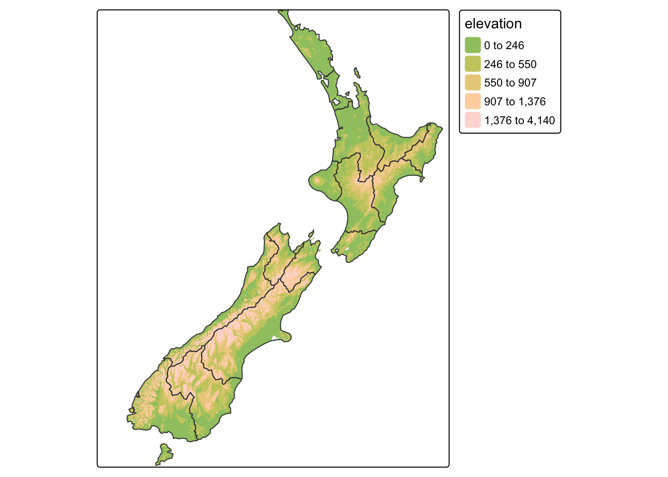
Next, we use the nz object to calculate New Zealand’s
territorial waters, and add the resulting lines to our map:
nz_water <- st_union(nz) |> # Dissolve regions
st_buffer(22200) |> # Create buffer
st_cast(to = "LINESTRING") # Save as sf object
# Creat new tmap object
map_nz3 <- map_nz2 +
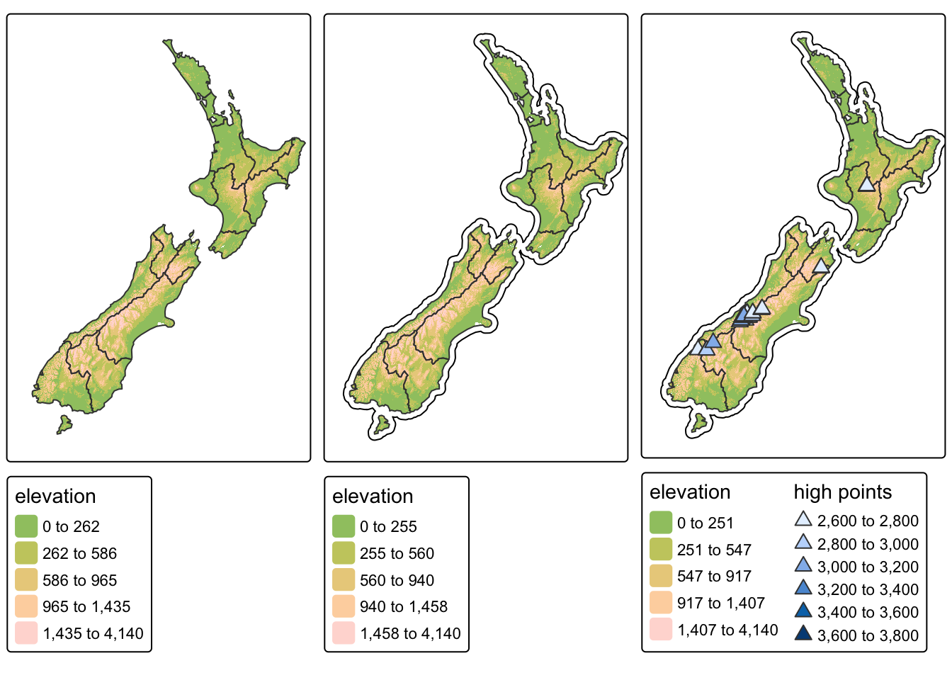
tm_shape(nz_water) + tm_lines()There is no limit to the number of layers or shapes that can be added
to tmap objects, and the same shape can even be used
multiple times. The final map we create as part of this section adds a
layer representing high points (stored in the object
nz_height) onto the previously created map_nz3
object with tm_symbols():
map_nz4 <- map_nz3 +
  tm_shape(nz_height) +              # Add nz_height as new layer
       tm_symbols(shape = 24,        # 24 = triangle; see https://r-tmap.github.io
              size = 0.6,            # Size of shape
              fill = "elevation",    # Data column to use for plotting
              fill.legend = tm_legend(title = "high points")   # Name on legend
                  )
A very useful feature of tmap is that multiple map
objects can be arranged in a single composite map with
tmap_arrange(). This is demonstrated in the code chunk
below which plots the three tmap objects produced
earlier:
Creating layouts
The map layout encompasses the arrangement of all elements that compose a cohesive map. These elements include, but are not limited to, the mapped objects, map grid, scale bar, title, and margins. Additionally, the colour palette selection and breakpoint adjustments contribute to the map’s overall appearance. Even subtle modifications in either layout or color can significantly influence the visual impact and perception of the map.
Map elements such as graticules, north arrows, scale bars, and map
titles have their own functions in tmap:
tm_graticules(), tm_compass(),
tm_scalebar(), and tm_title().
In the following example, we take the map_nz4 object
that we created earlier and add a coordinate grid, compass, scale bar
and title:
map_nz4 +
  tm_graticules() +   # Use tm_grid() to plot CRS of the object;
                      # Use tm_graticules() to plot lat/long coordinates (EPSG 4326)

   tm_compass(type = "arrow",       # Options: "arrow", "4star", "8star", "radar", "rose"
        position = c(1.17,0.25)) +  # Position of compass. Coordinates or:
                                    # "left", "center", "right", for the first value and
                                    # "top", "center", "bottom", for the second value

  tm_scalebar(breaks = c(0, 100, 200),             # Scale bar breaks
        text.size = 1, position = c(1.1,0.14)) +   # Size / position as above

  tm_title("New Zealand / Aotearoa",    # Map title
           fontface = "bold")           # See https://r-tmap.github.io for more options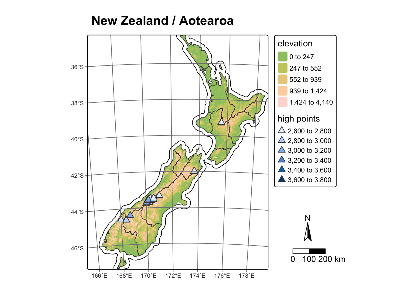
Faceted maps
Faceted maps consist of multiple maps arranged side by side. These maps allow for the visualization of how spatial relationships evolve in relation to another variable, such as time. In most cases, each facet within a faceted map contains the same geometric data, repeated across multiple panels based on different attribute columns. However, facets can also be used to illustrate changing geometries, such as the evolution of a point pattern over time.
In the next example, we use the urban_agglomerations
data frame to extract population data for major urban centres for the
following years: 1970, 1990, 2010, 2030. Before we do this however, let
us inspect urban_agglomerations:
From the above we can see that urban_agglomerations is
an sf object of POINT geometry (i.e.,
S3: sfc_POINT) with 9 attribute columns.
Filter that data to extract the population data we need:
# Extract data for 1970, 1990, 2010, and 2030
urb_1970_2030 = urban_agglomerations |>
  filter(year %in% c(1970, 1990, 2010, 2030))

# Print the first rows
head(urb_1970_2030)
The new spatial data frame urb_1970_2030 only includes
the years that we are interested in. We can now add these data to a map
with tmap. We use the world spatial data
frame as the base map:
tm_shape(world) +
  tm_fill(fill = "#fffee0") +  # Hex Code for light yellow
  tm_borders(col = "gray") +   # Use gray for borders

tm_shape(urb_1970_2030) +
  tm_symbols(
    col = "darkred",                      # Interior fill color
    border.col = "white" ,                # Border (outline) color
    size = "population_millions",         # Size mapped to population_millions
    title.size = ("Population (million)") # Legend title
) +

tm_crs("+proj=robin") +                   # Use Robinson projection
tm_facets_wrap(by = "year", nrow = 2)     # Plot facet by year in 2 rows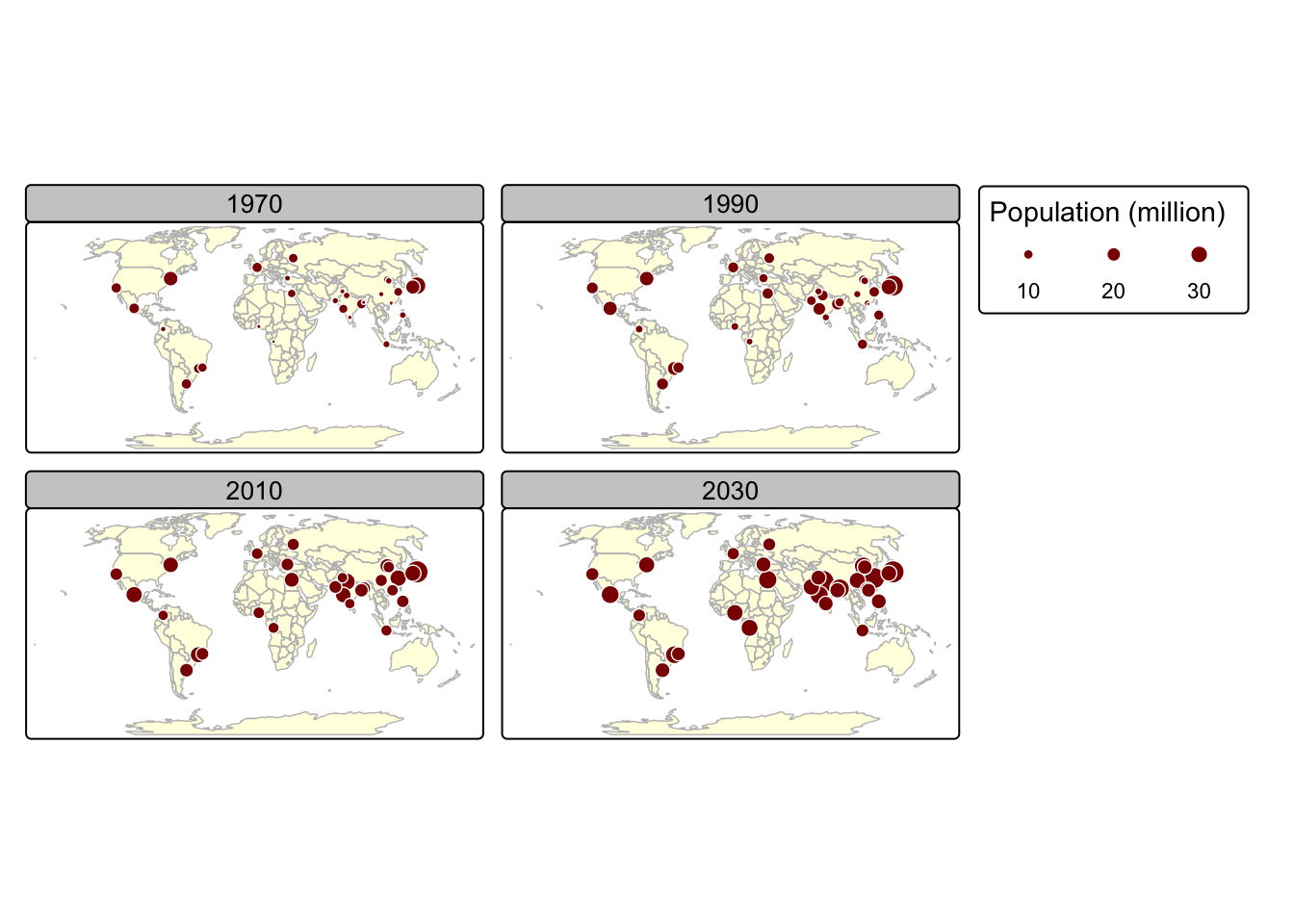
Notes on tm_facets_wrap():
- Shapes that do not have a facet variable are repeated (country
polygons in
worldin this case) - The
byargument which varies depending on a variable (yearin this case) - The
nrow/ncolsetting specifying the number of rows and columns that facets should be arranged into. Alternatively, it is possible to use thetm_facets_grid()function that allows to have facets based on up to three different variables: one for rows, one for columns, and possibly one for pages.
Animated and interactive maps
Faceted maps effectively illustrate changes in spatial distributions of variables (e.g., over time). However, this approach has limitations. When numerous facets are included, their size is reduced, making details harder to discern. Additionally, because each facet is physically separated on the screen or page, detecting subtle differences between them can be challenging. Animated maps solve these issues.
The next chunk of code illustrates how animated maps can be created using tmap. We will save the animated map as a GIF file, and this will require the use of the gifski package:
Install the gifski package:
Load gifski:
We recycle the code we used to create faceted maps and create an
animated map using the tmap_animation() function:
urb_anim =
  tm_shape(world) +
    tm_fill(fill = "#fffee0") +
    tm_borders(col = "gray") +

  # Use urban_agglomerations instead of urb_1970_2030
  tm_shape(urban_agglomerations) +
    tm_symbols(
       col = "darkred",
       border.col = "white" ,
       size = "population_millions" ,
       title.size = ("Population (million)")) +
  tm_crs("+proj=robin") +

  # Create individual facets
  tm_facets_wrap(by = "year", nrow = 1, ncol = 1, free.coords = FALSE)

# Create animated map and save as GIF
tmap_animation(urb_anim, filename = "./img/urb_anim.gif", delay = 25)
## Creating frames##
## Creating animation
## Animation saved to /Volumes/Work/Dropbox/Transfer/SCII206/R-Resource/img/urb_anim.gif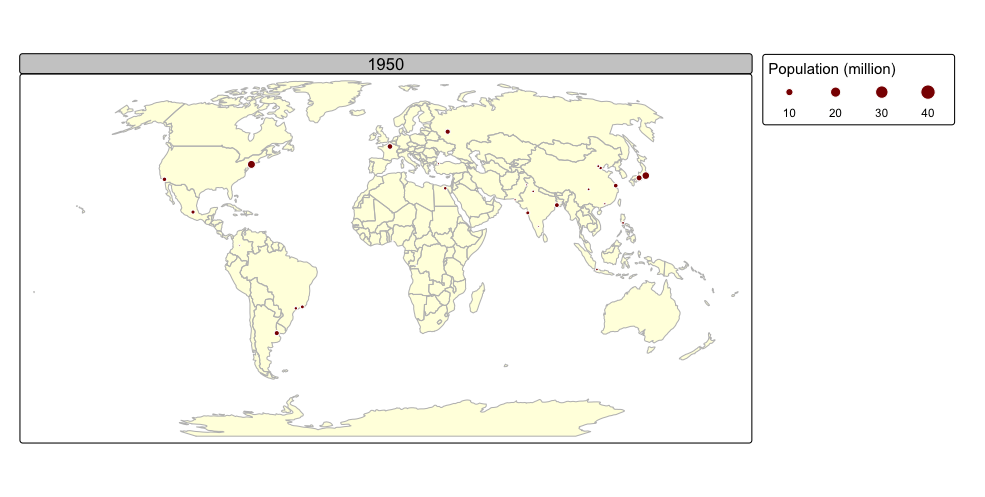
A distinctive feature of tmap is its capability to generate both static and interactive maps using the same code. The introduction of the leaflet package in 2015, which leverages the leaflet JavaScript library, transformed interactive web map creation in R.
At any stage, maps can be viewed interactively by switching to view
mode with the command tmap_mode("view"). To switch back to
static mode use the command tmap_mode("plot").
The next example displays the nz sf
object as an interactive map using leaflet. Regions are
coloured using the Population field and borders are
coloured red using dotted lines:
# Switch to interactive mode
tmap_mode("view")

# Standard tmap code
tm_interactive <- tm_shape(nz) +
    tm_fill(col = "Population", style = "quantile", fill_alpha = 0.5) +
    tm_borders(col = "red", lty = "dotted")

# Display the interactive map
tm_interactiveThe above map is fully interactive. For example, clicking on an feature will display information stored in the attribute table.
Summary
This practical introduced three packages that enable working with spatial data in R:
The sf package provides a standardised framework for handling spatial vector data in R based on the simple features standard (OGC). It enables users to easily work with points, lines, and polygons by integrating robust geospatial libraries such as GDAL, GEOS, and PROJ.
The terra package is designed for efficient spatial data analysis, with a particular emphasis on raster data processing and vector data support. As a modern successor to the “raster” package, it utilises improved performance through C++ implementations to manage large datasets and offers a suite of functions for data import, manipulation, and analysis.
The tmap package provides a flexible and powerful system for creating thematic maps in R, drawing on a layered grammar of graphics approach similar to that of ggplot2. It supports both static and interactive map visualizations, making it easy to tailor maps to various presentation and analysis needs.
Other relevant packages included:
spData: Supplies sample geographic (vector) datasets used for teaching and examples in spatial analysis. It provides ready-to-use data for demonstrating spatial methods.
spDataLarge: Offers larger and more detailed geographic datasets compared to spData, which can be used for more advanced or higher-resolution spatial analyses.
ggplot2: A powerful and flexible system for creating graphics in R based on the Grammar of Graphics. It is the backbone for many modern visualizations and is highly extensible.
ggspatial: Provides spatial data layers and annotations (like scale bars and north arrows) that integrate with ggplot2, making it easier to produce publication-quality maps. It enhances ggplot2’s mapping capabilities by adding geospatial context.
tidyverse (specifically, the dplyr functions within): A collection of R packages for data manipulation, exploration, and visualization; dplyr (part of tidyverse) is focused on efficient data manipulation using a clear and consistent syntax. It streamlines tasks such as filtering, joining, and summarizing data.
grid: Provides low-level graphical functions and support for unit objects, which are useful for fine control over graphical layouts in R. The
unit()function from grid is used here to specify dimensions in map annotations.
List of R functions
This practical showcased a diverse range of R functions. A summary of these is presented below:
base R functions
c(): concatenates its arguments to create a vector, which is one of the most fundamental data structures in R. It is used to combine numbers, strings, and other objects into a single vector.class(): retrieves the class attribute of an object, providing insight into its type and structure. It is essential for understanding how objects interact with R’s generic functions and method dispatch.head(): returns the first few elements or rows of an object, such as a vector, matrix, or data frame. It is a convenient tool for quickly inspecting the structure and content of data.names(): retrieves or sets the names attribute of an object, such as column names in a data frame or element names in a list. It is crucial for managing and accessing labels within R data structures.print(): outputs the value of an R object to the console. It is useful for debugging and ensuring that objects are displayed correctly within functions.seq(): generates regular sequences of numbers based on specified start, end, and increment values. It is essential for creating vectors that represent ranges or intervals.
grid functions
unit(): constructs unit objects that specify measurements for graphical parameters, such as centimeters or inches. It is often used in layout and annotation functions for precise control over plot elements.
sf functions
st_buffer(): creates a buffer zone around spatial features by a specified distance. It is useful for spatial analyses that require proximity searches or zone creation.st_bbox(): computes the bounding box of a spatial object, representing the minimum rectangle that encloses the geometry. It is useful for setting map extents and spatial limits.st_cast(): converts geometries from one type to another, such as from MULTIPOLYGON to POLYGON. It is helpful when a specific geometry type is required for analysis.st_crs(): retrieves or sets the coordinate reference system (CRS) of spatial objects. It is essential for ensuring that spatial data align correctly on maps.st_graticule(): generates a grid of latitude and longitude lines, known as graticules. It is often added to maps to provide spatial reference and context.st_transform(): reprojects spatial data into a different coordinate reference system. It ensures consistent spatial alignment across multiple datasets.st_union(): merges multiple spatial geometries into a single combined geometry. It is useful for dissolving boundaries and creating aggregate spatial features.
terra functions
as.data.frame(): converts a raster object into a data frame, optionally including coordinate columns. It facilitates the integration of raster data with tools like ggplot2 for visualization.crop(): trims a raster to a specified spatial extent. It is used to focus analysis on a region of interest within a larger dataset.ext(): creates or extracts an extent object that defines the spatial boundaries of data. It is used as input for spatial operations such as cropping.project(): reprojects raster data into a different coordinate reference system. It supports various methods and resolutions for aligning spatial datasets.rast(): reads a raster file from disk or creates a new raster object. It is the starting point for most raster data operations in terra.
ggplot2 (tidyverse) functions
aes(): defines aesthetic mappings in ggplot2 by linking data variables to visual properties such as color, size, and shape. It forms the core of ggplot2’s grammar for mapping data to visuals.coord_sf(): sets a coordinate system for spatial data in ggplot2, enabling proper handling of geographic projections. It is especially useful for mapping spatial datasets.element_blank(): represents an empty theme element in ggplot2, often used to remove unwanted plot components. It helps streamline the visual appearance of plots.element_line(): defines the appearance of lines in a ggplot2 theme, including color, size, and linetype. It is used to customise grid lines, axes, and other line elements in a plot.geom_raster(): displays raster data as a grid of colored rectangles in ggplot2. It provides an efficient way to visualise large raster datasets.geom_sf(): plots simple feature (sf) objects in ggplot2, allowing direct visualization of vector spatial data. It automatically respects spatial properties and coordinate systems.ggplot(): initialises a ggplot object and establishes the framework for creating plots using the grammar of graphics. It allows for incremental addition of layers, scales, and themes to build complex visualizations.labs(): allows you to add or modify labels in a ggplot2 plot, such as titles, axis labels, and captions. It enhances the readability and interpretability of visualizations.scale_fill_viridis_c(): applies a continuous viridis color scale to the fill aesthetic in ggplot2. It offers a perceptually uniform and colorblind-friendly palette ideal for scientific visualizations.scale_x_continuous(): customises the x-axis scale in a ggplot, including breaks and labels. It allows precise control over the presentation of numeric data on the x-axis.scale_y_continuous(): customises the y-axis scale in a ggplot, similar toscale_x_continuous(). It ensures that the y-axis meets both visual and analytical requirements.theme(): modifies non-data elements of a ggplot, such as fonts, colors, and backgrounds. It provides granular control over the overall appearance of the plot.theme_minimal(): applies a minimalistic theme to a ggplot, reducing visual clutter by removing unnecessary background elements. It is favored for its clean and modern look.
ggspatial functions
annotation_north_arrow(): adds a north arrow to a ggplot map, indicating geographic orientation. It offers several customizable styles to suit different map designs.annotation_scale(): adds a scale bar to a ggplot map, providing a reference for distance. It enhances spatial context by indicating the scale of the map.
dplyr (tidyverse) functions
filter(): subsets rows of a data frame based on specified logical conditions. It is essential for extracting relevant data for analysis.join_by(): specifies columns to be used for joining two data frames, clarifying the join criteria. It enhances the readability and flexibility of join operations in dplyr.left_join(): merges two data frames by including all rows from the left data frame and matching rows from the right. It is commonly used to retain all observations from the primary dataset while incorporating additional information.
tmap functions
tm_borders(): draws border lines around spatial objects on a map. It is often used in combination with fill functions to delineate regions clearly.tm_compass(): adds a compass element to a map to indicate orientation. It offers customizable styles and positions for clear directional reference.tm_crs(): sets or retrieves the coordinate reference system for a tmap object. It ensures that all spatial layers are correctly projected.tm_facets_wrap(): creates a faceted layout by splitting a map into multiple panels based on a grouping variable. It is useful for comparing maps across different time periods or categories.tm_fill(): fills spatial objects with color based on data values or specified aesthetics in a tmap. It is a key function for thematic mapping.tm_graticules(): adds graticule lines (latitude and longitude grids) to a map, providing spatial reference. It improves map readability and context.tm_legend(): customises the appearance and title of map legends in tmap. It is used to enhance the clarity and presentation of map information.tm_lines(): draws line features, such as borders or network connections, on a map. It offers customization options for line width and color to highlight spatial relationships.tm_raster(): adds a raster data layer to a tmap, with options for transparency and color palettes. It is tailored for visualizing continuous spatial data.tm_shape(): defines the spatial object that subsequent tmap layers will reference. It establishes the base layer for building thematic maps.tm_symbols(): adds point symbols to a map with customizable shapes, sizes, and colors based on data attributes. It is useful for plotting locations with varying characteristics.tm_scalebar(): adds a scale bar to a tmap to indicate distance. It can be customised in terms of breaks, text size, and position.tm_title(): adds a title and optional subtitle to a tmap, providing descriptive context. It helps clarify the purpose and content of the map.tmap_animation(): creates an animated map by iterating through facets or time steps, typically saving the output as a GIF. It is used to visualise spatial changes over time.tmap_arrange(): arranges multiple tmap objects into a single composite layout. It is useful for side-by-side comparisons or dashboard displays.tmap_mode(): switches between static (“plot”) and interactive (“view”) mapping modes in tmap. It allows users to choose the most appropriate display format for their needs.