Spatial data in R: Operations on continuous fields
SCII205: Introductory Geospatial Analysis / Practical No. 4
Alexandru T. Codilean
Last modified: 2025-06-14
![]()
Introduction
This practical is divided into two distinct parts. In the first section, the focus is on spatial interpolation, learning how to convert a discrete POINT geometry sf object into a continuous terra SpatRaster. This transformation is essential for analysing spatial patterns and gradients across a landscape, and the section offers a detailed, step-by-step guide to understanding and applying interpolation techniques to generate continuous surfaces from point data. In the second section, the emphasis shifts to analysing continuous fields through the use of an existing digital elevation model (DEM). This part of the practical demonstrates a range of geospatial operations, including convolution, viewshed analysis, and terrain analysis. The techniques covered here are crucial for applications such as hydrological modelling and landform analysis.
R packages
The practical will utilise R functions from packages explored in previous sessions:
The sf package: provides a standardised framework for handling spatial vector data in R based on the simple features standard (OGC). It enables users to easily work with points, lines, and polygons by integrating robust geospatial libraries such as GDAL, GEOS, and PROJ.
The terra package: is designed for efficient spatial data analysis, with a particular emphasis on raster data processing and vector data support. As a modern successor to the raster package, it utilises improved performance through C++ implementations to manage large datasets and offers a suite of functions for data import, manipulation, and analysis.
The tmap package: provides a flexible and powerful system for creating thematic maps in R, drawing on a layered grammar of graphics approach similar to that of ggplot2. It supports both static and interactive map visualizations, making it easy to tailor maps to various presentation and analysis needs.
The tidyverse: is a collection of R packages designed for data science, providing a cohesive set of tools for data manipulation, visualization, and analysis. It includes core packages such as ggplot2 for visualization, dplyr for data manipulation, tidyr for data tidying, and readr for data import, all following a consistent and intuitive syntax.
The practical also introduces these new packages:
The gstat package: provides a comprehensive toolkit for geostatistical modelling, prediction, and simulation. It offers robust functions for variogram estimation, multiple kriging techniques (including ordinary, universal, and indicator kriging), and conditional simulation, making it a cornerstone for spatial data analysis in R.
The whitebox package: is an R frontend for WhiteboxTools, an advanced geospatial data analysis platform developed at the University of Guelph. It provides an interface for performing a wide range of GIS, remote sensing, hydrological, terrain, and LiDAR data processing operations directly from R.
The plotly package: is an open-source library that enables the creation of interactive, web-based data visualizations directly from R by leveraging the capabilities of the
plotly.jsJavaScript library. It seamlessly integrates with other R packages like ggplot2, allowing users to convert static plots into dynamic, interactive charts with features such as zooming, hovering, and clickable elements.
Resources
- The Geocomputation with R book.
- The tidyverse library of packages documentation.
- The sf package documentation.
- The terra package documentation.
- The tmap package documentation.
- The gstat package documentation.
- The WhiteboxTools library documentation.
- The plotly package documentation.
The gstat package
The gstat R package is a comprehensive tool for spatial and geostatistical analysis. It includes functions for variogram estimation, various kriging methods (such as ordinary, universal, indicator, and co-kriging), and both conditional and unconditional stochastic simulation to generate multiple realisations of spatial fields. Designed for multivariable geostatistics, gstat is ideal for modeling spatial phenomena and analyzing relationships among different spatially distributed variables.
Key characteristics include:
Versatile modeling: Offers tools for variogram estimation, multiple kriging methods, and spatial simulation, making it suitable for diverse spatial prediction tasks.
Multivariable capabilities: Supports the joint analysis of multiple spatially correlated variables, essential for complex environmental and geochemical studies.
Integration with the R spatial ecosystem: Works seamlessly with packages like sf and terra, facilitating data handling, visualization, and advanced spatial analysis.
User-friendly interface: Features clear syntax for model specification, cross-validation, and diagnostics, accommodating both beginners and experts.
Robust documentation and community support: Extensive resources, tutorials, and a supportive community ensure effective use in both academic research and practical applications.
The whitebox package
The whitebox package in R serves as an interface to the open‐source WhiteboxTools library, which offers high-performance geospatial analysis capabilities. Here are its key characteristics and advantages:
High-performance processing: WhiteboxTools is developed in Rust, offering fast and efficient execution of computationally intensive geospatial operations. The whitebox package lets users leverage this performance directly from R.
Comprehensive geospatial functionality: It provides access to a broad array of tools for terrain analysis, hydrological modeling, remote sensing, and image processing. This versatility makes it suitable for diverse spatial analyses and environmental modeling tasks.
Seamless integration with R workflows: the package allows you to execute WhiteboxTools commands within R, enabling smooth integration with other R spatial packages for data manipulation, visualization, and further analysis.
User-friendly command interface: By wrapping the command-line operations of WhiteboxTools, the whitebox package provides a straightforward and accessible interface, which is beneficial for users who prefer R’s scripting environment over direct command-line interaction.
Open-source and actively developed: Both WhiteboxTools and its R interface are open-source, fostering community contributions, continuous improvements, and transparency in geospatial research.
Install and load packages
Packages such as sf, terra, tmap, and tidyverse should already be installed. Should this not be the case, execute the following chunk of code:
# Main spatial packages
install.packages("sf")
install.packages("terra")

# tmap dev version and leaflet for dynamic maps
install.packages("tmap",
    repos = c("https://r-tmap.r-universe.dev", "https://cloud.r-project.org"))
install.packages("leaflet")

# tidyverse for additional data wrangling
install.packages("tidyverse")
Next install gstat, plotly:
Load packages:
library(sf)
library(terra)
library(tmap)
library(leaflet)
library(tidyverse)
library(gstat)
library(plotly)

# Set tmap to static maps
tmap_mode("plot")
The following code block installs both the whitebox package and the WhiteboxTools library. Since this is a two-step process, it is executed separately from the installation of the other packages:
# Install the CRAN version of whitebox
install.packages("whitebox")

# For the development version run this:
# if (!require("remotes")) install.packages('remotes')
# remotes::install_github("opengeos/whiteboxR", build = FALSE)

# Install the WhiteboxTools library
whitebox::install_whitebox()
Load and initialise the whitebox package:
Load and prepare data
This practical is divided into two parts. The first section focuses on spatial interpolation and explains how to convert a POINT geometry sf object into a continuous terra SpatRaster. The second section uses an existing digital elevation model (DEM) to demonstrate various geospatial operations on continuous fields. Each section employs a different dataset, as detailed below.
Dataset for interpolation
The dataset for the first part of this practical comprises the following layers:
chelsa_map_1km: this GeoTIFF raster represents a subset of the global mean annual precipitation (BIO12) dataset for the period 1981 to 2010, derived from the CHELSA (Climatologies at high resolution for the Earth’s land surface areas) project. The raster features a 1 km resolution and is projected using the EPSG:32653 (WGS 84 / UTM zone 53N) coordinate reference system.chelsa_mat_1km: this GeoTIFF raster represents a subset of the global mean annual temperature dataset (BIO01) for the period 1981 to 2010, derived from the CHELSA project. The raster features a 1 km resolution and is projected using the EPSG:32653 (WGS 84 / UTM zone 53N) coordinate reference system.dem_1km: this GeoTIFF raster represents a 1 km resolution digital elevation model (DEM) for the area covered by the CHELSA precipitation and temperature rasters. The DEM was created by resampling a 10 m resolution DEM of the same region, sourced from the Geospatial Information Authority of Japan. It is projected using the EPSG:32653 (WGS 84 / UTM zone 53N) coordinate reference system.bnd.gpkg: This Geopackage contains a POLYGON geometry layer representing the bounding box of the aforementioned raster datasets. The vector layer is projected using the EPSG:32653 (WGS 84 / UTM zone 53N) coordinate reference system.
Load raster data
Read the three GeoTIFF files as SpatRaster objects and
verify that the extents match:
# Read in the 3 GeoTIFF files as SpatRaster objects
r_map <- rast("./data/data_spat3/raster/chelsa_map_1km.tif")
r_mat <- rast("./data/data_spat3/raster/chelsa_mat_1km.tif")
r_dem <- rast("./data/data_spat3/raster/dem_1km.tif")

names(r_map) <- "Precip"
names(r_mat) <- "Temp"
names(r_dem) <- "Elev"

# Verify that the extents match:
# (1) Extract numeric extent values for each raster
ext_map <- c(xmin(r_map), xmax(r_map), ymin(r_map), ymax(r_map))
ext_mat <- c(xmin(r_mat), xmax(r_mat), ymin(r_mat), ymax(r_mat))
ext_dem <- c(xmin(r_dem), xmax(r_dem), ymin(r_dem), ymax(r_dem))

# (2) Compare the extents pairwise
if (!isTRUE(all.equal(ext_map, ext_mat, tolerance = .Machine$double.eps^0.5)) ||
    !isTRUE(all.equal(ext_map, ext_dem, tolerance = .Machine$double.eps^0.5))) {
  stop("The raster extents do not match!")
}
Plot the three rasters with tmap:
tm_shape(r_map) +
       tm_raster("Precip",
        col.scale = tm_scale_continuous(values = "-scico.vik")
  ) +
  tm_layout(frame = FALSE,
                 legend.text.size = 0.7,
                 legend.title.size = 0.7,
                 legend.position = c("right", "bottom"),
                 legend.bg.color = "white") +
  tm_title("CHELSA Precipitation [mm]", size = 1) +
  tm_graticules(col = "white", lwd = 0.5)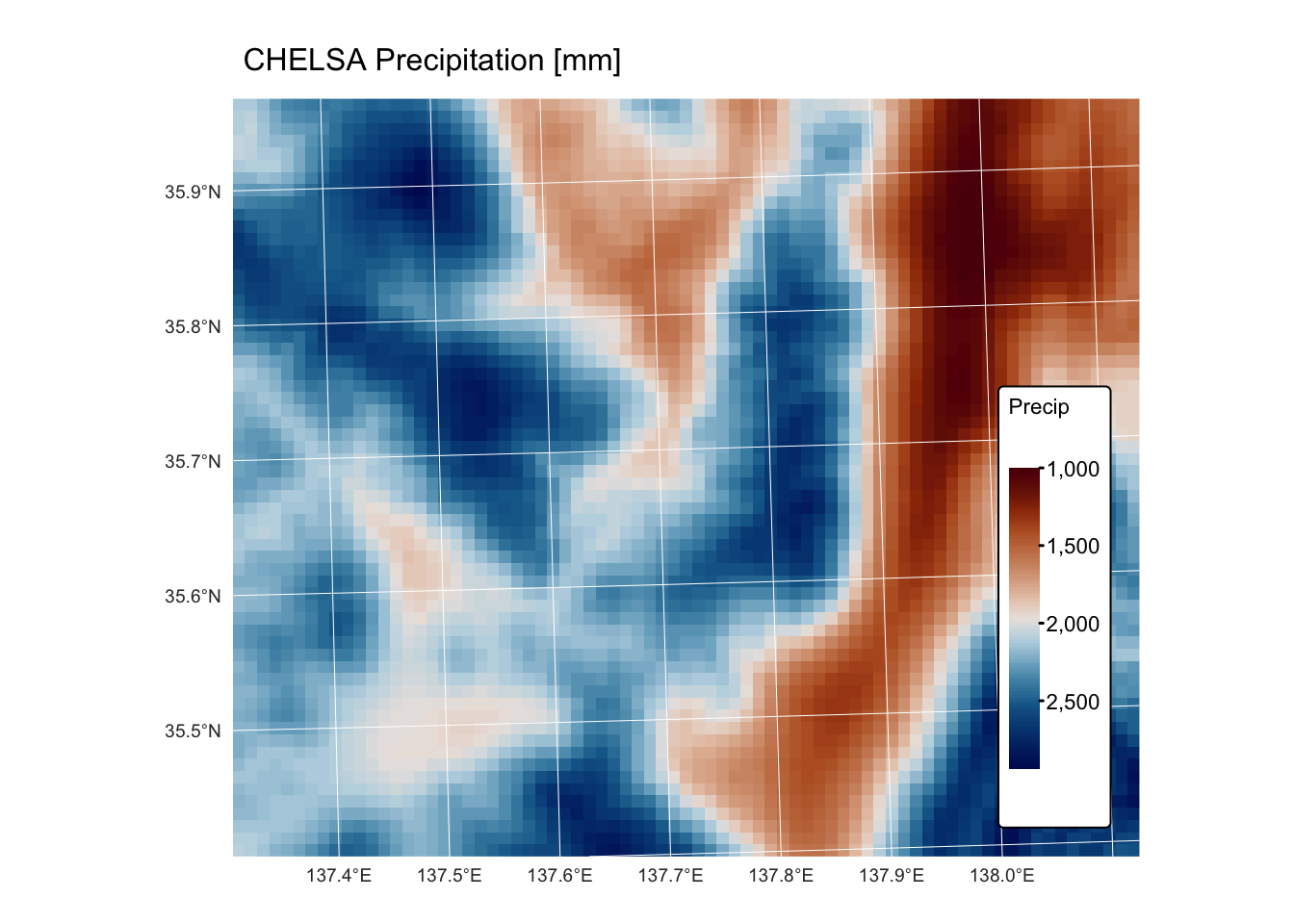
tm_shape(r_mat) +
       tm_raster("Temp",
        col.scale = tm_scale_continuous(values = "scico.davos")
  ) +
  tm_layout(frame = FALSE,
                 legend.text.size = 0.7,
                 legend.title.size = 0.7,
                 legend.position = c("right", "bottom"),
                 legend.bg.color = "white") +
  tm_title("CHELSA Temperature [degrees C]", size = 1) +
  tm_graticules(col = "white", lwd = 0.5)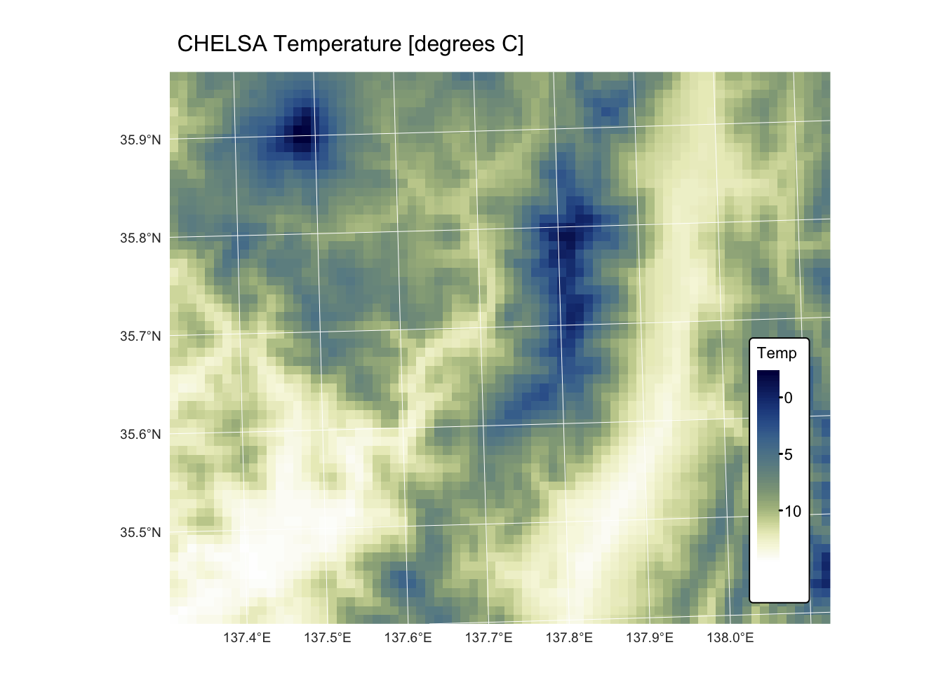
tm_shape(r_dem) +
       tm_raster("Elev",
        col.scale = tm_scale_continuous(values = "matplotlib.terrain")
  ) +
  tm_layout(frame = FALSE,
                 legend.text.size = 0.7,
                 legend.title.size = 0.7,
                 legend.position = c("right", "bottom"),
                 legend.bg.color = "white") +
  tm_title("Elevation [m]", size = 1) +
  tm_graticules(col = "white", lwd = 0.5)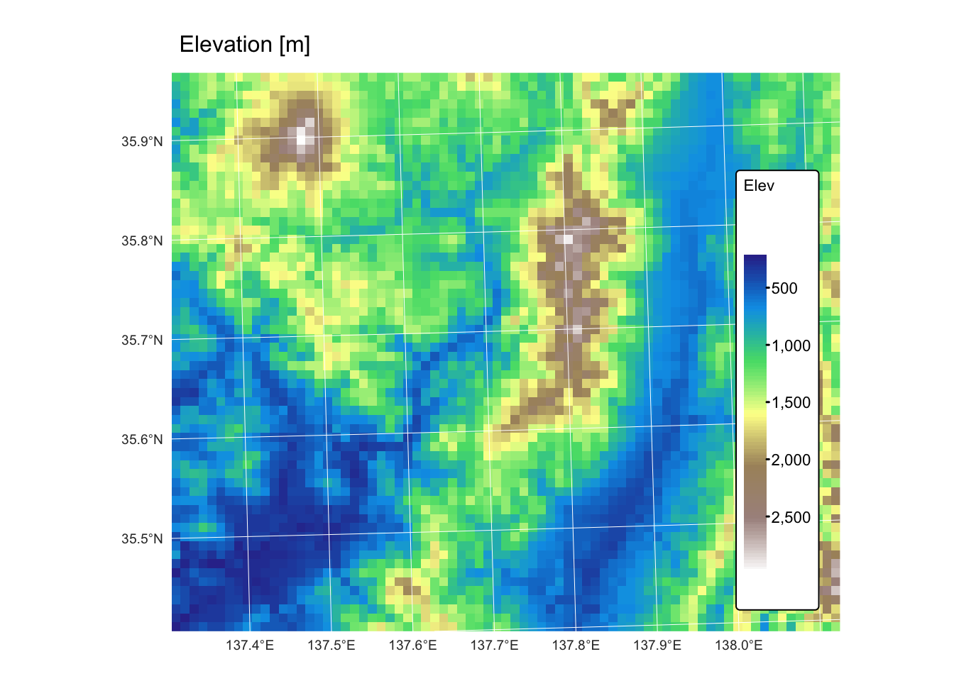
Create points for interpolation
To illustrate the various interpolation methods available in the gstat package, we will:
Create an sf object containing 500 POINT geometries randomly distributed within the
bndbounding box, assigning each point values from the precipitation, temperature, and elevation rasters.Randomly split this sf object into two equal datasets — a training set for performing the interpolation and a testing set for evaluating the performance of each method. Additionally, the interpolated rasters can be directly compared with the original GeoTIFFs.
The next R code block generates the 500 random points and saves them as an sf object. Given that the resolution of the provided rasters is 1 km, the random points are ensured to be at least 1 km apart.
# Create a bounding box from the bnd layer provided
bnd <- st_read("./data/data_spat3/vector/bnd.gpkg")
## Reading layer `Bounding Box' from data source
## `/Volumes/Work/Dropbox/Transfer/SCII206/R-Resource/data/data_spat3/vector/bnd.gpkg'
## using driver `GPKG'
## Simple feature collection with 1 feature and 20 fields
## Geometry type: MULTIPOLYGON
## Dimension: XY
## Bounding box: xmin: 709205 ymin: 3920571 xmax: 783782.5 ymax: 3982934
## Projected CRS: WGS 84 / UTM zone 53Nbbox <- st_as_sfc(st_bbox(bnd))
# Initialize variables for the greedy sampling algorithm
accepted_points <- list()
n_points <- 500 # Number of points
min_dist <- 1000 # Minimum distance in meters
attempt <- 0
max_attempts <- 100000 # To avoid infinite loops
# Note: This method assumes that the CRS units are in meters.
# If not, you may need to transform the coordinate system appropriately.
# Greedily sample points until 500 valid ones are collected
while (length(accepted_points) < n_points && attempt < max_attempts) {
attempt <- attempt + 1
# Generate a random point within the bounding box
bbox_coords <- st_bbox(bbox)
x <- runif(1, bbox_coords["xmin"], bbox_coords["xmax"])
y <- runif(1, bbox_coords["ymin"], bbox_coords["ymax"])
pt <- st_sfc(st_point(c(x, y)), crs = st_crs(bnd))
# If this is the first point, add it immediately
if (length(accepted_points) == 0) {
accepted_points[[1]] <- pt
} else {
# Combine already accepted points into one sfc object
accepted_sfc <- do.call(c, accepted_points)
# Calculate distances from the new point to all accepted points
dists <- st_distance(pt, accepted_sfc)
# If the new point is at least 1000 m from all others, accept it
if (all(as.numeric(dists) >= min_dist)) {
accepted_points[[length(accepted_points) + 1]] <- pt
}
}
}
# Check that enough points were generated
if (length(accepted_points) < n_points) {
stop("Could not generate 500 points with the specified minimum distance.")
}
# Combine accepted points into a single sf object
points_sf <- st_sf(geometry = do.call(c, accepted_points))Plot random points with tmap to inspect spatial distribution:
# Plot random points with bbox
bnd_map <- tm_shape(bnd) + tm_borders("red")

bnd_map + tm_shape(points_sf) + tm_dots(size = 0.3) +
                    tm_layout(frame = FALSE) +
                    tm_legend(show = FALSE)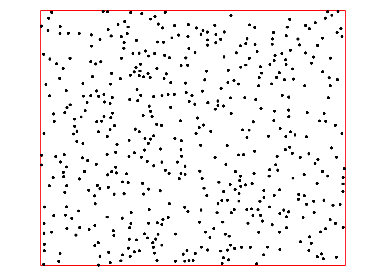
The above point sf object (points_sf)
looks satisfactory: there is no obvious clustering of points and there
is good coverage of the area of interest. The following chunk of R code
extracts the values from the raster layers and assigns them as attribute
columns of points_sf.
# Stack the three rasters together
r_stack <- c(r_map, r_mat, r_dem)

# Convert the sf object to a SpatVector for extraction
points_vect <- vect(points_sf)

# Extract values from the raster stack at point locations
extracted_vals <- terra::extract(r_stack, points_vect)
# Remove the ID column produced by extract()
extracted_vals <- extracted_vals[, -1]

# Set the column names for the extracted values explicitly.
colnames(extracted_vals) <- c("Precipitation", "Temperature", "Elevation")

# Bind the extracted raster values to the sf object.
points_sf <- cbind(points_sf, extracted_vals)
Finally, the random points are divided into two subsets — a training set and a testing set — each comprising 250 randomly selected points.
# Add a unique ID column
points_sf <- points_sf %>% mutate(ID = row_number())

# Set a seed for reproducibility and randomly split the data into two groups
set.seed(123)  # Adjust or remove the seed if necessary
training_indices <- sample(nrow(points_sf), 250)
training_sf <- points_sf[training_indices, ]
testing_sf  <- points_sf[-training_indices, ]

#Inspect the final objects by printing the first few rows
head(training_sf)We can see from the above that each new sf object includes the three columns with data from the precipitation, temperature, and elevation rasters, plus one ID column holding unique identifiers for each row.
Plot the training and testing sets with tmap:
# Plot random points with bbox
bnd_map <- tm_shape(bnd) +
              tm_borders("red")

training_map <- bnd_map +
     tm_shape(training_sf) + tm_dots(size = 0.3, "blue") +
                 tm_layout(frame = FALSE) +
                 tm_legend(show = FALSE)

training_map +
     tm_shape(testing_sf) + tm_dots(size = 0.3, "green") +
                tm_layout(frame = FALSE) +
                tm_legend(show = FALSE)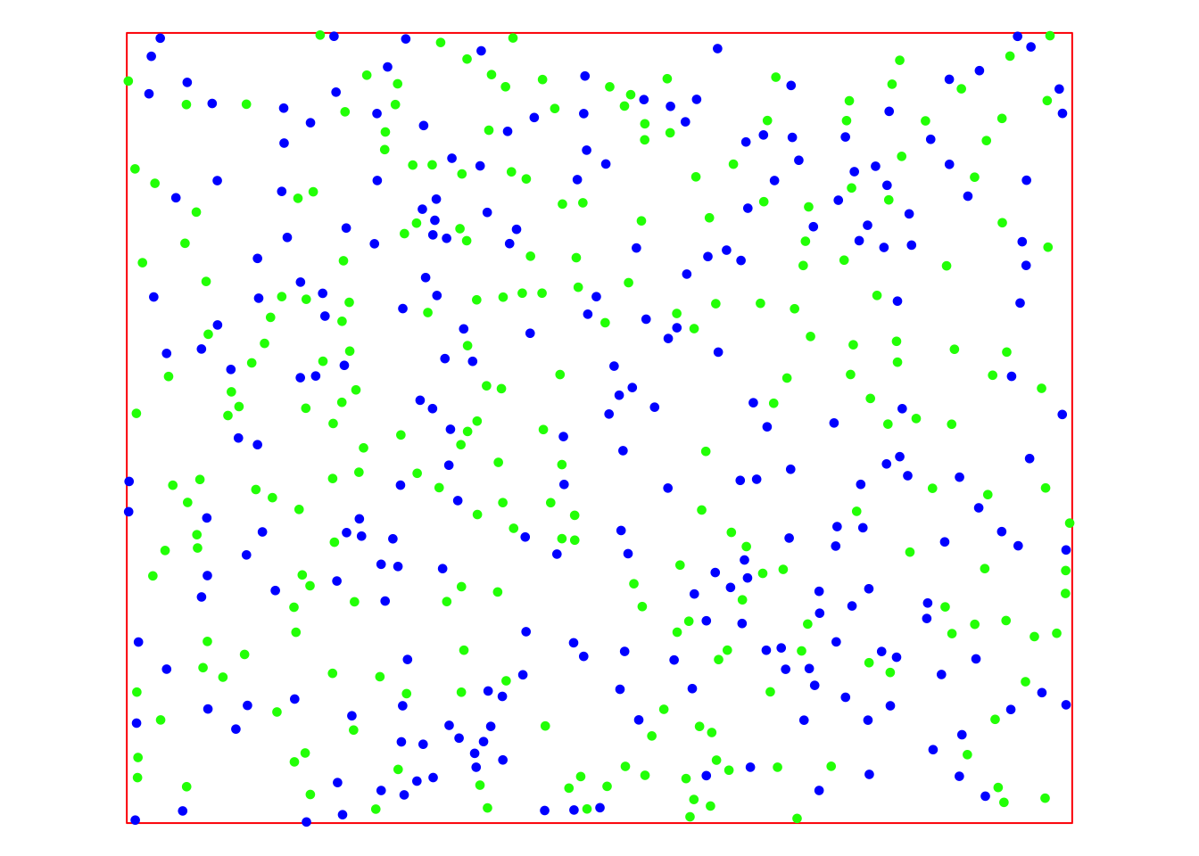
The map displays the training data in blue and the testing data in green. With these sets of points, we can now apply and evaluate the various interpolation methods offered by gstat.
Dataset for operations
The dataset for the second part of this practical comprises the following layers:
dem_5m: A GeoTIFF raster representing a 5 m resolution digital elevation model (DEM) obtained from the Geospatial Information Authority of Japan.basin_outlets.gpkg: A Geopackage containing a POINT geometry layer that represents the outlets of two small watersheds.basin_poly.gpkg: A Geopackage with a POLYGON geometry layer representing the watersheds draining into basin_outlets, delineated fromdem_5m.bnd_small.gpkg: A Geopackage containing a POLYGON geometry layer representing the extent ofdem_5m.
All layers are projected using the EPSG:32653 (WGS 84 / UTM zone 53N) coordinate reference system.
The next R code block reads in the data and plots it on a map using tmap:
## Reading layer `Bounding Box Small' from data source
##   `/Volumes/Work/Dropbox/Transfer/SCII206/R-Resource/data/data_spat3/vector/bnd_small.gpkg'
##   using driver `GPKG'
## Simple feature collection with 1 feature and 1 field
## Geometry type: POLYGON
## Dimension:     XY
## Bounding box:  xmin: 749207.5 ymin: 3951521 xmax: 750697.5 ymax: 3952976
## Projected CRS: WGS 84 / UTM zone 53N## Reading layer `JP Basins' from data source
## `/Volumes/Work/Dropbox/Transfer/SCII206/R-Resource/data/data_spat3/vector/basins_poly.gpkg'
## using driver `GPKG'
## Simple feature collection with 2 features and 2 fields
## Geometry type: MULTIPOLYGON
## Dimension: XY
## Bounding box: xmin: 749442.5 ymin: 3951706 xmax: 750442.5 ymax: 3952766
## Projected CRS: WGS 84 / UTM zone 53N## Reading layer `JP basin outlets' from data source
## `/Volumes/Work/Dropbox/Transfer/SCII206/R-Resource/data/data_spat3/vector/basin_outlets.gpkg'
## using driver `GPKG'
## Simple feature collection with 2 features and 3 fields
## Geometry type: POINT
## Dimension: XY
## Bounding box: xmin: 749790 ymin: 3952729 xmax: 749884.9 ymax: 3952758
## Projected CRS: WGS 84 / UTM zone 53N# Read in DEM as SpatRast object
jp_dem <- rast("./data/data_spat3/raster/dem_5m.tif")
names(jp_dem) <- "Elevation"
# Plot bnd + Add DEM, basins, and outlets
bnd_map <- tm_shape(bnd_small) + tm_borders("black") +
tm_layout(frame = FALSE)
dem_map <- bnd_map +
tm_shape(jp_dem) + tm_raster("Elevation",
col.scale = tm_scale_continuous(values = "matplotlib.terrain")) +
tm_layout(frame = FALSE,
legend.text.size = 0.7,
legend.title.size = 0.7,
legend.bg.color = "white") +
tm_graticules(col = "white", lwd = 0.5, n.x = 3, n.y = 3)
basin_map <-dem_map +
tm_shape(jp_basins) + tm_borders("darkred") + tm_fill("black", fill_alpha = 0.4)
tm_layout(frame = FALSE)
basin_map +
tm_shape(jp_outlets) + tm_dots(size = 0.7, "darkred") +
tm_layout(frame = FALSE)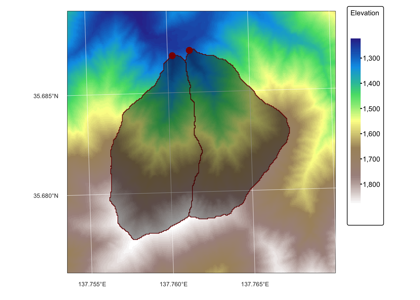
Spatial interpolation
Data models
In geospatial analysis the natural world is captured using two fundamental data models:
Discrete entities: are individual, well-defined objects represented as points, lines, or polygons with clear boundaries, such as buildings or roads. They focus on the exact location and shape of each object, making them ideal for analyses that require detailed spatial relationships.
Continuous fields: represent spatial phenomena as grids of cells where each cell holds a value, such as temperature or elevation, that changes gradually across space. They assume that the measured attribute exists continuously over the area, allowing for smooth interpolation and analysis of natural gradients.
The primary difference between the two data models, namely that discrete entities capture distinct, bounded features, while continuous fields describe phenomena that vary seamlessly across a region, influences the choice of data formats (vector for discrete and raster for continuous) and the analytical methods used in geospatial analysis.
Continuous fields are typically obtained by gathering data from a variety of sources—such as field measurements, remote sensing imagery, or sensor networks — and then using interpolation techniques to estimate values at unmeasured locations.
Spatial interpolation methods
Spatial interpolation is a set of methods used to estimate unknown values at unsampled locations based on known data points. It leverages the principle of spatial autocorrelation — the concept that nearby locations are more likely to have similar values than those farther apart (often referred to as Tobler’s First Law of Geography).
The choice of interpolation method depends on the nature of the data, the spatial structure of the phenomenon being studied, and the specific requirements of the analysis. All interpolation methods require careful consideration of data quality and density, as these factors significantly affect the accuracy of the interpolated surfaces.
Spatial interpolation methods are typically classified as either deterministic or stochastic, and further categorized as either exact or inexact. The differences between these categories are briefly discussed below.
Deterministic/stochastic methods
Deterministic Methods:
- Operate under the assumption that spatial relationships follow fixed mathematical rules.
- Examples include inverse distance weighting (IDW) and spline interpolation.
- Rely solely on the geometric configuration of sample points, assigning weights that decrease with distance.
- Produce a single “best guess” value for each unsampled location without modeling statistical variability.
Stochastic Methods:
- Also known as geostatistical methods.
- Treat spatial data as a realisation of an underlying random process.
- Use statistical models (often encapsulated in variograms) to describe spatial autocorrelation.
- Provide not only predicted values but also measures of prediction uncertainty.
- Particularly advantageous when data exhibit inherent randomness or when quantifying uncertainty is crucial.
Exact/inexact interpolators
Exact interpolators:
- Reproduce the original data values exactly at the sample locations.
- Common in many deterministic methods and some stochastic methods (e.g., kriging with a zero nugget effect).
- Best used when data are highly accurate and it’s important to honor the original measurements.
Inexact (smoothing) interpolators:
- Balance fidelity to the data with the smoothness of the resulting surface.
- Do not necessarily pass through every sample point.
- Examples include smoothing splines and trend surface analysis.
- Help to smooth out measurement noise and local variability.
- Preferable when reducing noise and generalising the data is more important than reproducing every original value.
Spatial interpolation with gstat
As noted above, spatial interpolation is a method used to estimate unknown values at specific locations based on measurements taken at known locations. In geospatial analysis, these specific locations usually refer to a regular grid of cells (magenta squares in the Fig. 1 below). The method applies a mathematical model or function to compute a new value for each grid cell (magenta squares) based on the measured values from the proximity of that grid cell (blue triangles). The grid does not need to have a rectangular shape, and can be cropped to the boundary of the area of interest.
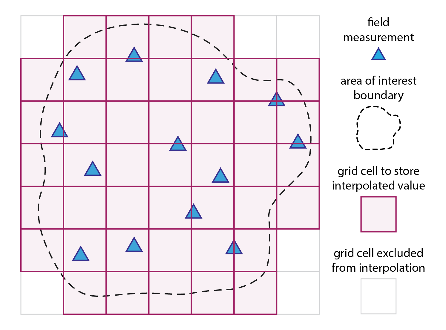
Fig. 1: Spatial interpolation in a nutshell: a mathematical model/function is used to compute a new value for each grid cell (magenta squares) based on the measured values from the proximity of that grid cell (blue triangles).
The next block of R code produces a regular grid for interpolation
and crops this to the bnd sf polygon
object.
# Create a grid based on the bounding box of the polygon
# We set the spatial resolution to 1 km (75 x 62 cells)
bbox <- st_bbox(bnd)
x.range <- seq(bbox["xmin"], bbox["xmax"], length.out = 75)
y.range <- seq(bbox["ymin"], bbox["ymax"], length.out = 62)
grid <- expand.grid(x = x.range, y = y.range)

# Convert the grid to an sf object and assign the same CRS as the polygon
grid_sf <- st_as_sf(grid, coords = c("x", "y"), crs = st_crs(bnd))

# Crop the grid to the polygon area using an intersection
grid_sf_cropped <- st_intersection(grid_sf, bnd)

# Convert the cropped grid to a Spatial object (gstat requires Spatial objects)
grid_sp <- as(grid_sf_cropped, "Spatial")
Fitting a first order polynomial
The simplest mathematical model we can fit to a dataset is a linear model. For two dimensional data, the first order polynomial has the following equation:
\[f(x,y) = ax + by + c\] where: \(a\), \(b\), and \(c\) are constants and \(x\) and \(y\) are the x and y coordinates of the data, respectively.
The next example fits a first order polynomial (i.e., a plane) to the
cloud of points defined by our training dataset
(training_sf). We create two surfaces: one for temperature
and one for precipitation.
# Extract coordinates from points and prepare data for modeling
points_coords <- st_coordinates(training_sf)
temp_df <- data.frame(x = points_coords[,1], y = points_coords[,2],     # Temp.
                        value_temp = points_sf$Temperature)
precip_df <- data.frame(x = points_coords[,1], y = points_coords[,2],   # Precip.
                        value_precip = points_sf$Precipitation)

# Fit a first order polynomial model (linear trend surface)
lm_model_temp <- lm(value_temp ~ x + y, data = temp_df)
lm_model_precip <- lm(value_precip ~ x + y, data = precip_df)

# Prepare grid data for prediction by extracting coordinates
grid_coords <- st_coordinates(grid_sf_cropped)
grid_df_temp <- data.frame(x = grid_coords[,1], y = grid_coords[,2])      # Temp.
grid_df_precip <- data.frame(x = grid_coords[,1], y = grid_coords[,2])    # Precip.

# Predict trend surface
grid_df_temp$pred <- predict(lm_model_temp, newdata = grid_df_temp)       # Temp.
grid_df_precip$pred <- predict(lm_model_precip, newdata = grid_df_precip) # Precip.

# Convert the prediction grid to a terra SpatRaster using type = "xyz"
rast_temp <- rast(grid_df_temp, type = "xyz")
rast_precip <- rast(grid_df_precip, type = "xyz")

# Assign a CRS and set variable names
crs(rast_temp) <- st_crs(bnd)$wkt
crs(rast_precip) <- st_crs(bnd)$wkt

names(rast_temp) <- "Temperature"
names(rast_precip) <- "Precipitation"
To visualize the resulting first order polynomial surfaces and how well they approximate the data, the next blocks of R code will produce some interactive 3D plots. We start with the temperature data:
# Data for plotting
t <- rast_temp
sf_points <- training_sf

# Prepare Data for 3D Plotting
# Convert the raster to a matrix for plotly.
t_mat <- terra::as.matrix(t, wide = TRUE)

# Flip the matrix vertically so that row order matches the y sequence (ymin to ymax).
t_mat <- t_mat[nrow(t_mat):1, ]

# Define x and y sequences based on the raster extent and resolution.
x_seq_t <- seq(terra::xmin(t), terra::xmax(t), length.out = ncol(t_mat))
y_seq_t <- seq(terra::ymin(t), terra::ymax(t), length.out = nrow(t_mat))

# Extract coordinates from the sf object.
sf_coords <- st_coordinates(sf_points)

# Combine coordinates with the z attribute
sf_df_t <- data.frame(X = sf_coords[, "X"], Y = sf_coords[, "Y"],
                    Z = sf_points$Temperature)

# Create an Interactive 3D Plot with plotly
# Initialize a plotly surface plot for the raster.
p_t <- plot_ly(x = ~x_seq_t, y = ~y_seq_t, z = ~t_mat) %>%
  add_surface(showscale = TRUE, colorscale = "Portland", opacity = 0.8)

# Add the sf object to plot.
p_t <- p_t %>% add_trace(x = sf_df_t$X, y = sf_df_t$Y, z = sf_df_t$Z,
                     type = 'scatter3d', mode = 'markers',
                     marker = list(size = 3, color = 'blue'))


# Modify the layout to control the z-axis range and adjust the vertical exaggeration.
p_t <- p_t %>% layout(scene = list(
      zaxis = list(title = "Temperature (oC)",
      # Alternatively, specify a custom range, e.g., range = c(0, 20)
      range = c(min(sf_df_t$Z, na.rm = TRUE), max(sf_df_t$Z, na.rm = TRUE))),
      aspectmode = "manual", aspectratio = list(x = 1, y = 1, z = 0.3)
  ))

# Display the temperature plot
p_t
And now, plot precipitation:
# Data for plotting
r <- rast_precip
sf_points <- training_sf

# Prepare Data for 3D Plotting
# Convert the raster to a matrix for plotly.
r_mat <- terra::as.matrix(r, wide = TRUE)

# Flip the matrix vertically so that row order matches the y sequence (ymin to ymax).
r_mat <- r_mat[nrow(r_mat):1, ]

# Define x and y sequences based on the raster extent and resolution.
x_seq_r <- seq(terra::xmin(r), terra::xmax(r), length.out = ncol(r_mat))
y_seq_r <- seq(terra::ymin(r), terra::ymax(r), length.out = nrow(r_mat))

# Extract coordinates from the sf object.
sf_coords <- st_coordinates(sf_points)

# Combine coordinates with the z attribute
sf_df_r <- data.frame(X = sf_coords[, "X"], Y = sf_coords[, "Y"],
                    Z = sf_points$Precipitation)

# Create an Interactive 3D Plot with plotly
# Initialize a plotly surface plot for the raster.
p_r <- plot_ly(x = ~x_seq_r, y = ~y_seq_r, z = ~r_mat) %>%
  add_surface(showscale = TRUE, colorscale = "Portland", opacity = 0.8)

# Add the sf object to plot.
p_r <- p_r %>% add_trace(x = sf_df_r$X, y = sf_df_r$Y, z = sf_df_r$Z,
                     type = 'scatter3d', mode = 'markers',
                     marker = list(size = 3, color = 'blue'))


# Modify the layout to control the z-axis range and adjust the vertical exaggeration.
p_r <- p_r %>% layout(scene = list(
      zaxis = list(title = "Precipitation [mm]",
      # Alternatively, specify a custom range, e.g., range = c(0, 20)
      range = c(min(sf_df_r$Z, na.rm = TRUE), max(sf_df_r$Z, na.rm = TRUE))),
      aspectmode = "manual", aspectratio = list(x = 1, y = 1, z = 0.3)
  ))

# Display the precipitation plot
p_r
As you can see, a first order polynomial is doing a bad job at
approximating the temperature and precipitation data. Another, more
formal, way of evaluating the performance of the interpolation is by
using the testing dataset testing_sf.
In the next block of R code, we assign the predicted temperature and precipitation values to the testing dataset and then compare these values with the actual ones:
# Create copy of training set so we do not overwrite the original
testing_sf_new <- testing_sf

# Extract predicted values
r_stack <- c(rast_precip, rast_temp) # Stack the two rasters together
points_vect <- vect(testing_sf_new) # Convert to a SpatVector for extraction
extracted_vals <- terra::extract(r_stack, points_vect) # Extract values
extracted_vals <- extracted_vals[, -1] # Remove the ID column produced by extract()
colnames(extracted_vals) <- c("Precip_predict", "Temp_predict") # Set the column names
testing_sf_new <- cbind(testing_sf_new, extracted_vals) # Bind the extracted raster values

# Compute the common limits for both axes from the data
lims_temp <- range(c(testing_sf_new$Temperature, testing_sf_new$Temp_predict))
# First plot: Observed vs. Predicted for Temperature
plot1 <- ggplot(testing_sf_new, aes(x = Temperature, y = Temp_predict)) +
  geom_point(shape = 16, colour = "blue") +
  geom_smooth(method = "lm", se = FALSE, linetype = "dashed", colour = "red", size = 1) +
  geom_abline(intercept = 0, slope = 1, colour = "black") +
  labs(title = "Observed vs. Predicted Temperature [oC]",
       x = "Observed", y = "Predicted") +
  coord_fixed(ratio = 1) +
  theme(aspect.ratio = 1) +
  scale_x_continuous(limits = lims_temp) +
  scale_y_continuous(limits = lims_temp)

# Compute the common limits for both axes from the data
lims_precip <- range(c(testing_sf_new$Precipitation, testing_sf_new$Precip_predict))
# Second plot: Observed vs. Predicted for Precipitation
plot2 <- ggplot(testing_sf_new, aes(x = Precipitation, y = Precip_predict)) +
  geom_point(shape = 16, colour = "blue") +
  geom_smooth(method = "lm", se = FALSE, linetype = "dashed", colour = "red", size = 1) +
  geom_abline(intercept = 0, slope = 1, colour = "black") +
  labs(title = "Observed vs. Predicted Precipitation [mm]",
       x = "Observed", y = "Predicted") +
  coord_fixed(ratio = 1) +
  theme(aspect.ratio = 1) +
  scale_x_continuous(limits = lims_precip) +
  scale_y_continuous(limits = lims_precip)

# Make plots
plot1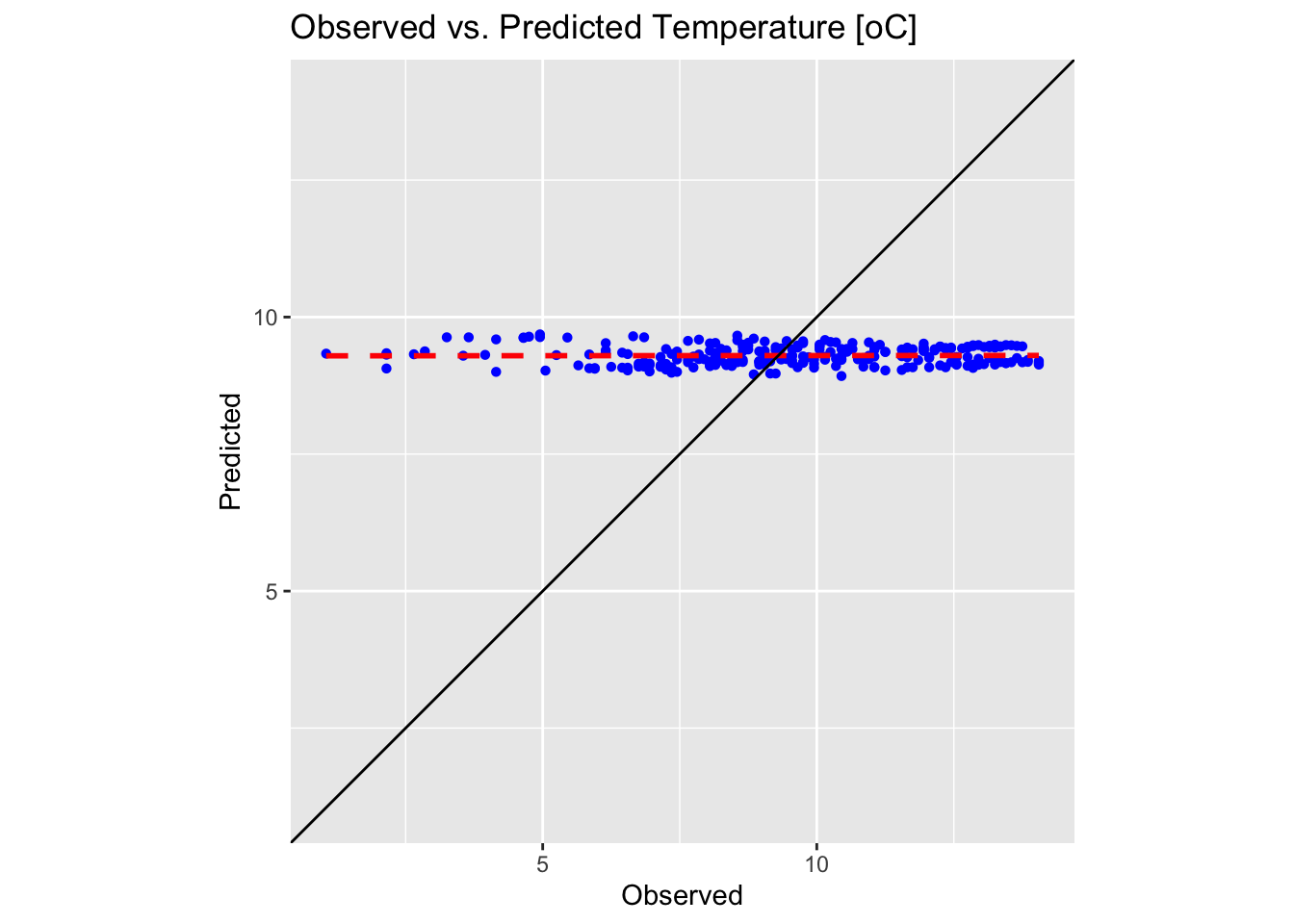
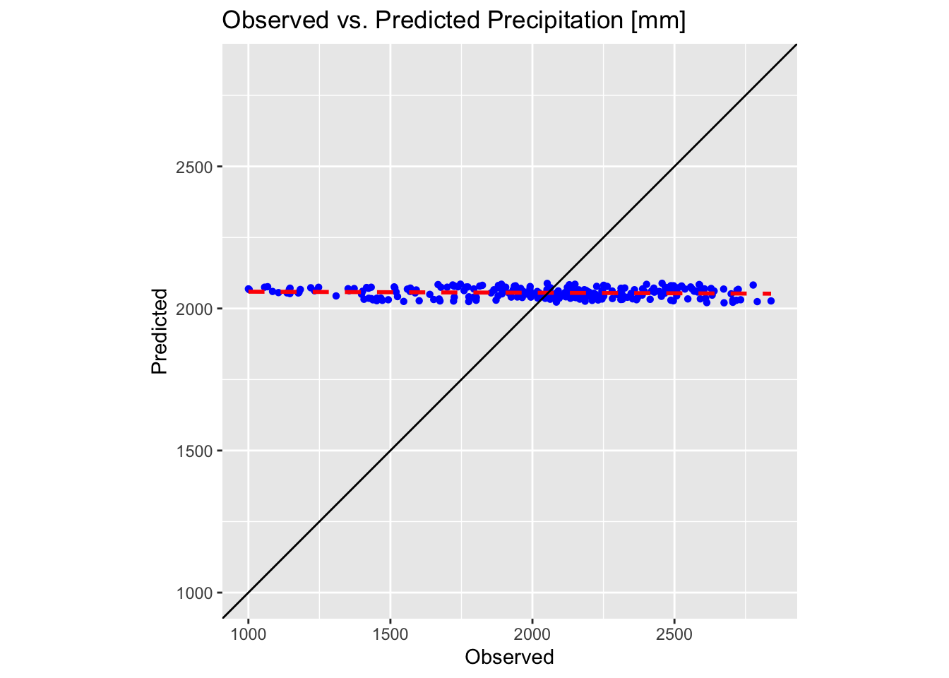
These plots confirm the poor performance of first-order polynomial interpolation in approximating our precipitation and temperature values. In each plot, the black solid line represents the ideal 1:1 correspondence, while the red dotted line shows the linear fit to the predicted versus observed data. The closer the red dotted line is to the black line, the more accurate the interpolation; in a perfect scenario, the two would overlap exactly.
Fitting higher order polynomials
In the following examples, we repeat the above steps while fitting second- and third-order polynomial models to the precipitation data. For brevity, we omit the temperature data.
A second order (quadratic) polynomial in two dimensions is generally written as:
\[f(x,y) = ax^{2} + bxy + cy^{2} + dx + ey + f\] A third order (cubic) polynomial in two dimensions is generally written as:
\[f(x,y) = ax^{3} + bx^{2}y + cxy^{2} + dy^{3} + ex^{2} + fxy + gy^{2} + hx + iy +j\] Here, the coefficients \(a,b,c,…,j\) are constants and \(x\) and \(y\) are the x and y coordinates of the data, respectively.
The next code block fits a quadratic polynomial to the precipitation
data in training_sf:
# Extract coordinates from points and prepare data for modeling
points_coords <- st_coordinates(training_sf)
precip_df <- data.frame(x = points_coords[,1], y = points_coords[,2],
                        value_precip = points_sf$Precipitation)

# Fit a quadratic polynomial model (linear trend surface)
lm_model_precip <- lm(value_precip ~ x + y + I(x^2) + I(y^2) + I(x*y), data = precip_df)

# Prepare grid data for prediction by extracting coordinates
grid_coords <- st_coordinates(grid_sf_cropped)
grid_df_precip <- data.frame(x = grid_coords[,1], y = grid_coords[,2])

# Predict trend surface
grid_df_precip$pred <- predict(lm_model_precip, newdata = grid_df_precip)

# Convert the prediction grid to a terra SpatRaster using type = "xyz"
rast_precip_2 <- rast(grid_df_precip, type = "xyz")

# Assign a CRS and set variable names
crs(rast_precip_2) <- st_crs(bnd)$wkt
names(rast_precip_2) <- "Precipitation"
The above code block is identical to the one used for fitting a first
order polynomial, except that the lm() function parameters
have been changed to reflect the terms of the quadratic polynomial:
To fit a cubic polynomial we modify the lm() function
parameters as follows:
lm_model_precip <- lm(value_precip ~ x + y +
                      I(x^2) + I(y^2) + I(x*y) +
                      I(x^3) + I(y^3) + I(x^2*y) + I(x*y^2),
                      data = precip_df)
The complete code block for fitting a cubic polynomial is thus:
# Extract coordinates from points and prepare data for modeling
points_coords <- st_coordinates(training_sf)
precip_df <- data.frame(x = points_coords[,1], y = points_coords[,2],
                        value_precip = points_sf$Precipitation)

# Fit a quadratic polynomial model (linear trend surface)
lm_model_precip <- lm(value_precip ~ x + y +
                      I(x^2) + I(y^2) + I(x*y) +
                      I(x^3) + I(y^3) + I(x^2*y) + I(x*y^2),
                      data = precip_df)

# Prepare grid data for prediction by extracting coordinates
grid_coords <- st_coordinates(grid_sf_cropped)
grid_df_precip <- data.frame(x = grid_coords[,1], y = grid_coords[,2])

# Predict trend surface
grid_df_precip$pred <- predict(lm_model_precip, newdata = grid_df_precip)

# Convert the prediction grid to a terra SpatRaster using type = "xyz"
rast_precip_3 <- rast(grid_df_precip, type = "xyz")

# Assign a CRS and set variable names
crs(rast_precip_3) <- st_crs(bnd)$wkt
names(rast_precip_3) <- "Precipitation"
To create the 3D plots, we repurpose the code block originally used for plotting the first-order polynomial trend surface of the precipitation data, omitting the sections that remain unchanged.
# Data for plotting
r <- rast_precip_2
# Convert the raster to a matrix for plotly.
r_mat <- terra::as.matrix(r, wide = TRUE)
# Flip the matrix vertically so that row order matches the y sequence (ymin to ymax).
r_mat <- r_mat[nrow(r_mat):1, ]

# Create an Interactive 3D Plot with plotly
# Initialize a plotly surface plot for the raster.
p_r2 <- plot_ly(x = ~x_seq_r, y = ~y_seq_r, z = ~r_mat) %>%
  add_surface(showscale = TRUE, colorscale = "Portland", opacity = 0.8)

# Add the sf object to plot.
p_r2 <- p_r2 %>% add_trace(x = sf_df_r$X, y = sf_df_r$Y, z = sf_df_r$Z,
                     type = 'scatter3d', mode = 'markers',
                     marker = list(size = 3, color = 'blue'))

# Modify the layout to control the z-axis range and adjust the vertical exaggeration.
p_r2 <- p_r2 %>% layout(scene = list(
      zaxis = list(title = "Precipitation [mm]",
      # Alternatively, specify a custom range, e.g., range = c(0, 20)
      range = c(min(sf_df_r$Z, na.rm = TRUE), max(sf_df_r$Z, na.rm = TRUE))),
      aspectmode = "manual", aspectratio = list(x = 1, y = 1, z = 0.8)
  ))

# Display the precipitation plot
p_r2
# Data for plotting
r <- rast_precip_3
# Convert the raster to a matrix for plotly.
r_mat <- terra::as.matrix(r, wide = TRUE)
# Flip the matrix vertically so that row order matches the y sequence (ymin to ymax).
r_mat <- r_mat[nrow(r_mat):1, ]
# Create an Interactive 3D Plot with plotly
# Initialize a plotly surface plot for the raster.
p_r3 <- plot_ly(x = ~x_seq_r, y = ~y_seq_r, z = ~r_mat) %>%
add_surface(showscale = TRUE, colorscale = "Portland", opacity = 0.8)
# Add the sf object to plot.
p_r3 <- p_r3 %>% add_trace(x = sf_df_r$X, y = sf_df_r$Y, z = sf_df_r$Z,
type = 'scatter3d', mode = 'markers',
marker = list(size = 3, color = 'blue'))
# Modify the layout to control the z-axis range and adjust the vertical exaggeration.
p_r3 <- p_r3 %>% layout(scene = list(
zaxis = list(title = "Precipitation [mm]",
# Alternatively, specify a custom range, e.g., range = c(0, 20)
range = c(min(sf_df_r$Z, na.rm = TRUE), max(sf_df_r$Z, na.rm = TRUE))),
aspectmode = "manual", aspectratio = list(x = 1, y = 1, z = 0.8)
))
# Display the precipitation plot
p_r3Next, we plot the testing dataset:
# Create a copy of training set so we do not overwrite the original
testing_sf_new2 <- testing_sf

# Extract predicted values from quadratic surface
r_stack <- c(rast_precip_2, rast_precip_3) # Stack the two rasters together
points_vect <- vect(testing_sf_new2) # Convert to a SpatVector for extraction
extracted_vals <- terra::extract(r_stack, points_vect) # Extract values
extracted_vals <- extracted_vals[, -1] # Remove the ID column produced by extract()
colnames(extracted_vals) <- c("Precip_quadratic", "Precip_cubic") # Set the column names
testing_sf_new2 <- cbind(testing_sf_new2, extracted_vals) # Bind the extracted raster values

# Compute the common limits for both axes from the data
lims_precip <- range(c(testing_sf_new2$Precipitation, testing_sf_new2$Precip_quadratic))
# First plot: Observed vs. Predicted for Precipitation
plot1 <- ggplot(testing_sf_new2, aes(x = Precipitation, y = Precip_quadratic)) +
  geom_point(shape = 16, colour = "blue") +
  geom_smooth(method = "lm", se = FALSE, linetype = "dashed", colour = "red", size = 1) +
  geom_abline(intercept = 0, slope = 1, colour = "black") +
  labs(title = "Observed vs. Predicted Precipitation [mm] \nQuadratic Polynomial",
       x = "Observed", y = "Predicted") +
  coord_fixed(ratio = 1) +
  theme(aspect.ratio = 1) +
  scale_x_continuous(limits = lims_precip) +
  scale_y_continuous(limits = lims_precip)

# Compute the common limits for both axes from the data
lims_precip <- range(c(testing_sf_new2$Precipitation, testing_sf_new2$Precip_cubic))
# Second plot: Observed vs. Predicted for Precipitation
plot2 <- ggplot(testing_sf_new2, aes(x = Precipitation, y = Precip_cubic)) +
  geom_point(shape = 16, colour = "blue") +
  geom_smooth(method = "lm", se = FALSE, linetype = "dashed", colour = "red", size = 1) +
  geom_abline(intercept = 0, slope = 1, colour = "black") +
  labs(title = "Observed vs. Predicted Precipitation [mm] \nCubic Polynomial",
       x = "Observed", y = "Predicted") +
  coord_fixed(ratio = 1) +
  theme(aspect.ratio = 1) +
  scale_x_continuous(limits = lims_precip) +
  scale_y_continuous(limits = lims_precip)

# Make plots
plot1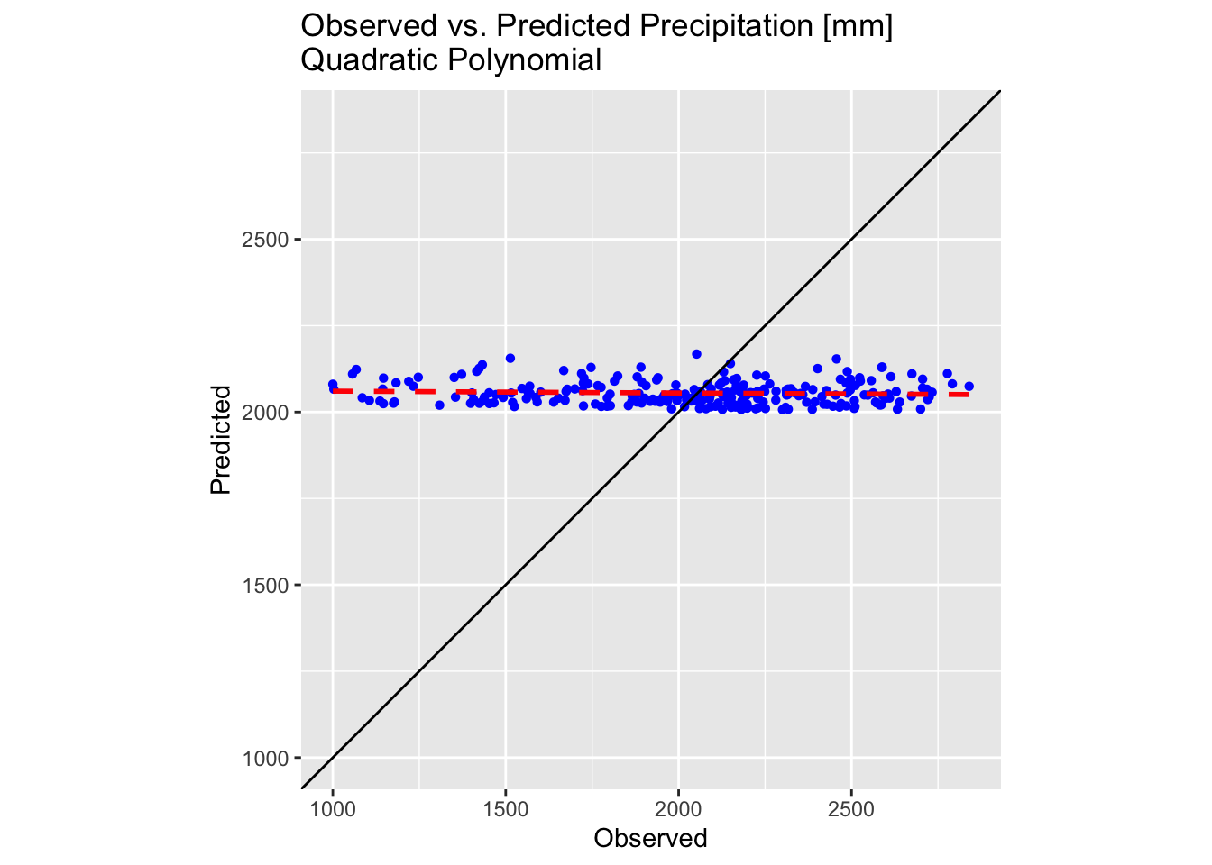
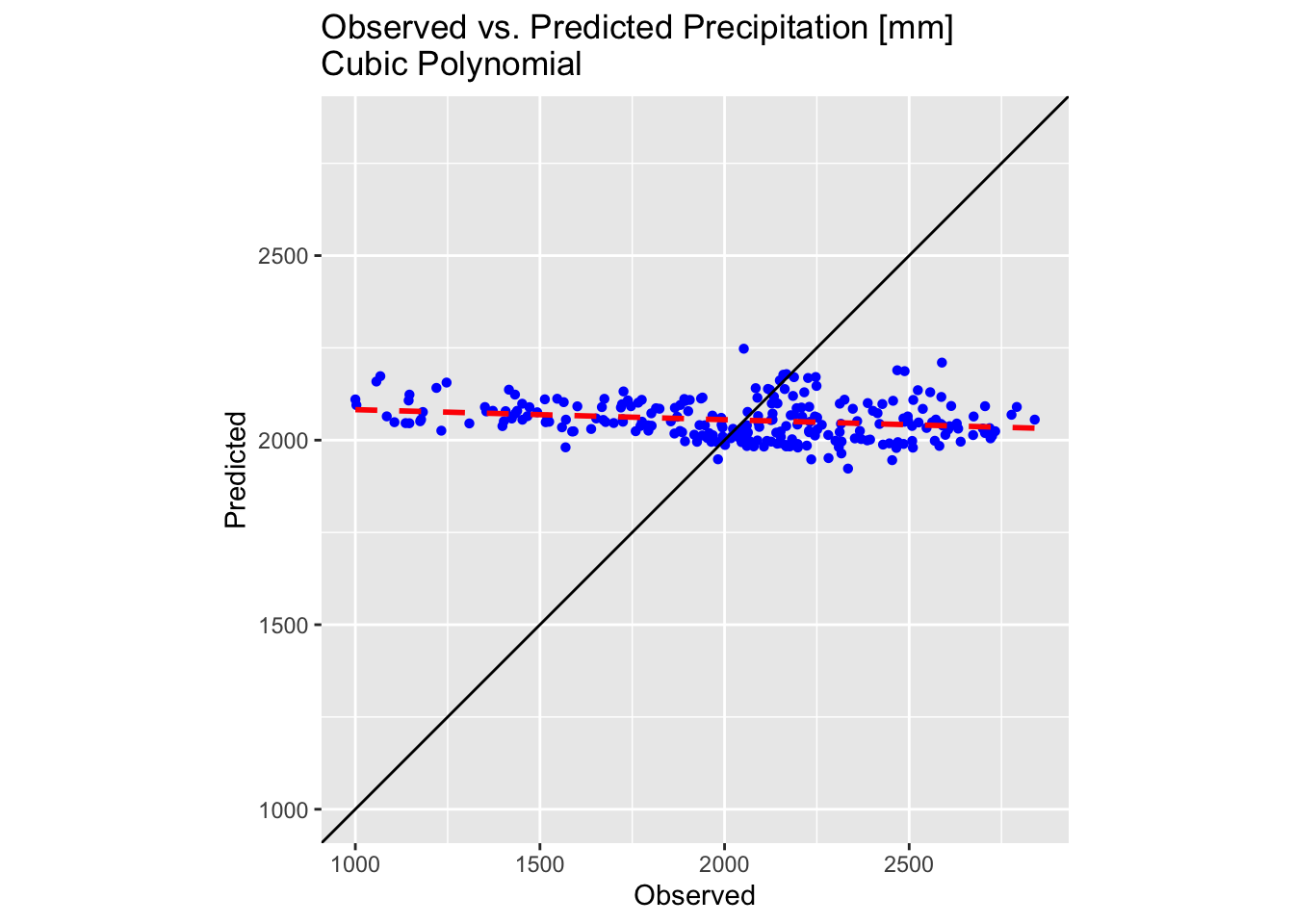
The results are slightly improved but still sub-optimal. While fitting even higher order polynomials might offer further improvements, several key issues must be considered:
Overfitting: high-order models often capture not only the underlying trend but also the noise in the data. This results in a model that fits the training data extremely well yet performs poorly on unseen data.
Numerical instability: as the polynomial order increases, the model can become highly sensitive to small changes in the data. This can lead to large and erratic coefficient estimates, making the model unstable.
Extrapolation problems: high-order polynomials tend to exhibit extreme oscillations, especially near the boundaries of the data range. This behaviour can result in highly unreliable predictions when extrapolating beyond the observed data.
Interpretability: with higher-order terms, it becomes challenging to interpret the influence of individual predictors. The resulting model is often more of a black box, making it difficult to explain or understand the relationship between the variables.
Increased variance: more complex models typically have higher variance, meaning they can vary widely with different training data samples. This variability can undermine the robustness of the predictions.
Multicollinearity: when using powers of the same variable as predictors, there is often a high degree of correlation among these terms. This multicollinearity can make the model’s coefficient estimates unstable and harder to interpret.
Global regression
Spatial prediction using global regression on cheap-to-measure attributes involves building a single regression model over the entire study area to predict a target variable — typically one that is expensive or difficult to measure directly — by utilising ancillary data that are inexpensive and readily available. These ancillary or predictor variables might include remote sensing products, digital elevation models, land cover classifications, or other environmental covariates.
Underlying principles of the method
A global regression model is developed by relating the target variable to the cheap-to-measure attributes. The model is termed “global” because it assumes that the relationship between the target variable and the predictors is consistent across the entire study area. For example, a linear regression model might be specified as:
\[Z(i,j) = a_{0} + a_{1}X_{1}(i,j) + \dotsm + a_{n}X_{n}(i,j)+ \epsilon(i,j)\] where \(Z(i,j)\) is the target variable at location \((i,j)\), \(X_{1}\dotsc X_{n}\) are cheap-to-measure covariates, \(a_{0},a_{1},\dotsc a_{n}\) are regression coefficients, and \(\epsilon(i,j)\) is the error term.
Once the model is calibrated using observed data from locations where both the target and predictor variables are measured, it is then applied to predict the target variable at new locations based solely on the predictor variables. Because these predictors are available for the whole study region, spatial prediction becomes possible even in areas with sparse or no direct measurements of the target variable.
Assumptions and Limitations
Global Assumption: the method assumes a spatially invariant relationship between the predictor variables and the target variable. This can be a limitation in regions where local conditions vary significantly.
Residual Variability: while the global regression captures the main trend, local deviations or spatial autocorrelation in the residuals may remain unmodelled. Often, these residuals are further modelled using geostatistical interpolation methods like kriging (a process known as regression kriging) to capture local spatial structure.
Benefits in geospatial analysis
Cost-efficiency: by relying on cheap-to-measure attributes that are often available from remote sensing or other large-scale data sources, the approach can reduce the need for extensive and expensive field measurements.
Broad coverage: the global regression approach allows for predictions over extensive areas, providing a consistent and continuous map of the target variable.
Integration with other methods: it can be integrated with spatial interpolation methods to enhance prediction accuracy, balancing the broad-scale trend with local spatial detail.
Global regression of temperature data
In the following example, we apply the global regression method to
interpolate temperature data from training_sf using the
digital elevation model r_dem.
There is a strong dependence between temperature and elevation: temperature decreases with increasing elevation due to the decrease in atmospheric pressure, which leads to adiabatic cooling of rising air. The average rate of temperature decrease, known as the environmental lapse rate, is approximately 6.5°C per kilometre in the troposphere, though this can vary with local conditions such as humidity and weather patterns.
training_sf includes both temperature and elevation
data, and so we can easily verify the relationship between these two
parameters:
# Plot temperature vs. elevation
plot_temp_elev <- ggplot(testing_sf, aes(x = Elevation, y = Temperature)) +
  geom_point(shape = 16, colour = "blue") +
  # add linear fit to the data
  geom_smooth(method = "lm", se = FALSE, linetype = "dashed", colour = "red", size = 1) +
  labs(title = "Temperature vs. Elevation",
       x = "Elevation [m]", y = "Temperature [oC]") +
  theme(aspect.ratio = 1)

# Make plot
plot_temp_elev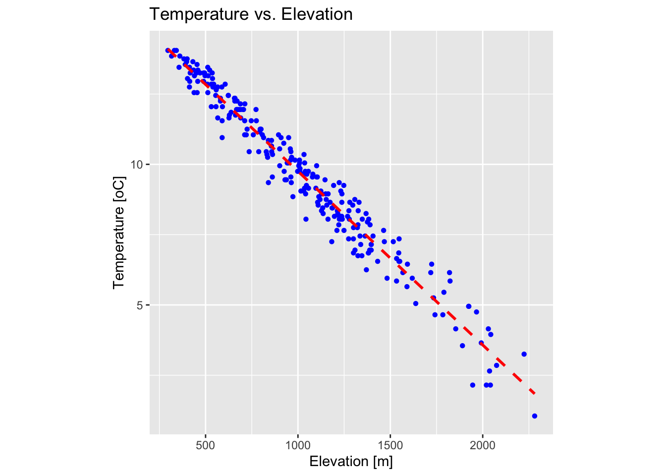
The above plot confirms that there is a strong relationship between temperature and elevation in our dataset.
The next code block performs a linear regression with elevation as
the independent (predictor) variable and temperature as the dependent
(response) variable. It then uses map algebra to predict temperature
values using the digital elevation model r_dem.
# Perform linear regression
lm_model <- lm(Temperature ~ Elevation, data = training_sf)

# Extract model parameters
intercept <- coef(lm_model)[1]
slope <- coef(lm_model)[2]

# Predict temperature values using map algebra
r_temp_predicted <- r_dem * slope + intercept
# Rename variable in SpatRaster
names(r_temp_predicted) <- "Temp."
Plot the resulting temperature raster on a map using tmap:
tm_shape(r_temp_predicted) + tm_raster("Temp.",
col.scale = tm_scale_continuous(values = "-scico.davos")) +
tm_layout(frame = FALSE,
legend.text.size = 0.7,
legend.title.size = 0.7,
legend.position = c("right", "bottom"),
legend.bg.color = "white") +
tm_graticules(col = "white", lwd = 0.5, n.x = 5, n.y = 4)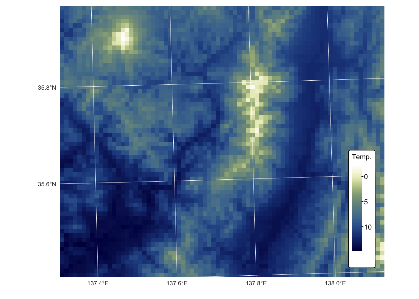 Compare with testing dataset:
# Create a copy of training set so we do not overwrite the original
testing_sf_temp <- testing_sf

# Convert testing_sf_idw to a SpatVector
points_vect <- vect(testing_sf_temp)
# Extract raster values at point locations
extracted_vals <- terra::extract(r_temp_predicted, points_vect)
# Remove the ID column produced by extract()
extracted_vals <- extracted_vals[, -1, drop = FALSE]
# Rename extracted column
colnames(extracted_vals) <- "Temp_regress"
# Convert extracted values to an sf-compatible format
extracted_vals_sf <- as.data.frame(extracted_vals)
# Ensure row counts match for binding
testing_sf_temp <- cbind(testing_sf_temp, extracted_vals_sf)

# Compute the common limits for both axes from the data
lims_precip <- range(c(testing_sf_temp$Temperature, testing_sf_temp$Temp_regress))

# First plot: Observed vs. Predicted for Temperature
plot_regress <- ggplot(testing_sf_temp, aes(x = Temperature, y = Temp_regress)) +
  geom_point(shape = 16, colour = "blue") +
  geom_smooth(method = "lm", se = FALSE, linetype = "dashed", colour = "red", size = 1) +
  geom_abline(intercept = 0, slope = 1, colour = "black") +
  labs(title = "Observed vs. Predicted Temperature [oC] \nGlobal regression with DEM",
       x = "Observed", y = "Predicted") +
  coord_fixed(ratio = 1) +
  theme(aspect.ratio = 1) +
  scale_x_continuous(limits = lims_precip) +
  scale_y_continuous(limits = lims_precip)

# Make plot
plot_regress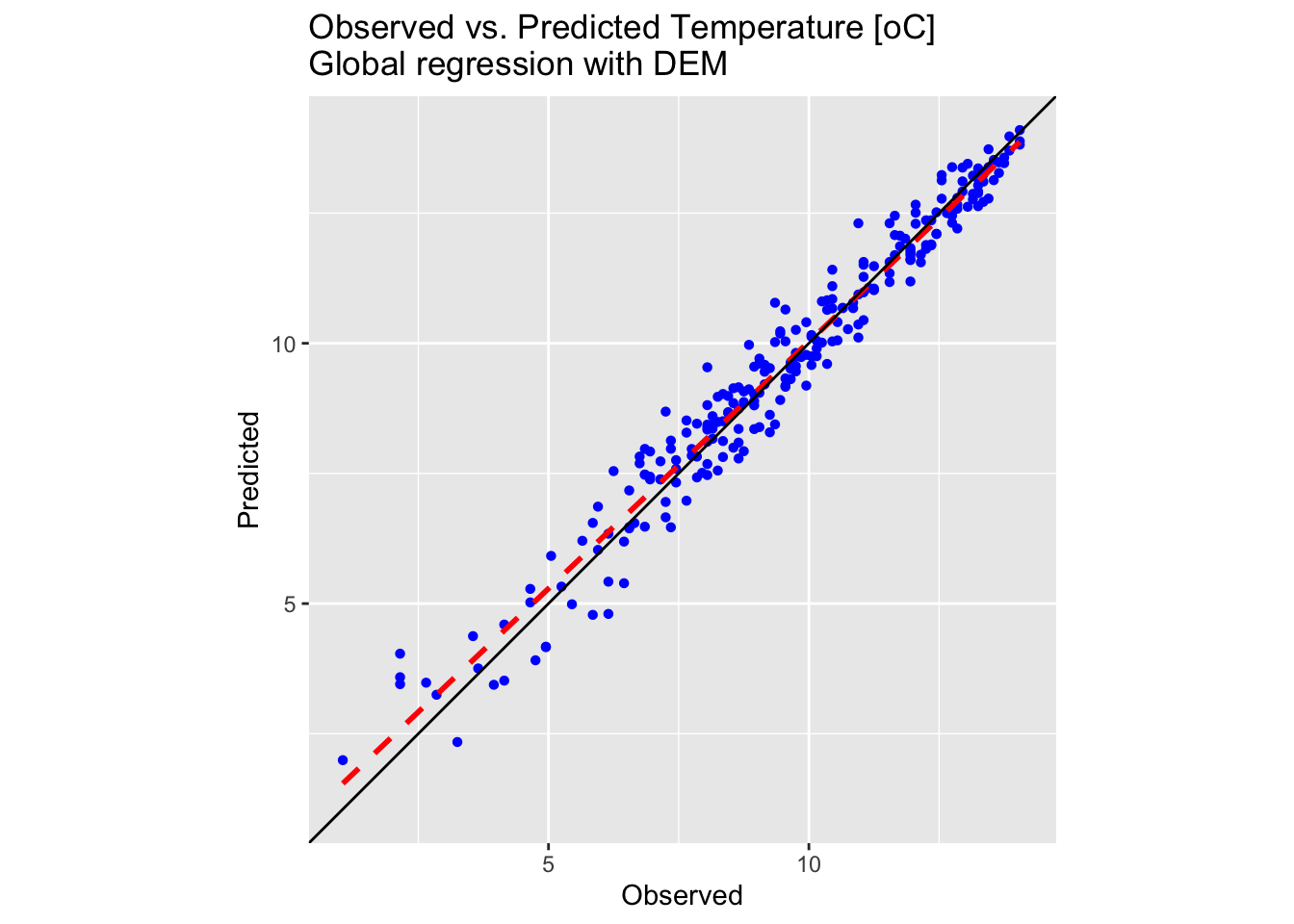
Both the map and the plot above confirm a satisfactory outcome, with observed and predicted values differing by only a few degrees Celsius.
IDW interpolation
Inverse Distance Weighted (IDW) interpolation is a deterministic spatial interpolation method used to estimate values at unmeasured locations based on the values of nearby measured points. The underlying principle is that points closer in space are more alike than those further away.
Weighting by Distance
Each known data point is assigned a weight that is inversely proportional to its distance from the target location. Typically, the weight is calculated using the formula:
\[w_{i} = \frac{1}{d^{p}_{i}}\] where \(d_{i}\) is the distance from the known point to the estimation point, and \(p\) is a power parameter that controls how quickly the influence of a point decreases with distance. A higher \(p\) emphasises nearer points even more.
The estimated value at an unknown location is computed as a weighted average of the known values:
\[z(x,y) = \frac{\sum_{i=1}^{n}w_{i}z_{i}}{\sum_{i=1}^{n}w_{i}}\]
Here, \(z_{i}\) represents the known values at different points and \(w_{i}\) is the weight. The summation is taken over all the points used in the interpolation.
Advantages and limitations:
The method is relatively simple to implement and understand, and it works well when the spatial distribution of known data points is fairly uniform. However, it can sometimes lead to artefacts (e.g., bullseye effects) if data points are clustered or if there are abrupt spatial changes that the method cannot account for.
The next R code block performs IDW interpolation on the precipitation
values from training_sf:
# Extract coordinates from training points and prepare data for IDW interpolation
points_coords <- st_coordinates(training_sf)
precip_df <- data.frame(x = points_coords[,1], y = points_coords[,2],
                        value_precip = training_sf$Precipitation)

# Convert to sf spatial object
precip_sf <- st_as_sf(precip_df, coords = c("x", "y"), crs = st_crs(training_sf))

# Prepare grid data for interpolation
grid_coords <- st_coordinates(grid_sf_cropped)
grid_df_precip <- data.frame(x = grid_coords[,1], y = grid_coords[,2])

# Convert grid to sf spatial object
grid_sf <-
  st_as_sf(grid_df_precip, coords = c("x", "y"), crs = st_crs(grid_sf_cropped))

# Perform IDW interpolation
idw_result <-
  idw(formula = value_precip ~ 1, locations = precip_sf, newdata = grid_sf, idp = 2)
## [inverse distance weighted interpolation]# Extract predicted values
grid_df_precip$pred <- idw_result$var1.pred
# Convert the prediction grid to a terra SpatRaster using type = "xyz"
rast_precip_idw <- rast(grid_df_precip, type = "xyz")
# Assign a CRS and set variable names
crs(rast_precip_idw) <- st_crs(bnd)$wkt
names(rast_precip_idw) <- "Precipitation"Plot the resulting surface on an interactive 3D plot:
# Data for plotting
r <- rast_precip_idw
# Convert the raster to a matrix for plotly.
r_mat <- terra::as.matrix(r, wide = TRUE)
# Flip the matrix vertically so that row order matches the y sequence (ymin to ymax).
r_mat <- r_mat[nrow(r_mat):1, ]

# Create an Interactive 3D Plot with plotly
# Initialize a plotly surface plot for the raster.
p_idw <- plot_ly(x = ~x_seq_r, y = ~y_seq_r, z = ~r_mat) %>%
  add_surface(showscale = TRUE, colorscale = "Portland", opacity = 0.8)

# Add the sf object to plot.
p_idw <- p_idw %>% add_trace(x = sf_df_r$X, y = sf_df_r$Y, z = sf_df_r$Z,
                     type = 'scatter3d', mode = 'markers',
                     marker = list(size = 3, color = 'blue'))

# Modify the layout to control the z-axis range and adjust the vertical exaggeration.
p_idw <- p_idw %>% layout(scene = list(
      zaxis = list(title = "Precipitation [mm]",
      # Alternatively, specify a custom range, e.g., range = c(0, 20)
      range = c(min(sf_df_r$Z, na.rm = TRUE), max(sf_df_r$Z, na.rm = TRUE))),
      aspectmode = "manual", aspectratio = list(x = 1, y = 1, z = 0.5)
  ))

# Display the precipitation plot
p_idw
Next, plot the testing dataset:
# Create a copy of training set so we do not overwrite the original
testing_sf_idw <- testing_sf

# Convert testing_sf_idw to a SpatVector
points_vect <- vect(testing_sf_idw)
# Extract raster values at point locations
extracted_vals <- terra::extract(rast_precip_idw, points_vect)
# Remove the ID column produced by extract()
extracted_vals <- extracted_vals[, -1, drop = FALSE]
# Rename extracted column
colnames(extracted_vals) <- "Precip_idw"
# Convert extracted values to an sf-compatible format
extracted_vals_sf <- as.data.frame(extracted_vals)
# Ensure row counts match for binding
testing_sf_idw <- cbind(testing_sf_idw, extracted_vals_sf)

# Compute the common limits for both axes from the data
lims_precip <- range(c(testing_sf_idw$Precipitation, testing_sf_idw$Precip_idw))
# First plot: Observed vs. Predicted for Precipitation
plot_idw <- ggplot(testing_sf_idw, aes(x = Precipitation, y = Precip_idw)) +
  geom_point(shape = 16, colour = "blue") +
  geom_smooth(method = "lm", se = FALSE, linetype = "dashed", colour = "red", size = 1) +
  geom_abline(intercept = 0, slope = 1, colour = "black") +
  labs(title = "Observed vs. Predicted Precipitation [mm] \nIDW Interpolation with power = 2",
       x = "Observed", y = "Predicted") +
  coord_fixed(ratio = 1) +
  theme(aspect.ratio = 1) +
  scale_x_continuous(limits = lims_precip) +
  scale_y_continuous(limits = lims_precip)

# Make plot
plot_idw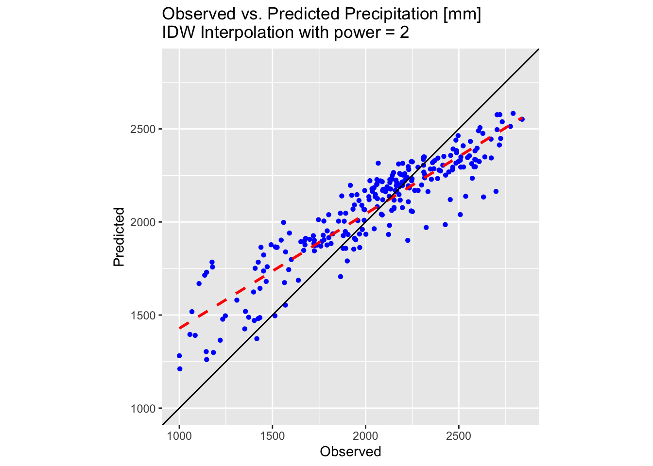
Examining the above 3D plot alongside the scatter plot of the testing dataset reveals that the IDW interpolation performs significantly better than the polynomial methods attempted earlier. However, the predicted surface appears rather “pointy”, displaying the bullseye effect noted previously.
The latter is most clear when the surface is plotted on a map:
tm_shape(rast_precip_idw) + tm_raster("Precipitation",
        col.scale = tm_scale_continuous(values = "-scico.vik")) +
  tm_layout(frame = FALSE,
                 legend.text.size = 0.7,
                 legend.title.size = 0.7,
                 legend.position = c("right", "bottom"),
                 legend.bg.color = "white") +
  tm_graticules(col = "white", lwd = 0.5, n.x = 5, n.y = 4)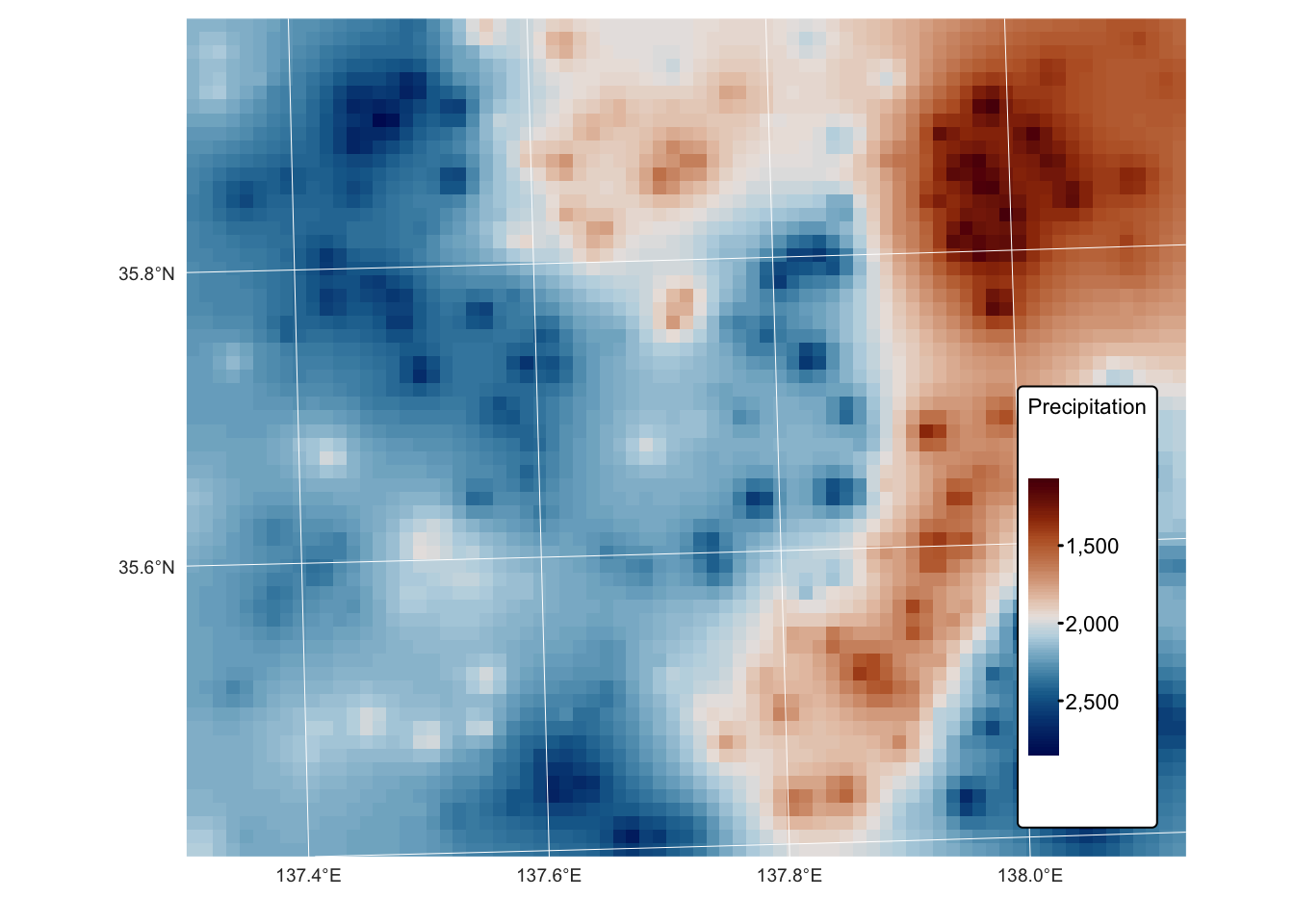
The default value for \(p\) (the
power parameter) in the idw() function is 2 (set using
idp = 2). The value of this parameter can be modified, and
in general:
- values of
idp < 2will produce a smoother interpolation with distant points having more influence, and - values of
idp > 2will produce a sharper local influence, with nearby points dominating more.
The idw() function in gstat also allows
further customisation by limiting the size of the search radius. This is
achieved by using the nmax and maxdist
parameters:
nmax: the maximum number of nearest neighbours to consider for interpolation.maxdist: the maximum search radius (distance in CRS units) within which points are considered.
The following block of code illustrates how to use these parameters together:
# Perform IDW interpolation with a limited search window
idw_result <- idw(formula = value_precip ~ 1,
                  locations = precip_sf,
                  newdata = grid_sf,
                  idp = 2,          # Power parameter (changeable)
                  nmax = 10,        # Consider only the 10 nearest points
                  maxdist = 50000)  # Maximum search distance (e.g., 50 km)
In the next example, we will set the idp = 4 to reduce
the bullseye effect and produce a smoother, yet more accurate,
surface:
# Perform IDW interpolation with power = 4
idw_result4 <-
  idw(formula = value_precip ~ 1, locations = precip_sf, newdata = grid_sf, idp = 4)
## [inverse distance weighted interpolation]# Extract predicted values
grid_df_precip$pred <- idw_result4$var1.pred
# Convert the prediction grid to a terra SpatRaster using type = "xyz"
rast_precip_idw4 <- rast(grid_df_precip, type = "xyz")
# Assign a CRS and set variable names
crs(rast_precip_idw4) <- st_crs(bnd)$wkt
names(rast_precip_idw4) <- "Precipitation"Plot in 3D:
# Data for plotting
r <- rast_precip_idw4
# Convert the raster to a matrix for plotly.
r_mat <- terra::as.matrix(r, wide = TRUE)
# Flip the matrix vertically so that row order matches the y sequence (ymin to ymax).
r_mat <- r_mat[nrow(r_mat):1, ]

# Create an Interactive 3D Plot with plotly
# Initialize a plotly surface plot for the raster.
p_idw <- plot_ly(x = ~x_seq_r, y = ~y_seq_r, z = ~r_mat) %>%
  add_surface(showscale = TRUE, colorscale = "Portland", opacity = 0.8)

# Add the sf object to plot.
p_idw <- p_idw %>% add_trace(x = sf_df_r$X, y = sf_df_r$Y, z = sf_df_r$Z,
                     type = 'scatter3d', mode = 'markers',
                     marker = list(size = 3, color = 'blue'))

# Modify the layout to control the z-axis range and adjust the vertical exaggeration.
p_idw <- p_idw %>% layout(scene = list(
      zaxis = list(title = "Precipitation [mm]",
      # Alternatively, specify a custom range, e.g., range = c(0, 20)
      range = c(min(sf_df_r$Z, na.rm = TRUE), max(sf_df_r$Z, na.rm = TRUE))),
      aspectmode = "manual", aspectratio = list(x = 1, y = 1, z = 0.5)
  ))

# Display the precipitation plot
p_idw
Plot testing dataset:
# Create a copy of training set so we do not overwrite the original
testing_sf_idw4 <- testing_sf

# Convert testing_sf_idw to a SpatVector
points_vect <- vect(testing_sf_idw4)
# Extract raster values at point locations
extracted_vals <- terra::extract(rast_precip_idw4, points_vect)
# Remove the ID column produced by extract()
extracted_vals <- extracted_vals[, -1, drop = FALSE]
# Rename extracted column
colnames(extracted_vals) <- "Precip_idw"
# Convert extracted values to an sf-compatible format
extracted_vals_sf <- as.data.frame(extracted_vals)
# Ensure row counts match for binding
testing_sf_idw4 <- cbind(testing_sf_idw4, extracted_vals_sf)

# Compute the common limits for both axes from the data
lims_precip <- range(c(testing_sf_idw4$Precipitation, testing_sf_idw4$Precip_idw))
# First plot: Observed vs. Predicted for Precipitation
plot_idw <- ggplot(testing_sf_idw4, aes(x = Precipitation, y = Precip_idw)) +
  geom_point(shape = 16, colour = "blue") +
  geom_smooth(method = "lm", se = FALSE, linetype = "dashed", colour = "red", size = 1) +
  geom_abline(intercept = 0, slope = 1, colour = "black") +
  labs(title = "Observed vs. Predicted Precipitation [mm] \nIDW Interpolation with power = 4",
       x = "Observed", y = "Predicted") +
  coord_fixed(ratio = 1) +
  theme(aspect.ratio = 1) +
  scale_x_continuous(limits = lims_precip) +
  scale_y_continuous(limits = lims_precip)

# Make plot
plot_idw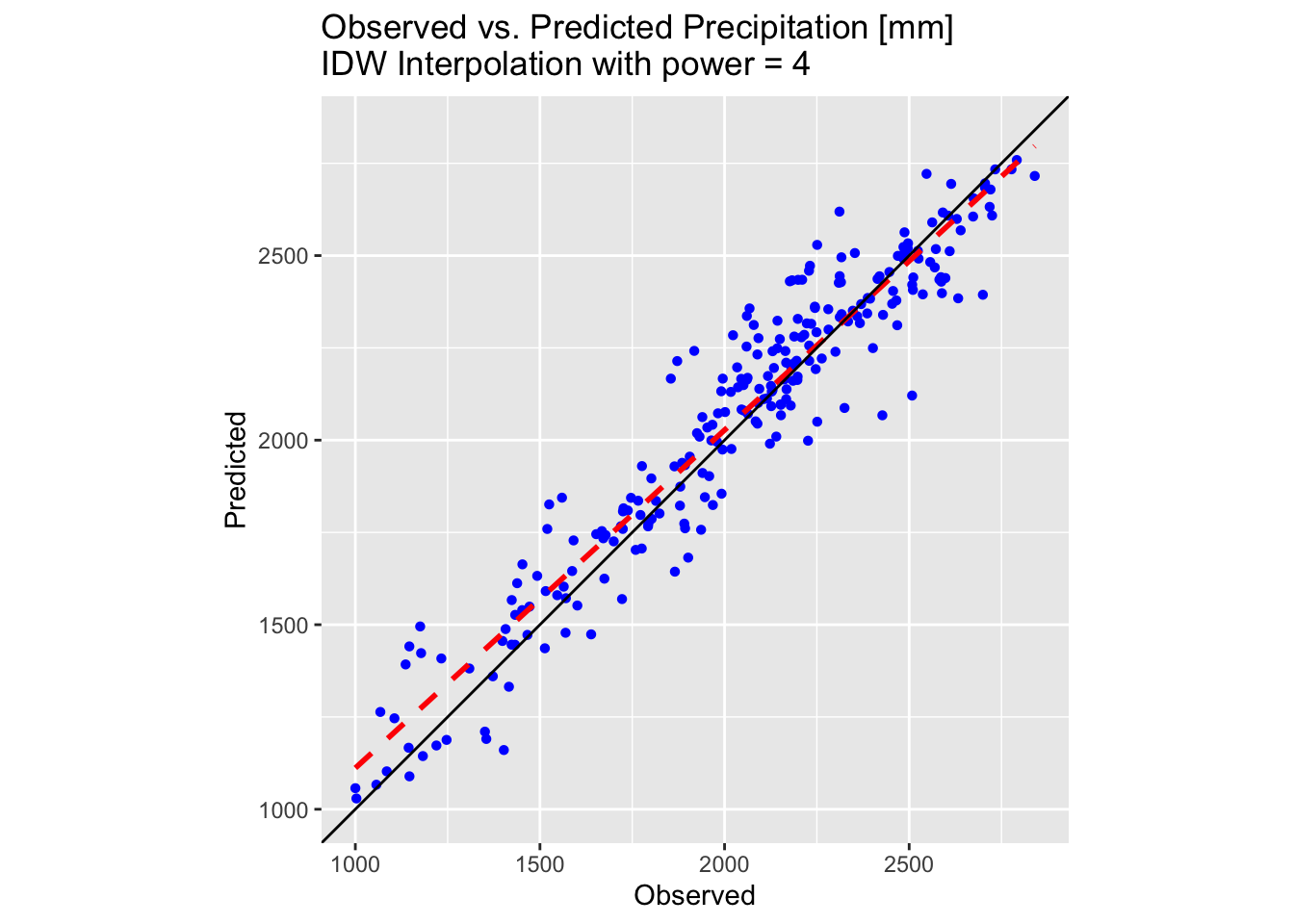
Plot on a map using tmap:
tm_shape(rast_precip_idw4) + tm_raster("Precipitation",
        col.scale = tm_scale_continuous(values = "-scico.vik")) +
  tm_layout(frame = FALSE,
                 legend.text.size = 0.7,
                 legend.title.size = 0.7,
                 legend.position = c("right", "bottom"),
                 legend.bg.color = "white") +
  tm_graticules(col = "white", lwd = 0.5, n.x = 5, n.y = 4)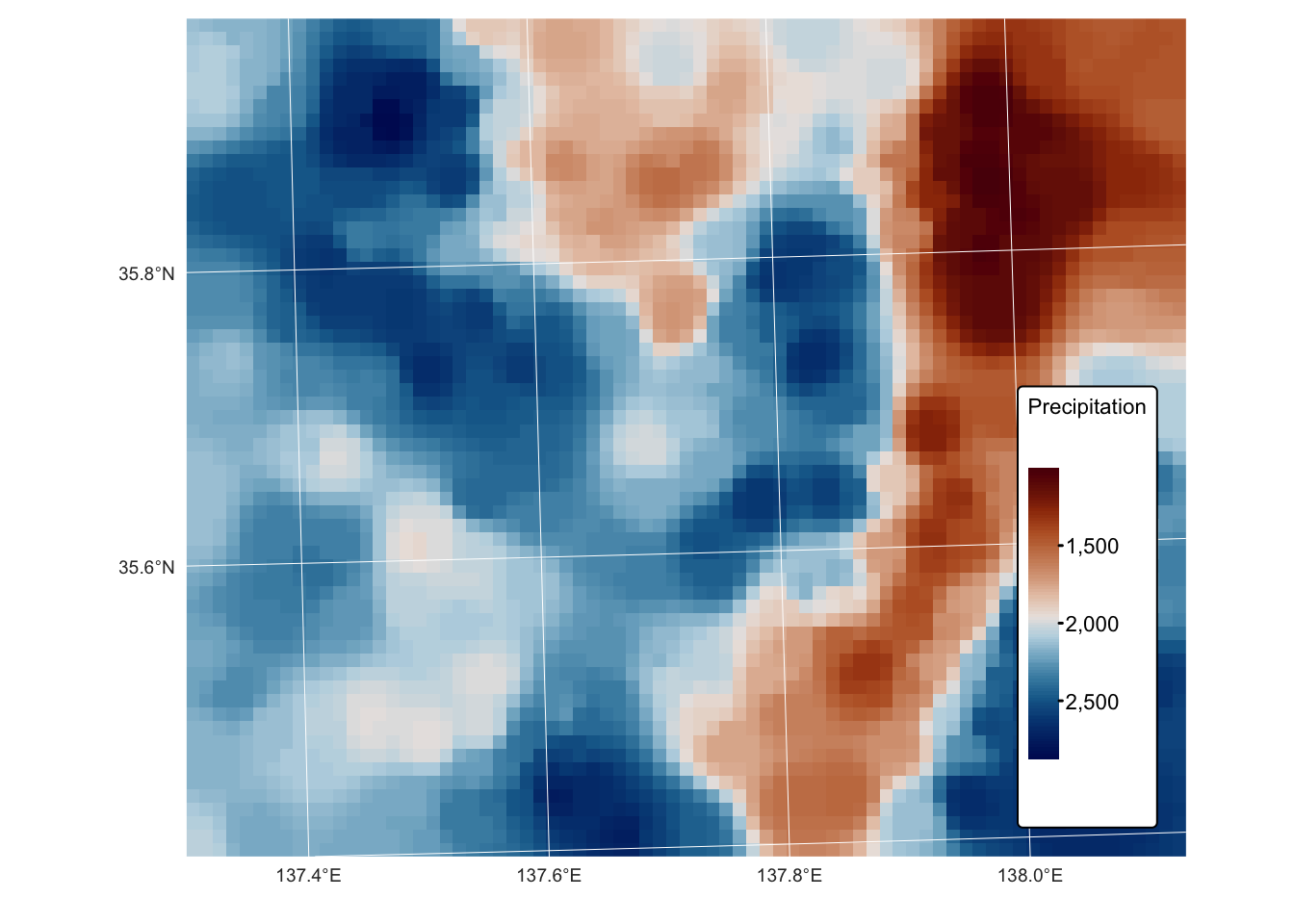
As shown by the above plots and map, increasing the idp
parameter to 4 produces a better-fitting surface for the precipitation
values in training_sf.
Kriging
Kriging is a geostatistical interpolation technique used to predict values at unmeasured locations based on spatially correlated data. Named after South African mining engineer Danie Krige, this method was formalised by Georges Matheron in the 1960s and has since been widely applied in fields such as geology, environmental science, meteorology, and geographic information systems (GIS).
Kriging differs from simpler interpolation methods (e.g., inverse distance weighting or spline interpolation) by incorporating spatial autocorrelation — the statistical relationship between measured points — to make more reliable predictions. It is based on the theory of regionalised variables, assuming that spatially distributed data exhibit a degree of continuity and structure.
At its core, Kriging uses a weighted linear combination of known data points to estimate unknown values, where the weights are determined through a variogram model. The variogram quantifies how data values change with distance, allowing Kriging to provide not only the best linear unbiased estimate but also an estimation of the associated uncertainty.
Several variants of Kriging exist, including:
- Ordinary Kriging – Assumes a constant but unknown mean and relies on the variogram to model spatial relationships.
- Simple Kriging – Assumes a known, constant mean across the study area.
- Universal Kriging – Accounts for deterministic trends in the data by incorporating external explanatory variables.
- Indicator Kriging – Used for categorical data by transforming it into binary indicators.
- Co-Kriging – Incorporates multiple correlated variables to improve estimation accuracy.
Kriging is particularly useful when dealing with sparse or irregularly spaced data, providing both interpolated values and a measure of prediction confidence. However, it requires careful variogram modelling and assumptions about spatial stationarity, making it more complex than deterministic interpolation methods.
Calculating the sample semivariogram
The semivariogram is a function that quantifies how similar or dissimilar data points are based on the distance between them. It is defined as:
\[\gamma(h) = \frac{1}{2}\mathbb{E}\{[Z(x)-Z(x+h)]^2\}\]
where:
- \(\gamma(h)\) is the semivariance for a lag distance \(h\),
- \(Z(x)\) is the value of the variable at location \(x\),
- \(Z(x+h)\) is the value at a location separated by a vector \(h\).
In kriging, the semivariogram serves to model the spatial autocorrelation of the data. The key steps of the process, include:
Empirical estimation: The semivariogram is first computed empirically by evaluating the half average squared differences between pairs of data points separated by various distances (lag bins).
Modelling the spatial structure: A theoretical model (e.g. spherical, exponential, linear, Gaussian) is then fitted to the empirical semivariogram. This model characterises how the data’s variance changes with distance.
Key parameters:
Nugget: represents the semivariance at zero distance and captures both measurement error and microscale variability that are not explained by larger-scale spatial trends. A high nugget value suggests that even very closely located samples can exhibit significant differences, indicating local variability or errors.
Sill: is the plateau that the semivariogram reaches, marking the maximum variance beyond which increases in separation distance do not add further variability. This indicates that spatial correlation has become negligible, and the data variability is fully accounted for at this level.
Range: is defined as the distance at which the semivariogram reaches the sill, beyond which data points are considered spatially independent. It provides an estimate of the spatial extent over which autocorrelation exists, meaning that observations further apart than this distance do not influence each other significantly.
Determining kriging weights:
The fitted semivariogram model is used to derive the weights for kriging. These weights determine how much influence each neighbouring sample point will have on the estimated value at an unsampled location, ensuring that the spatial dependence captured by the semivariogram is respected.
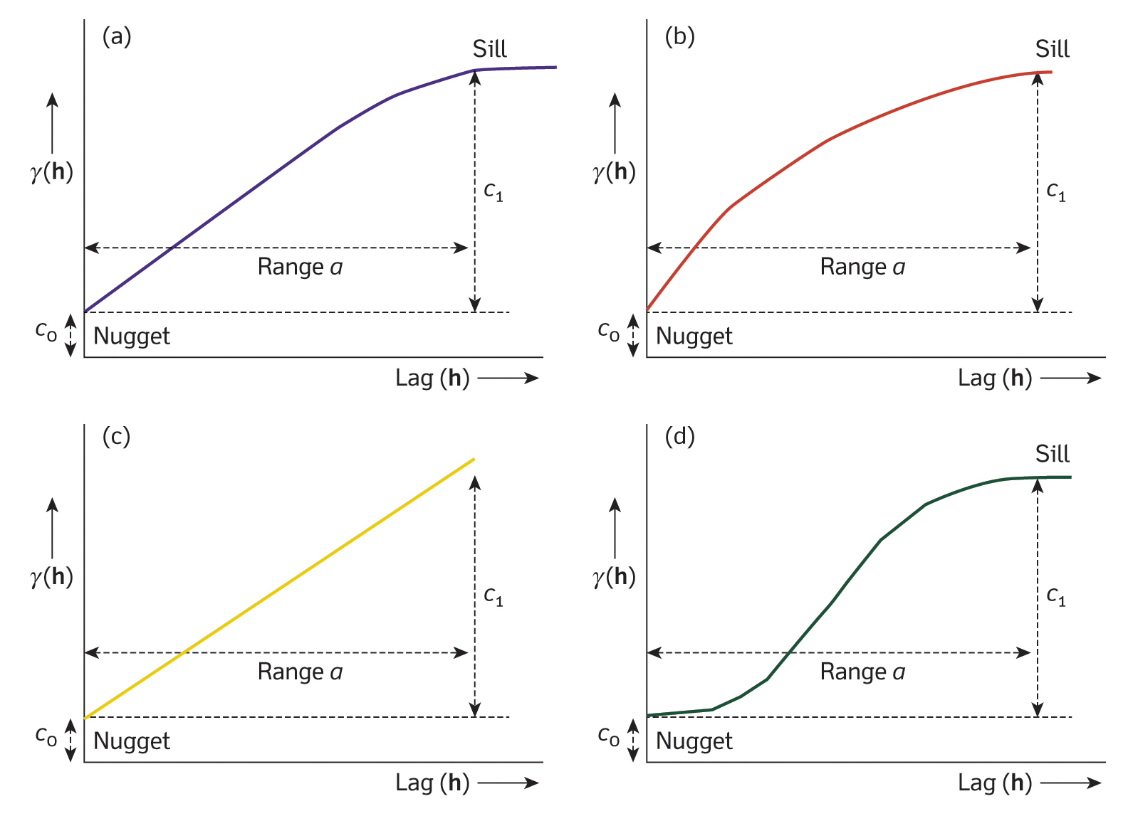
Fig. 2: Examples of the most commonly used variogram models: (a) spherical, (b) exponential, (c) linear, (d) Gaussian. Reproduced from: Burrough et al (2015), Principles of Geographical Information Systems (3rd ed.), Oxford University Press.
In the next block of R code we compute and plot the empirical
semivariogram for the precipitation data from
training_sf:
# Create a gstat object using the sf point data directly
# The formula precip ~ 1 indicates that no auxiliary predictors are used
# and the mean is assumed constant over the study area.
gstat_obj <- gstat(formula = Precipitation ~ 1, data = training_sf)

# Compute the empirical semivariogram
# The width parameter defines the lag distance binning
# We use 1 km for width; this should be adjusted as needed
emp_variogram <- variogram(gstat_obj, width = 1000)

# Plot empirical semivariogram
ggplot(emp_variogram, aes(x = dist, y = gamma)) +
  geom_point(colour = "blue") +
  labs(title = "Empirical Semivariogram for precipitation values",
       x = "Distance (m)", y = "Semivariance") +
  theme(aspect.ratio = 0.6)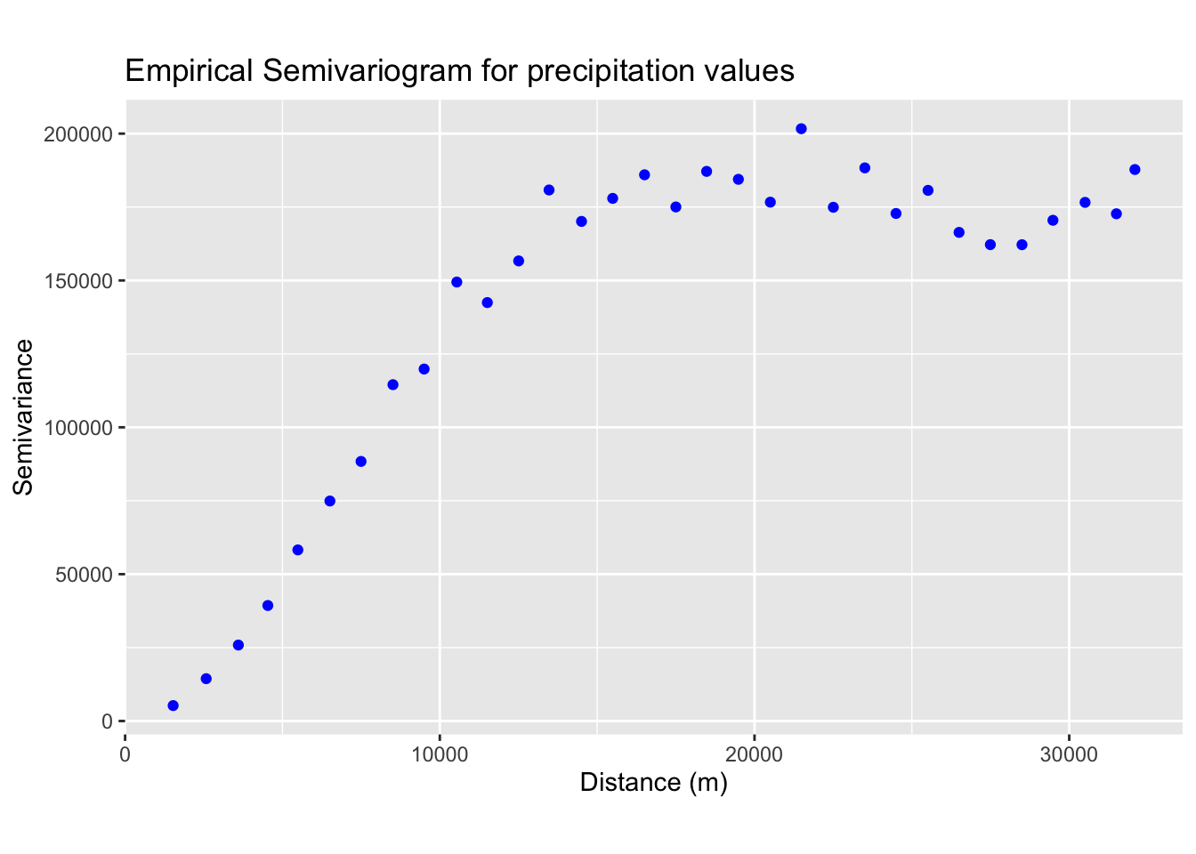
Next, we fit a theoretical model to the empirical semivariogram. The plot above suggests that the data may be best represented by a spherical model (see Fig. 2a). From the plot, we estimate the values for the nugget, sill, and range.
# Fit a spherical variogram model; adjust psill, range, and nugget as appropriate
model_variogram <-
  fit.variogram(emp_variogram,
        model = vgm(psill = 150000, model = "Sph", range = 15000, nugget = 0))

# Plot empirical semivariogram
vgm_line <- variogramLine(model_variogram, maxdist = max(emp_variogram$dist), n = 100)

ggplot() +
  geom_point(data = emp_variogram, aes(x = dist, y = gamma), colour = "blue") +
  geom_line(data = vgm_line, aes(x = dist, y = gamma), color = "red", size = 1) +
  labs(title = "Fitted semivariogram model for precipitation values",
       x = "Distance (m)", y = "Semivariance") +
  theme(aspect.ratio = 0.6)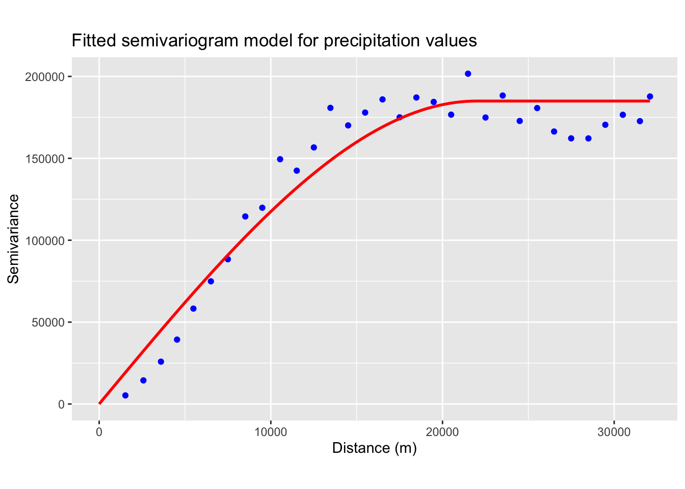
Ordinary Kriging
In the next block of R code, we apply the fitted variogram model to interpolate precipitation values over the previously generated grid (see Fig. 1).
Ordinary kriging is one of the most commonly used forms of kriging because it assumes that the mean is constant but unknown across the neighbourhood of interest. In that sense, it is often regarded as a “basic” or “default” kriging method. However, if one considers mathematical simplicity, simple kriging is actually simpler since it assumes that the mean is known a priori. In practice, ordinary kriging is favoured for its flexibility when the true mean is not known, even though it involves estimating that constant mean from the data.
# Extract coordinates from training points and prepare data for interpolation
points_coords <- st_coordinates(training_sf)
precip_df <- data.frame(x = points_coords[,1], y = points_coords[,2],
                        value_precip = training_sf$Precipitation)

# Convert to sf spatial object
precip_sf <- st_as_sf(precip_df, coords = c("x", "y"), crs = st_crs(training_sf))

# Perform ordinary kriging over the grid;
# The output will include prediction (var1.pred) and variance (var1.var)
kriging_result <- krige(formula = value_precip ~ 1,
                        locations = precip_sf,
                        newdata = grid_sf_cropped,
                        model = model_variogram)
## [using ordinary kriging]# Convert the kriging results (sf object) to a terra SpatVector
kriging_vect <- vect(kriging_result)
# Create a raster template based on the bounding polygon (bnd) with desired resolution
# Here we set resolution to 1km; adjust resolution as needed
raster_template <- rast(bnd, resolution = c(1000, 1000))
# Rasterize the predictions using the fields 'var1.pred' and 'var1.var'
kriging_raster_pred <- rasterize(kriging_vect, raster_template, field = "var1.pred")
kriging_raster_var <- rasterize(kriging_vect, raster_template, field = "var1.var")
# Convert variance to standard deviation
kriging_raster_var <- sqrt(kriging_raster_var)
# Assign a CRS and set variable names
crs(kriging_raster_pred) <- st_crs(bnd)$wkt
crs(kriging_raster_var) <- st_crs(bnd)$wkt
names(kriging_raster_pred) <- "Prediction"
names(kriging_raster_var) <- "Variance"Next, we will create 3D plots to visualize the results, compare the predicted values with the testing dataset, and map both the predictions and their associated variance using tmap.
# Data for plotting
r <- kriging_raster_pred
# Convert the raster to a matrix for plotly.
r_mat <- terra::as.matrix(r, wide = TRUE)
# Flip the matrix vertically so that row order matches the y sequence (ymin to ymax).
r_mat <- r_mat[nrow(r_mat):1, ]

# Create an Interactive 3D Plot with plotly
# Initialize a plotly surface plot for the raster.
p_krige <- plot_ly(x = ~x_seq_r, y = ~y_seq_r, z = ~r_mat) %>%
  add_surface(showscale = TRUE, colorscale = "Portland", opacity = 0.8)

# Add the sf object to plot.
p_krige <- p_krige %>% add_trace(x = sf_df_r$X, y = sf_df_r$Y, z = sf_df_r$Z,
                     type = 'scatter3d', mode = 'markers',
                     marker = list(size = 3, color = 'blue'))

# Modify the layout to control the z-axis range and adjust the vertical exaggeration.
p_krige <- p_krige %>% layout(scene = list(
      zaxis = list(title = "Precipitation [mm]",
      # Alternatively, specify a custom range, e.g., range = c(0, 20)
      range = c(min(sf_df_r$Z, na.rm = TRUE), max(sf_df_r$Z, na.rm = TRUE))),
      aspectmode = "manual", aspectratio = list(x = 1, y = 1, z = 0.5)
  ))

# Display the precipitation plot
p_krige
# Create a copy of training set so we do not overwrite the original
testing_sf_krige <- testing_sf
# Convert testing_sf_idw to a SpatVector
points_vect <- vect(testing_sf_krige)
# Extract raster values at point locations
extracted_vals <- terra::extract(kriging_raster_pred, points_vect)
# Remove the ID column produced by extract()
extracted_vals <- extracted_vals[, -1, drop = FALSE]
# Rename extracted column
colnames(extracted_vals) <- "Precip_krige"
# Convert extracted values to an sf-compatible format
extracted_vals_sf <- as.data.frame(extracted_vals)
# Ensure row counts match for binding
testing_sf_krige <- cbind(testing_sf_krige, extracted_vals_sf)
# Compute the common limits for both axes from the data
lims_precip <- range(c(testing_sf_krige$Precipitation, testing_sf_krige$Precip_krige))
# First plot: Observed vs. Predicted for Precipitation
plot_krige <- ggplot(testing_sf_krige, aes(x = Precipitation, y = Precip_krige)) +
geom_point(shape = 16, colour = "blue") +
geom_smooth(method = "lm", se = FALSE, linetype = "dashed", colour = "red", size = 1) +
geom_abline(intercept = 0, slope = 1, colour = "black") +
labs(title = "Observed vs. Predicted Precipitation [mm] \nOrdinary Kriging Interpolation",
x = "Observed", y = "Predicted") +
coord_fixed(ratio = 1) +
theme(aspect.ratio = 1) +
scale_x_continuous(limits = lims_precip) +
scale_y_continuous(limits = lims_precip)
# Make plot
plot_krige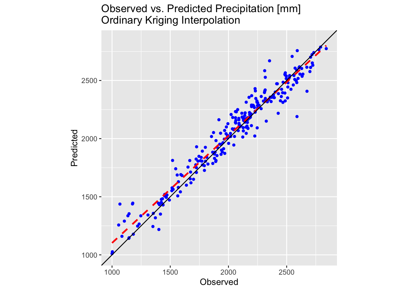
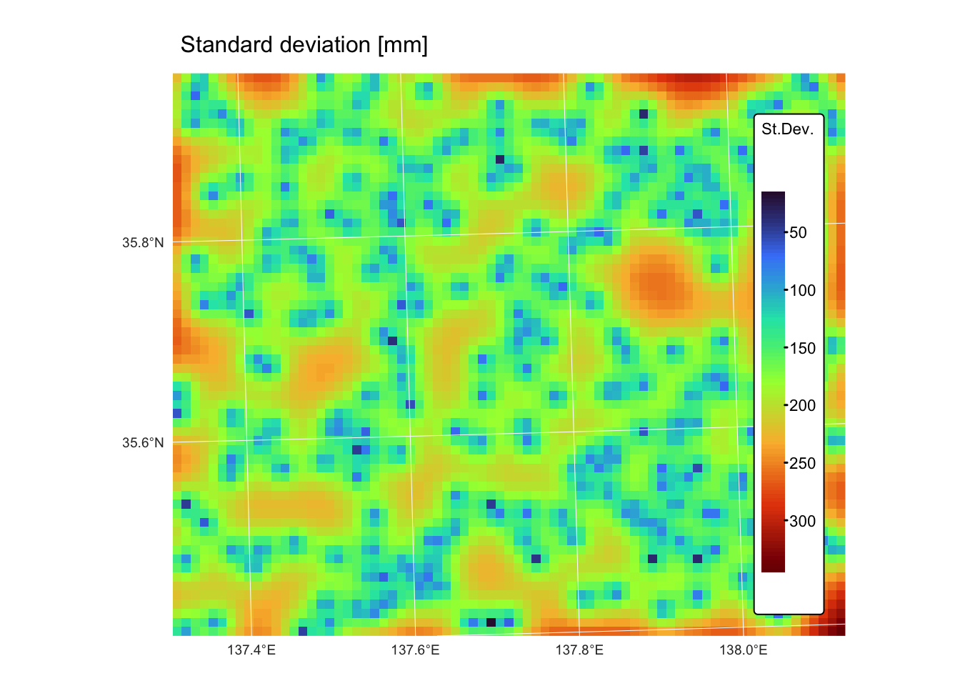
map_predict <-
  tm_shape(kriging_raster_pred) + tm_raster("Prediction",
           col.scale = tm_scale_continuous(values = "-scico.vik"),
                       tm_legend(title = "Precip.")) +
  tm_layout(frame = FALSE,
                 legend.text.size = 0.7,
                 legend.title.size = 0.7,
                 legend.position = c("right", "bottom"),
                 legend.bg.color = "white") +
  tm_graticules(col = "white", lwd = 0.5, n.x = 5, n.y = 4) +
  tm_title("Predicted values [mm]", size = 1)

map_var <-
  tm_shape(kriging_raster_var) + tm_raster("Variance",
           col.scale = tm_scale_continuous(values = "turbo"),
                       tm_legend(title = "St.Dev.")) +
  tm_layout(frame = FALSE,
                 legend.text.size = 0.7,
                 legend.title.size = 0.7,
                 legend.position = c("right", "bottom"),
                 legend.bg.color = "white") +
  tm_graticules(col = "white", lwd = 0.5, n.x = 5, n.y = 4) +
  tm_title("Standard deviation [mm]", size = 1)

map_predict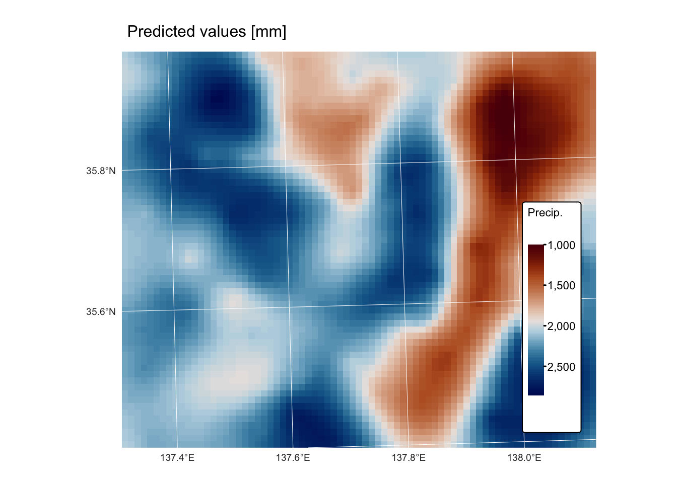
Operations on continuous fields
Spatial analysis of continuous fields involves a range of operations that allow us to understand, predict, and visualise phenomena that vary continuously over space.
Convolution and filtering
Convolution is a fundamental operation in spatial analysis that involves applying a filter (or kernel) to a continuous field to transform or enhance its features. The process works by moving a small matrix (the kernel) over each cell of the raster. At each position, the values under the kernel are multiplied by the corresponding kernel weights, and then a statistic of these products is computed to generate a new value for the central cell.
The kernel is frequently of size 3 × 3 raster cells, but any other kind of square window (e.g., 5 × 5, 7 × 7, or a distance measurement) is possible. The statistic is usually the mean or the sum of all products, but others are also possible (see Fig. 3, below).
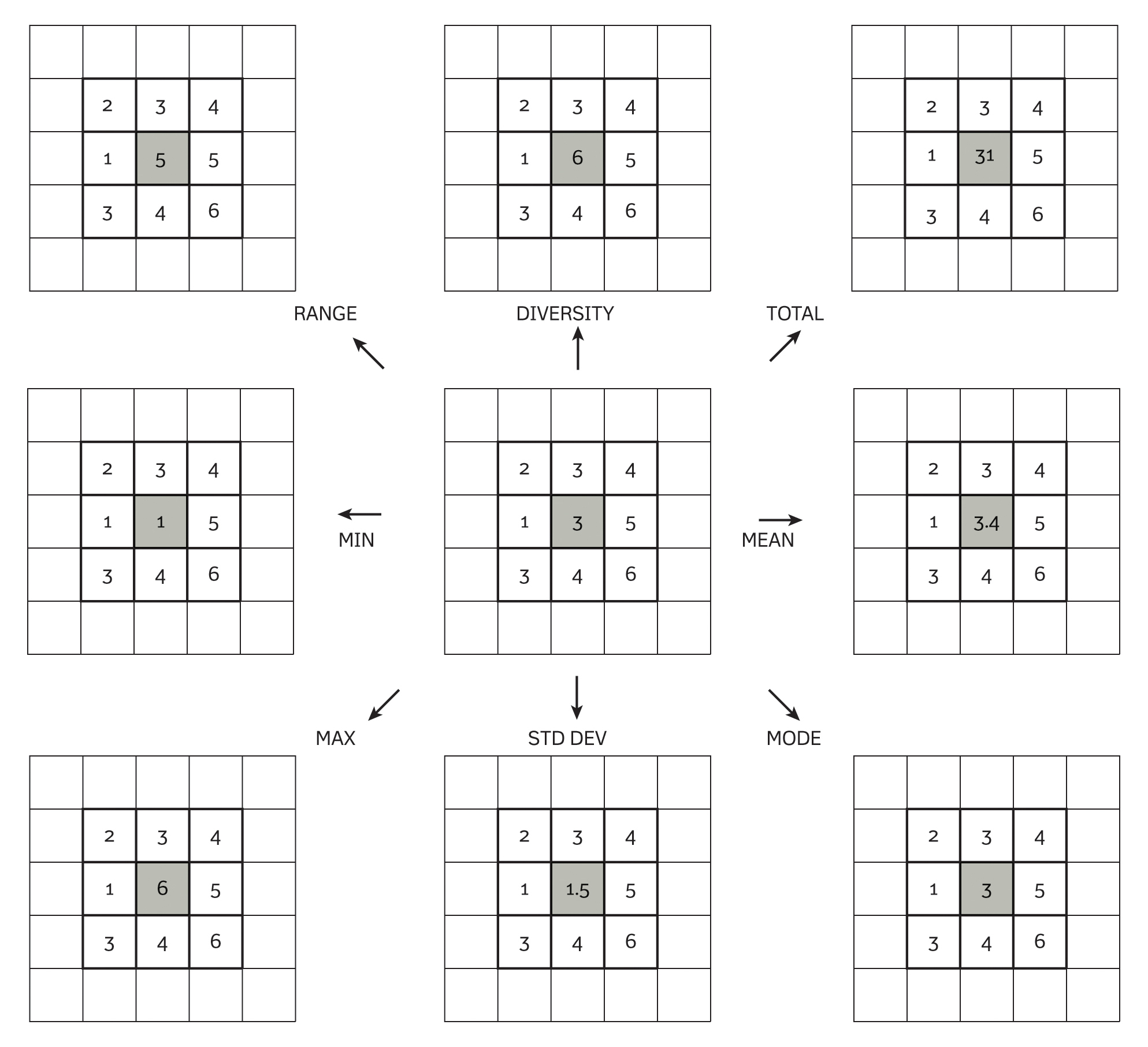
Fig. 2: Kernel operations for spatial filtering. Reproduced from: Burrough et al (2015), Principles of Geographical Information Systems (3rd ed.), Oxford University Press.
The kernel’s coefficients determine the nature of the operation:
Smoothing (low-pass filters): these kernels average the values of neighbouring cells to reduce noise. A common example is a uniform kernel (e.g. every element is 1/9 in a 3 × 3 matrix) or a Gaussian kernel where the centre has a higher weight.
Edge detection (high-pass filters): These kernels emphasise differences in adjacent cell values to highlight boundaries. Examples include the Sobel operator (which can detect horizontal or vertical edges) and the Laplacian filter.
Below are two examples of how to perform convolution operations on a
raster using the terra package in R. The first example
demonstrates the smoothing filter using the coarse (1km) resolution
digital elevation model r_dem, whereas the second example
demonstrates edge detection using the fine (5m) resolution digital
elevation model jp_dem.
r1km <- r_dem  # coarse DEM
r5m <- jp_dem  # fine DEM

# Define a 3 x 3 smoothing kernel (simple average filter)
smoothing_kernel <- matrix(1/9, nrow = 3, ncol = 3)
# Apply convolution for smoothing using the focal function
r_smoothed <- focal(r1km, w = smoothing_kernel, fun = sum, na.policy = "omit")

# Define a Sobel kernel for edge detection (horizontal edges)
sobel_x <- matrix(c(-1, 0, 1,
                    -2, 0, 2,
                    -1, 0, 1), nrow = 3, byrow = TRUE)
# Apply convolution for edge detection
r_edges <- focal(r5m, w = sobel_x, fun = sum, na.policy = "omit")

# Define a Laplace kernel for edge detection
laplace <- matrix(c(0, 1, 0,
                    1, -4, 1,
                    0, 1, 0), nrow = 3, byrow = TRUE)
# Apply convolution for edge detection
r_edges2 <- focal(r5m, w = laplace, fun = sum, na.policy = "omit")

# Rename SpatRaster names
names(r1km) <- "Elev."
names(r5m) <- "Elev."
names(r_smoothed) <- "Elev."
names(r_edges) <- "Elev."
names(r_edges2) <- "Elev."Explanation:
- the smoothing kernel is a 3 × 3 matrix with each element equal to 1/9, which computes the average of a cell and its eight neighbours.
- the Sobel kernel is designed for detecting horizontal edges by emphasising the differences in values across the x-direction.
- the
focal()function applies the convolution operation to each cell of the raster using the provided kernel. The argumentfun = sumspecifies that the weighted sum is computed.
Plot the 1km resolution rasters:
bnd_map <- tm_shape(bnd) + tm_borders()

# Plot original DEM
bnd_map + tm_shape(r1km) + tm_raster("Elev.",
           col.scale = tm_scale_continuous(values = "turbo"),
           col.legend = tm_legend(show = TRUE)) +
  tm_layout(frame = FALSE) +
  tm_title("Original DEM", size = 1)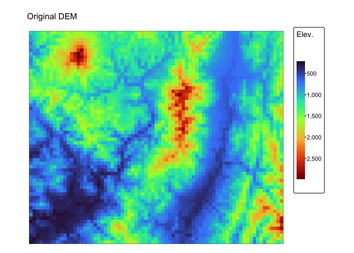
# Plot low-pass filtered DEM
bnd_map + tm_shape(r_smoothed) + tm_raster("Elev.",
           col.scale = tm_scale_continuous(values = "turbo"),
           col.legend = tm_legend(show = TRUE)) +
  tm_layout(frame = FALSE) +
  tm_title("Low-pass filter", size = 1)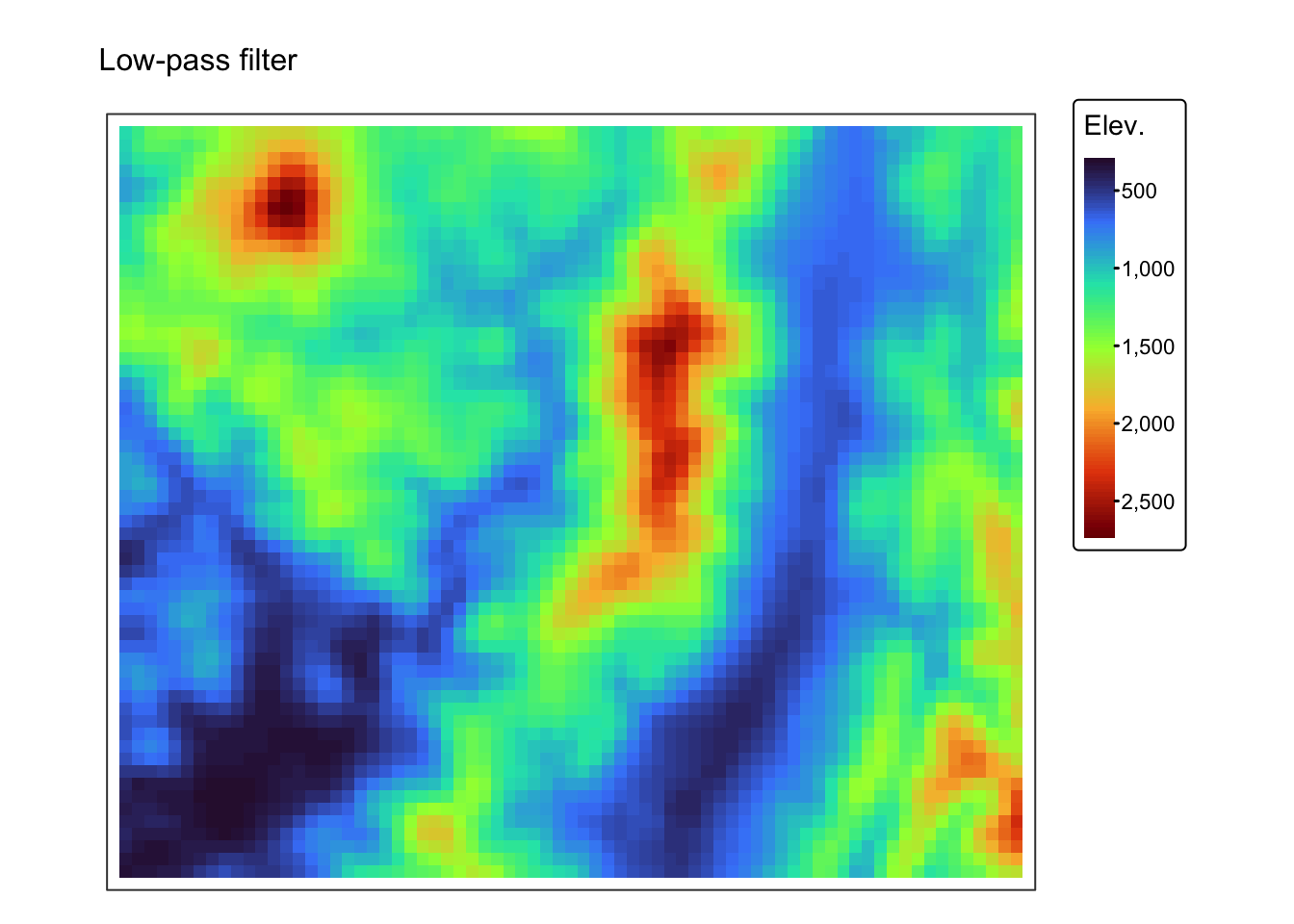
Plot the 5m resolution rasters:
bnd_map <- tm_shape(bnd_small) + tm_borders()

# Plot original DEM
bnd_map + tm_shape(r5m) + tm_raster("Elev.",
           col.scale = tm_scale_continuous(values = "turbo"),
           col.legend = tm_legend(show = TRUE)) +
  tm_layout(frame = FALSE) +
  tm_title("Original DEM", size = 1)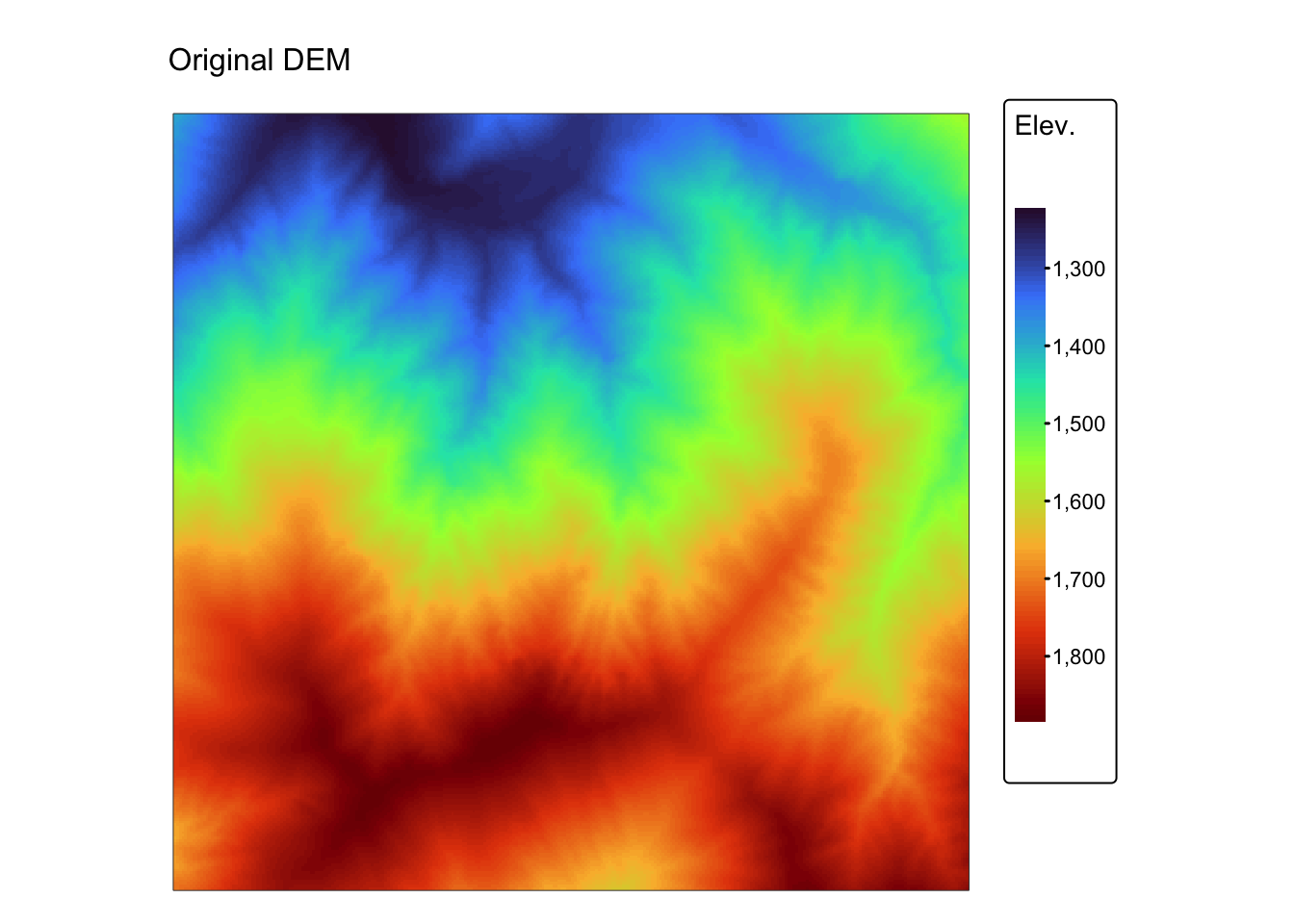
# Plot Sobel filtered DEM
m1 <- bnd_map + tm_shape(r_edges) + tm_raster("Elev.",
           col.scale = tm_scale_continuous(values = "turbo"),
           col.legend = tm_legend(show = FALSE)) +
  tm_layout(frame = FALSE) +
  tm_title("High-pass filter: Sobel", size = 1)

# Plot Laplace filtered DEM
m2 <- bnd_map + tm_shape(r_edges2) + tm_raster("Elev.",
           col.scale = tm_scale_continuous(values = "turbo"),
           col.legend = tm_legend(show = FALSE)) +
  tm_layout(frame = FALSE) +
  tm_title("High-pass filter: Laplace", size = 1)

tmap_arrange(m1,m2, asp = NA)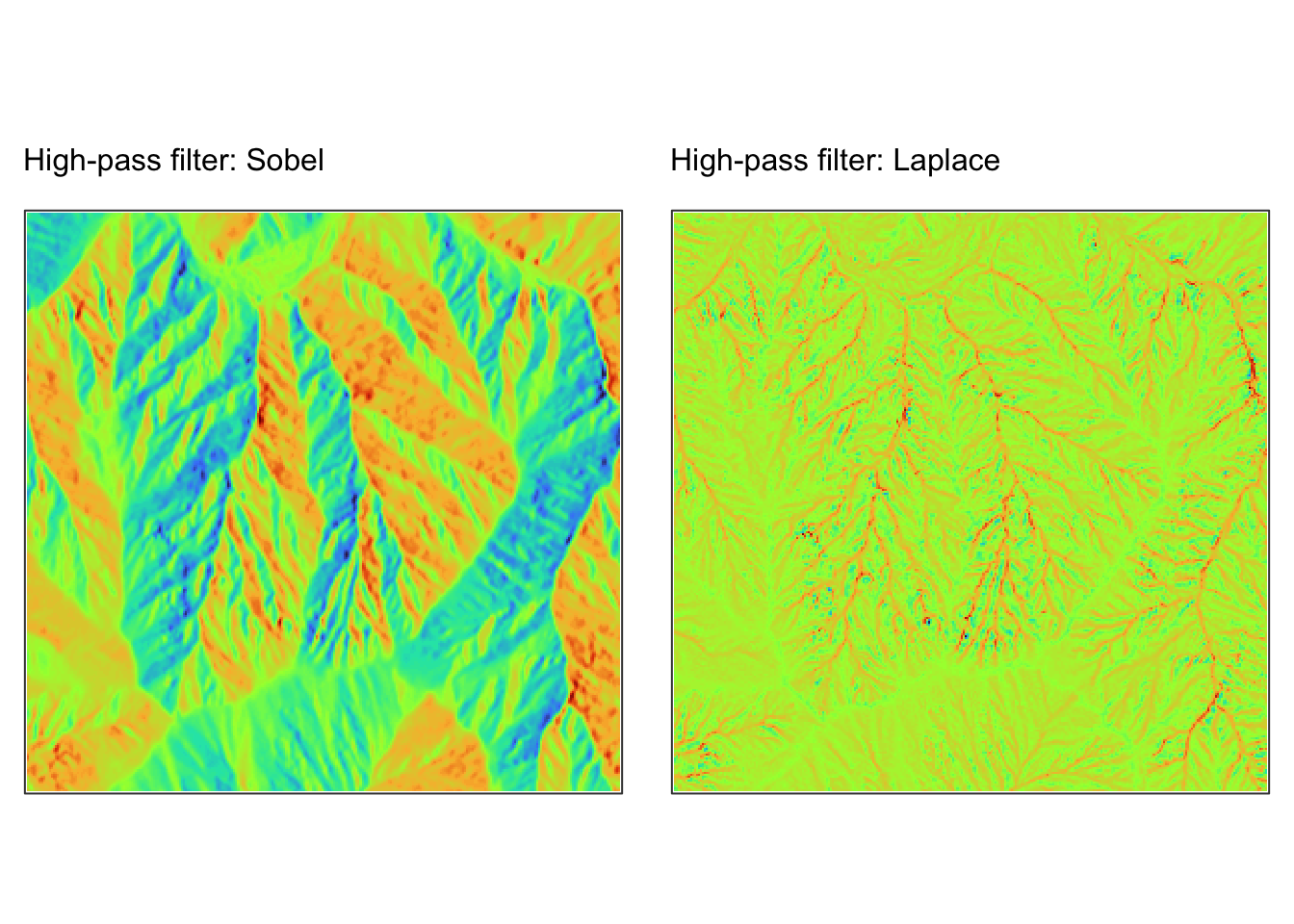
Viewshed analysis
Viewshed analysis is a spatial technique used in geospatial analysis to determine which areas of a landscape are visible from a specific observation point. This method utilises a DEM to simulate lines of sight (LOS) and identify zones that are unobstructed by intervening terrain features.
Viewshed analysis is employed in various fields: in telecommunications, it optimises the placement of cell towers or radio transmitters by pinpointing areas of maximum coverage; in military and security, it evaluates visibility from strategic locations such as observation posts; in urban planning and landscape design, it assesses the visual impact of new developments or conservation efforts; and in environmental studies, it examines how terrain shapes the visual aesthetics of natural landscapes and protected areas.
Key principles
Line-of-sight (LOS): the core concept involves drawing a line from the observer’s point to each target cell within the DEM. If this line is uninterrupted by higher terrain (or other obstacles, when considered), the target cell is deemed visible. Factors such as the curvature of the Earth may also be considered for more accurate analyses over large distances.
Observer and target heights: viewshed analysis often incorporates an observer height (e.g., a tower or a human standing on the ground) and a target height (e.g., the height of objects at the location). These parameters help simulate real-world conditions by accounting for elevated viewpoints or objects.
Maximum distance: a maximum distance parameter can be set to limit the analysis area. This parameter helps reduce computational load and focuses the analysis on a region of interest.
Obstructions and terrain blocking: the technique identifies obstructions—typically represented by higher elevation values in the DEM—that block the LOS between the observer and a given point. This allows the analysis to determine not only what is visible but also what is hidden behind terrain features.
Considerations and limitations
DEM quality: the accuracy of a viewshed analysis is highly dependent on the resolution and quality of the DEM used. Errors or coarse resolution may lead to inaccurate visibility results.
Simplifications: Many viewshed analyses assume that the terrain is the only source of obstruction, which may not account for vegetation, buildings, or atmospheric conditions unless additional data is incorporated.
Computational demands: High-resolution DEMs and large areas can require significant processing power and time, which is why setting an appropriate maximum distance can be important.
Performing viewshed analysis
In the following example, we use the viewshed() function
from the terra package to calculate the viewshed for a
location on jp_dem specified using WGS 84
longitude/latitude coordinates.
# Create an sf point object for the observer location
# Here we use WGS 84 long/lat for convenience
observer_sf <- st_sfc(st_point(c(137.7614, 35.685)), crs = st_crs(4326))

# Transform the observer to the DEM's CRS.
observer_sf <- st_transform(observer_sf, crs(jp_dem))

# Extract the coordinates as a numeric vector
observer_coords <- as.vector(st_coordinates(observer_sf))

# Calculate the viewshed using the observer coordinates
vs <- viewshed(jp_dem, observer_coords,
               observer = 2,    # The height above the elevation data of the observer
               target = 0,      # The height above the elevation data of the targets
               curvcoef=6/7)    # Coefficient to consider the effect of the curvature
                                # of the Earth and refraction of the atmosphere.

names(vs) <- "Viewshed"
The viewshed() function accepts several arguments,
including those specifying the heights of both the observer and the
target. In addition, the curvcoef parameter adjusts for the
effects of the Earth’s curvature and atmospheric refraction. With its
default value of 6/7 (approximately 0.85714), this setting implies that
roughly 1 meter of elevation is effectively lost for every 385 meters of
horizontal distance.
Plot viewshed raster:
# Plot viewshed raster
map1 <- bnd_map + tm_shape(vs) + tm_raster("Viewshed") +
  tm_layout(frame = FALSE,
                 legend.text.size = 0.7,
                 legend.title.size = 0.7,
                 legend.position = c("right", "bottom"),
                 legend.bg.color = "white") +
  tm_title("Height of observer = 2m", size = 1)

# Add drainage basins for clarity
map2 <-map1 + tm_shape(jp_basins) + tm_borders("white")
# Add observer location as red dot
map3 <- map2 + tm_shape(observer_sf) + tm_dots("red", size = 0.7)

# Show map
map3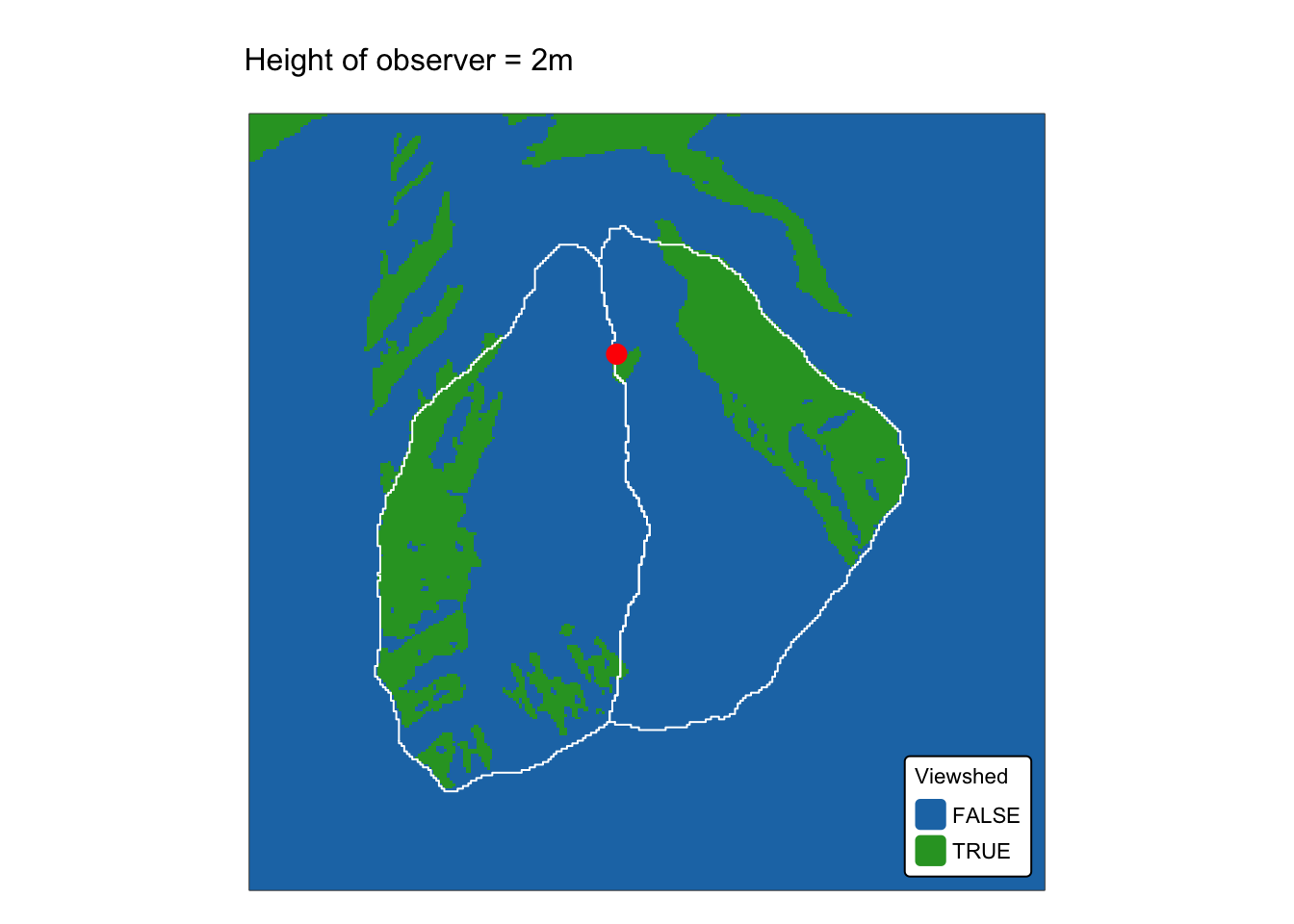
Terrain analysis
Terrain analysis examines landform characteristics through operations such as computing first‐ and second‐order surface derivatives, flow routing, and watershed delineation.
Slope and curvature
Slope and curvature are fundamental derivatives that describe a surface’s behaviour. Slope, the first derivative, quantifies the rate of change in elevation and is typically expressed as gradient and aspect. Curvature, the second derivative, measures how the slope itself changes — profile curvature (along the direction of the steepest slope) and plan curvature (perpendicular to that direction) indicate the surface’s concavity or convexity.
Although digital elevation models (DEMs) are inherently discretised, they approximate mathematically continuous surfaces, enabling the calculation of both slope and curvature at each grid cell. Derivatives for each cell in an altitude matrix are computed locally using data from a moving 3 × 3 kernel. This calculation can utilise either all eight neighbouring cells (QUEEN case) or only the four directly adjacent cells (ROOK case) (see Fig. 3).
Among the most widely implemented algorithms in geospatial software is the one developed by Berthold Horn in 1981, which computes derivatives using all eight neighbouring cells in a moving 3 × 3 kernel. Another popular method, developed by Lyle Zevenbergen and Colin Thorne in 1987, estimates slope and curvature by fitting a polynomial to the four orthogonal grid cells within a 3 × 3 kernel. Both algorithms yield similar results; however, the Zevenbergen and Thorne method can compute both first‐ and second‐order derivatives, while Horn’s algorithm is limited to determining slope gradient and aspect.
More recent algorithms — such as those implemented in the WhiteboxTools library, for example — have built upon these foundational approaches (see for example Florinsky, 2016).
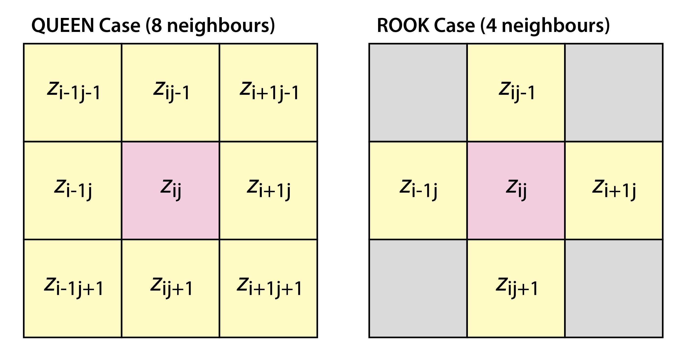
Fig. 3: The QUEEN versus ROOK neighbourhood
Slope gradient:
- Gradient represents the steepness of the terrain at a given location. It is typically calculated as the rate of change in elevation over a specified horizontal distance.
- In practice, slope is computed by determining the first derivative of the DEM. This is often done using finite difference methods where the differences in elevation between neighbouring cells are assessed.
- Slope values can be expressed in degrees (angular measurement) or as a percentage (rise over run).
Slope aspect:
- Aspect indicates the compass direction that a slope faces. It is derived by computing the orientation of the steepest slope at each cell in the DEM.
- The aspect is typically expressed in degrees (0°–360°), with 0° or 360° representing north, 90° east, 180° south, and 270° west.
- The calculation involves determining the direction of the gradient vector, essentially finding the angle of maximum rate of change in elevation.
Curvature:
Curvature quantifies the rate of change in slope (i.e., the second derivative of the elevation). It provides insights into how a surface bends or curves. The following includes the most common types of terrain curvature:
Profile curvature: is calculated in the vertical plane that is parallel to the direction of maximum slope (i.e. the downslope direction). It controls the acceleration and deceleration of flow; a convex (positive) profile curvature tends to slow down the flow, whereas a concave (negative) curvature accelerates it. This measure is critical for understanding erosion and deposition processes on slopes.
Plan curvature: (also known as horizontal curvature) is measured in the horizontal plane and is taken along a line perpendicular to the slope direction (i.e. along the contour). It indicates how the flow converges or diverges laterally. Convergent (negative) plan curvature can lead to flow accumulation, whereas divergent (positive) curvature may cause flow dispersion.
Tangential curvature: is measured along the direction tangential (i.e. along the contour line) to the steepest descent. It reflects the rate at which the slope changes along a line following the contour. Tangential curvature is important because it can indicate whether water flowing along a contour tends to converge (leading to accumulation) or diverge (leading to dispersion).
Minimal curvature: also known as the minimum principal curvature, this is the smaller of the two principal curvatures at a given point. It reflects the curvature in the direction where the surface bends the least. Minimal curvature is useful for identifying areas where the surface is relatively flat in one direction, even if it may be strongly curved in another.
Maximal curvature: or the maximum principal curvature, is the larger of the two principal curvatures. It indicates the direction in which the surface bends most sharply. This measure is significant in highlighting features such as ridges or steep transitions on a surface.
Gaussian curvature: is the product of the two principal curvatures (the maximal and minimal curvatures) at a point on the surface. It represents the intrinsic curvature of the surface: positive gaussian curvature indicates a dome-like or convex region (both principal curvatures have the same sign); negative gaussian curvature indicates a saddle-shaped surface (the principal curvatures have opposite signs); zero gaussian curvature suggests a flat or parabolic region. This measure is essential for understanding the overall shape and local surface behaviour.
Mean curvature: is the average of the two principal curvatures (the maximal and minimal curvatures) at a point on the surface. This measure provides a balanced indicator of the surface’s bending at a point, reflecting both convexity and concavity. A positive mean curvature typically indicates a locally convex (domed) shape, while a negative value suggests a concave (basin-like) surface. Mean curvature is widely used in terrain analysis to summarise the overall curvature and to help infer processes such as erosion and deposition.
Total curvature: is generally defined as the arithmetic sum of the two principal curvatures (the maximal and minimal curvatures) at a given point on the surface. This measure provides an overall indication of how much the surface bends at a point by combining the bending in both the steepest and least steep directions. It is sometimes referred to as “net curvature.” Note that because mean curvature is defined as half of this sum, total curvature is essentially a scaled version of mean curvature.
Calculating slope with the terra package
The terra package implements both the Horn algorithm
and an earlier version of the Zevenbergen and Thorne algorithm (see
terra’s documentation for more
details). Although it is possible to compute slope gradient and aspect,
the terrain() function in terra does not
currently support curvature calculations.
The following code block uses terra’s
terrain() function to calculate gradient and curvature:
# Compute gradient and aspect (in degrees) from the jp_dem using Horn's method
jp_slope <- terrain(jp_dem, v = "slope", neighbors=8, unit = "degrees")
jp_aspect <- terrain(jp_dem, v = "aspect", neighbors=8, unit = "degrees")

names(jp_slope) <- "Gradient"
names(jp_aspect) <- "Aspect"
Plot the two maps using tmap:
# Plot slope gradient
m1 <- bnd_map + tm_shape(jp_slope) + tm_raster("Gradient",
           col.scale = tm_scale_intervals(n = 6, values = "viridis", style = "jenks")) +
       tm_layout(frame = FALSE,
                 legend.text.size = 0.6,
                 legend.title.size = 0.6,
                 legend.position = c("right", "bottom"),
                 legend.bg.color = "white") +
       tm_title("Slope gradient (degrees) - terra", size = 1)

# Plot slope aspect
m2 <- bnd_map + tm_shape(jp_aspect) + tm_raster("Aspect",
           col.scale = tm_scale_intervals(n = 6, values = "turbo", style = "jenks")) +
       tm_layout(frame = FALSE,
                 legend.text.size = 0.6,
                 legend.title.size = 0.6,
                 legend.position = c("right", "bottom"),
                 legend.bg.color = "white") +
       tm_title("Slope aspect (degrees) - terra", size = 1)

tmap_arrange(m1, m2, asp = NA)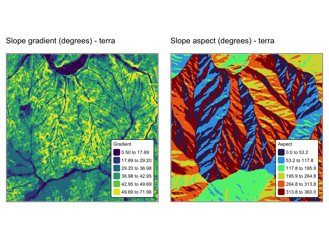
Calculating slope and curvature with the whitebox package
The WhiteboxTools library offers an extensive suite of terrain analysis tools (see the documentation for more details). It includes functionalities for computing slope gradient and aspect, as well as a comprehensive range of terrain curvature metrics.
The following code block calculates gradient and curvature from
jp_dem using the whitebox package:
# Specify output rasters
jp_gradient <- "./data/dump/spat3/jp_slope_5m.tif"
jp_aspect <- "./data/dump/spat3/jp_aspect_5m.tif"
jp_plan_curv <- "./data/dump/spat3/jp_plancurv_5m.tif"
jp_prof_curv <- "./data/dump/spat3/jp_profcurv_5m.tif"
jp_tang_curv <- "./data/dump/spat3/jp_tangcurv_5m.tif"
jp_min_curv <- "./data/dump/spat3/jp_mincurv_5m.tif"
jp_max_curv <- "./data/dump/spat3/jp_maxcurv_5m.tif"
jp_mean_curv <- "./data/dump/spat3/jp_meancurv_5m.tif"
jp_gauss_curv <- "./data/dump/spat3/jp_gausscurv_5m.tif"
jp_tot_curv <- "./data/dump/spat3/jp_totcurv_5m.tif"


# Initialise WhiteboxTools (just in case)
wbt_init()

# Calculate slope and aspect
# Options for units include: 'degrees', 'radians', 'percent'
wbt_slope(dem = jp_dem, output = jp_gradient, zfactor = 1.0, units="degrees")
wbt_aspect(dem = jp_dem, output = jp_aspect, zfactor = 1.0)

# Calculate curvature
# "log = TRUE" Display output values using a log-scale
wbt_plan_curvature(dem = jp_dem, output = jp_plan_curv, log = FALSE, zfactor = 1.0)
wbt_profile_curvature(dem = jp_dem, output = jp_prof_curv, log = FALSE, zfactor = 1.0)
wbt_tangential_curvature(dem = jp_dem, output = jp_tang_curv, log = FALSE, zfactor = 1.0)
wbt_minimal_curvature(dem = jp_dem, output = jp_min_curv, log = FALSE, zfactor = 1.0)
wbt_maximal_curvature(dem = jp_dem, output = jp_max_curv, log = FALSE, zfactor = 1.0)
wbt_mean_curvature(dem = jp_dem, output = jp_mean_curv, log = FALSE, zfactor = 1.0)
wbt_gaussian_curvature(dem = jp_dem, output = jp_gauss_curv, log = FALSE, zfactor = 1.0)
wbt_total_curvature(dem = jp_dem, output = jp_tot_curv, log = FALSE, zfactor = 1.0)

# Read in outputs as SpatRasters
r_slope <- rast(jp_gradient)
r_aspect <- rast(jp_aspect)
r_plancurv <- rast(jp_plan_curv)
r_profcurv <- rast(jp_prof_curv)
r_tangcurv <- rast(jp_tang_curv)
r_mincurv <- rast(jp_min_curv)
r_maxcurv <- rast(jp_max_curv)
r_meancurv <- rast(jp_mean_curv)
r_gausscurv <- rast(jp_gauss_curv)
r_totcurv <- rast(jp_tot_curv)

names(r_slope) <- "Gradient"
names(r_aspect) <- "Aspect"
names(r_plancurv) <- "Plan Curv."
names(r_profcurv) <- "Profile Curv."
names(r_tangcurv) <- "Tangential Curv."
names(r_mincurv) <- "Minimal Curv."
names(r_maxcurv) <- "Maximal Curv."
names(r_meancurv) <- "Mean Curv."
names(r_gausscurv) <- "Gaussian Curv."
names(r_totcurv) <- "Total Curv."
Plot results using tmap:
# Plot slope gradient
m1 <- bnd_map + tm_shape(r_slope) + tm_raster("Gradient",
           col.scale = tm_scale_intervals(n = 6, values = "viridis", style = "fisher")) +
       tm_layout(frame = FALSE,
                 legend.text.size = 0.6,
                 legend.title.size = 0.6,
                 legend.position = c("right", "bottom"),
                 legend.bg.color = "white") +
       tm_title("Slope gradient (degrees) - WhiteboxTools", size = 1)

# Plot slope aspect
m2 <- bnd_map + tm_shape(r_aspect) + tm_raster("Aspect",
           col.scale = tm_scale_intervals(n = 6, values = "turbo", style = "fisher")) +
       tm_layout(frame = FALSE,
                 legend.text.size = 0.6,
                 legend.title.size = 0.6,
                 legend.position = c("right", "bottom"),
                 legend.bg.color = "white") +
       tm_title("Slope aspect (degrees)  - WhiteboxTools", size = 1)

tmap_arrange(m1, m2, asp = NA)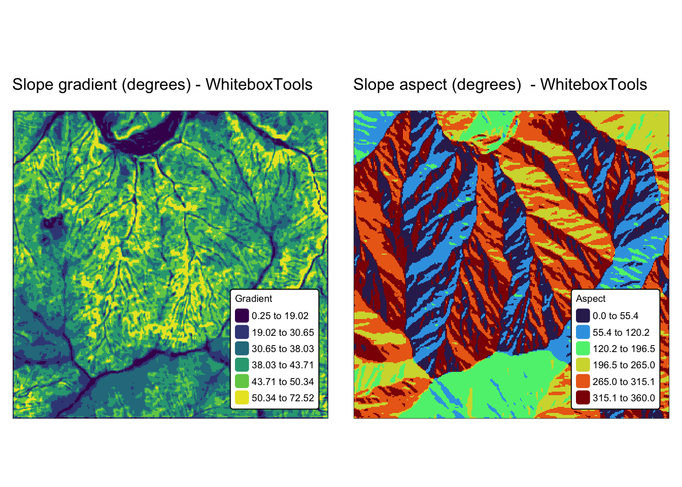
# Plot plan curvature
m3 <- bnd_map + tm_shape(r_plancurv) + tm_raster("Plan Curv.",
       col.scale = tm_scale_intervals(n = 6, values = "matplotlib.rd_bu", style = "fisher")) +
      tm_layout(frame = FALSE,
                 legend.text.size = 0.6,
                 legend.title.size = 0.6,
                 legend.position = c("right", "bottom"),
                 legend.bg.color = "white") +
      tm_title("Plan Curvature (1/m)", size = 1)

# Plot profile curvature
m4 <- bnd_map + tm_shape(r_profcurv) + tm_raster("Profile Curv.",
       col.scale = tm_scale_intervals(n = 6, values = "matplotlib.rd_bu", style = "fisher")) +
      tm_layout(frame = FALSE,
                 legend.text.size = 0.6,
                 legend.title.size = 0.6,
                 legend.position = c("right", "bottom"),
                 legend.bg.color = "white") +
      tm_title("Profile Curvature (1/m)", size = 1)

# Plot tangential curvature
m5 <- bnd_map + tm_shape(r_tangcurv) + tm_raster("Tangential Curv.",
       col.scale = tm_scale_intervals(n = 6, values = "matplotlib.rd_bu", style = "fisher")) +
      tm_layout(frame = FALSE,
                 legend.text.size = 0.6,
                 legend.title.size = 0.6,
                 legend.position = c("right", "bottom"),
                 legend.bg.color = "white") +
      tm_title("Tangential Curvature (1/m)s", size = 1)

# Plot minimal curvature
m6 <- bnd_map + tm_shape(r_mincurv) + tm_raster("Minimal Curv.",
       col.scale = tm_scale_intervals(n = 6, values = "matplotlib.rd_bu", style = "fisher")) +
      tm_layout(frame = FALSE,
                 legend.text.size = 0.6,
                 legend.title.size = 0.6,
                 legend.position = c("right", "bottom"),
                 legend.bg.color = "white") +
      tm_title("Minimal Curvature (1/m)", size = 1)

# Plot maximal curvature
m7 <- bnd_map + tm_shape(r_maxcurv) + tm_raster("Maximal Curv.",
       col.scale = tm_scale_intervals(n = 6, values = "matplotlib.rd_bu", style = "fisher")) +
      tm_layout(frame = FALSE,
                 legend.text.size = 0.6,
                 legend.title.size = 0.6,
                 legend.position = c("right", "bottom"),
                 legend.bg.color = "white") +
      tm_title("Maximal Curvature (1/m)", size = 1)

# Plot mean curvature
m8 <- bnd_map + tm_shape(r_meancurv) + tm_raster("Mean Curv.",
       col.scale = tm_scale_intervals(n = 6, values = "matplotlib.rd_bu", style = "fisher")) +
      tm_layout(frame = FALSE,
                 legend.text.size = 0.6,
                 legend.title.size = 0.6,
                 legend.position = c("right", "bottom"),
                 legend.bg.color = "white") +
      tm_title("Mean Curvature (1/m)", size = 1)

# Plot Gaussian curvature
m9 <- bnd_map + tm_shape(r_gausscurv) + tm_raster("Gaussian Curv.",
       col.scale = tm_scale_intervals(n = 6, values = "matplotlib.rd_bu", style = "fisher")) +
      tm_layout(frame = FALSE,
                 legend.text.size = 0.6,
                 legend.title.size = 0.6,
                 legend.position = c("right", "bottom"),
                 legend.bg.color = "white") +
      tm_title("Gaussian Curvature (1/m)", size = 1)

# Plot total curvature
m10 <- bnd_map + tm_shape(r_totcurv) + tm_raster("Total Curv.",
       col.scale = tm_scale_intervals(n = 6, values = "matplotlib.rd_bu", style = "fisher")) +
      tm_layout(frame = FALSE,
                 legend.text.size = 0.6,
                 legend.title.size = 0.6,
                 legend.position = c("right", "bottom"),
                 legend.bg.color = "white") +
      tm_title("Total Curvature (1/m)", size = 1)

# Show maps
tmap_arrange(m3, m4, asp = NA)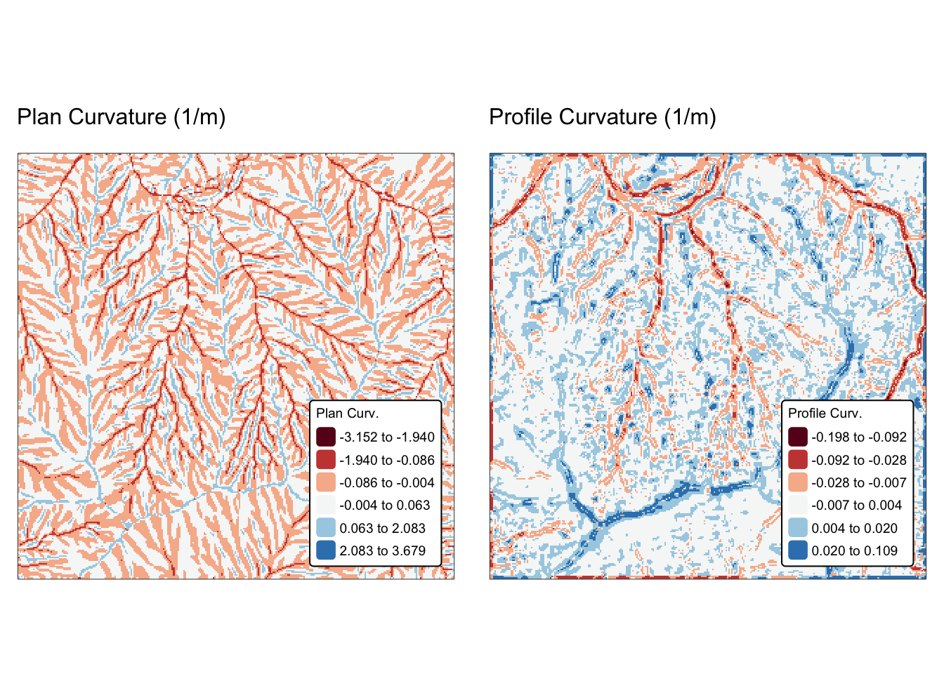
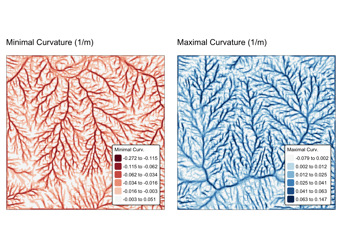
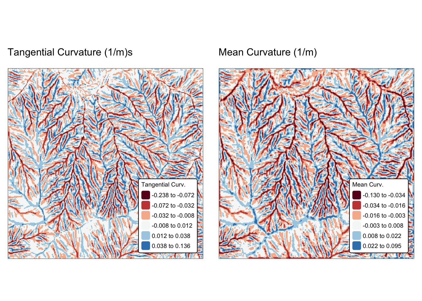
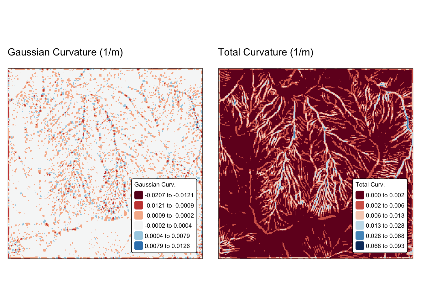
Watershed delineation
Watershed delineation in terrain analysis involves using a DEM to identify and outline the area, or catchment, that contributes surface runoff to a specific point (often called the pour point). This process is fundamental for hydrological modelling, water resource management, and environmental planning.
Below is an overview of the key steps involved:
DEM preprocessing: the DEM is first preprocessed to remove artefacts and fill depressions (or sinks) that might disrupt the natural flow of water (Fig. 4). This “sink-filling” step ensures a continuous and hydrologically sound surface.
Flow direction calculation: algorithms such as the D8 method (Fig. 4) are used to determine the direction of flow from each cell in the DEM, typically directing flow to the neighbouring cell with the steepest descent. This step establishes the primary flow paths across the terrain.
Flow accumulation: once flow directions are set, each cell’s flow accumulation is computed by counting the number of upstream cells that contribute runoff to it. Cells with high accumulation values typically represent stream channels.
Stream network extraction: a threshold is applied to the flow accumulation grid to extract the stream network. This network serves as a framework for identifying the main channels and tributaries within the watershed.
Watershed boundary delineation: starting from a defined pour point (often located at the outlet of a stream), the watershed boundary is delineated by tracing all cells that drain into that point. This aggregation of contributing cells forms the watershed.
The flow direction raster is a cornerstone of hydrological modelling in geospatial analysis, providing a basis for extracting stream networks, delineating watersheds, and calculating metrics such as the length of flow paths both upstream and downstream. Several well-established algorithms exist to compute flow direction, each with its own characteristics, strengths, and limitations. The main ones include (Fig. 4):
D8 (deterministic 8-neighbour) algorithm: this classic method directs flow from each cell to its steepest descending neighbour among the eight surrounding cells. It is computationally efficient but may oversimplify flow patterns in complex or flat terrains.
D-infinity (Dinf) algorithm: this approach computes flow direction as a continuous variable, allowing the assignment of flow along any downslope angle between cell centres. It offers improved representation of convergent and divergent flows in intricate landscapes.
Multiple flow direction (MFD) algorithm: unlike the D8 method, MFD methods such as FD8 distribute flow across all downslope neighbours rather than a single cell. This can provide a more realistic simulation of water dispersion, particularly in areas with gently sloping or ambiguous drainage paths.
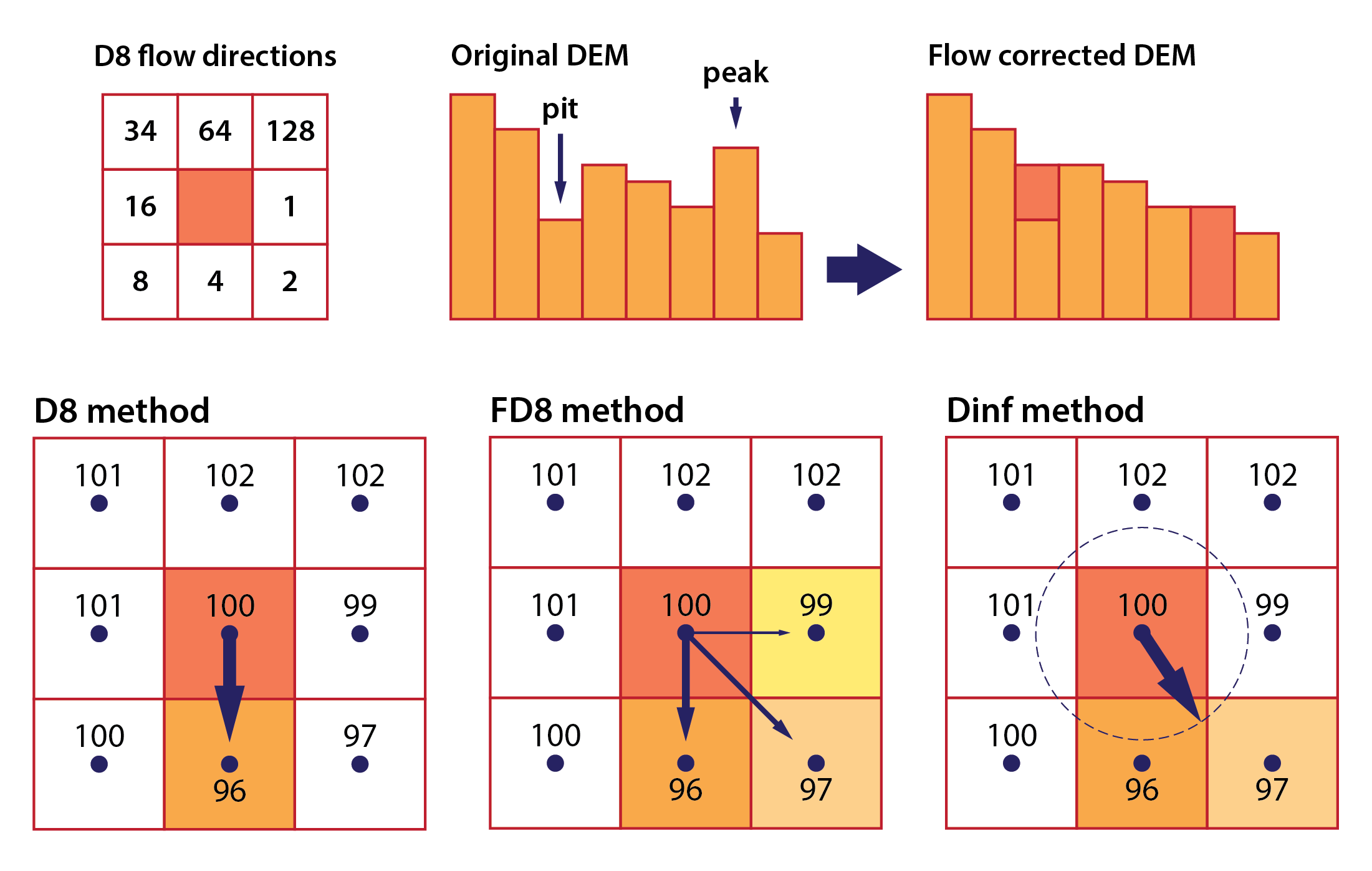
Fig. 4: D8 flow directions are coded with integers representing powers of 2 (top left), the principles behind DEM flow conditioning (top right), and the apportionment of flow directions in the D8, FD8, and Dinf flow routing methods (bottom).
Watershed delineation with the terra package
The terra package provides a limited suite of tools
for watershed delineation. For example, the terrain()
function generates D8 flow direction rasters when the
flowdir argument is selected. The
flowAccumulation() function computes flow accumulation from
a D8 flow direction raster, and the watershed() function
delineates the area of a catchment using both a D8 flow direction raster
and a pour-point (the catchment outlet).
However, the terra package does not include
functions for DEM preprocessing. Although the pitfinder()
function can identify the locations of depressions from a D8 flow
direction raster, it does not fill these depressions. This limitation
can be overcome by preprocessing the DEM using an alternative R package,
several of which are readily available.
Next, we use the terra package on
jp_dem to delineate two watersheds with outlets given by
jp_outlets.
Calculate flow direction and flow accumulation:
# Compute D8 flow direction raster
jp_flowdir <- terrain(jp_dem, v = "flowdir")
names(jp_flowdir) <- "D8 Dir."

# Compute flow accumulation
# weight = "x" - multiply cells with x
jp_flowacc <- flowAccumulation(jp_flowdir, weight = NULL)
names(jp_flowacc) <- "Flow.Acc."
Plot results using tmap:
# Plot flow direction
m1 <- bnd_map + tm_shape(jp_flowdir) + tm_raster("D8 Dir.",
           col.scale = tm_scale_categorical(values = "met.tiepolo")) +
       tm_layout(frame = FALSE,
                 legend.text.size = 0.6,
                 legend.title.size = 0.6,
                 legend.position = c("right", "bottom"),
                 legend.bg.color = "white") +
       tm_title("D8 Flow Direction", size = 1)

# Plot flow accumulation
m2 <- bnd_map + tm_shape(jp_flowacc) + tm_raster("Flow.Acc.",
           col.scale = tm_scale_continuous_log10(values = "viridis")) +
       tm_layout(frame = FALSE,
                 legend.text.size = 0.6,
                 legend.title.size = 0.6,
                 legend.position = c("right", "bottom"),
                 legend.bg.color = "white") +
       tm_title("Flow Accumulation", size = 1)

tmap_arrange(m1, m2, asp = NA)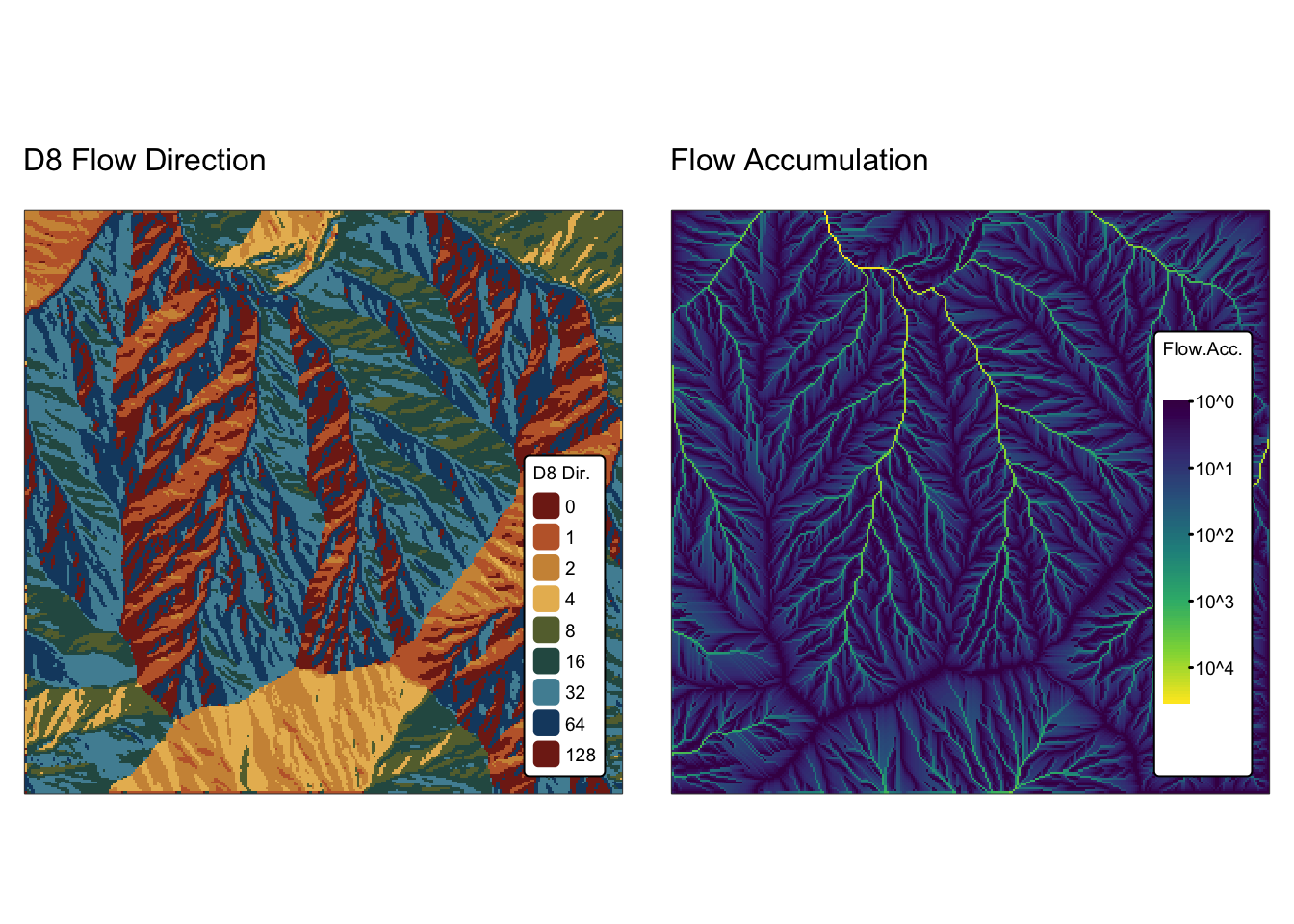
Identify depressions in the DEM:
# Find depressions (pits)
jp_pits <- pitfinder(jp_flowdir)
names(jp_pits) <- "Pits"

# Plot pit locations
m1 <- bnd_map + tm_shape(jp_pits) + tm_raster("Pits",
          col.scale = tm_scale_intervals(n=2, style = "fixed",
            values = c("#fcbc66","#584053"),
            breaks = c(0,1,100),
            labels = c("FALSE", "TRUE")
            )) +
  tm_layout(frame = FALSE,
                 legend.text.size = 0.7,
                 legend.title.size = 0.7,
                 legend.position = c("right", "bottom"),
                 legend.bg.color = "white")

# Add drainage basins for clarity
m2 <- m1 + tm_shape(jp_basins) + tm_borders("white")

# Show map
m2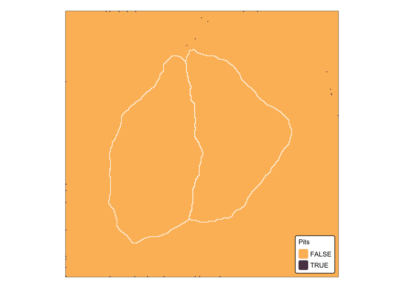
As shown in the map above, jp_dem has not been
hydrologically conditioned, and as a result, depressions (pits) are
present within the raster. To test whether the presence of pits in
jp_dem has an impact on watershed delineation, we next
apply the watershed() function:
# Convert the sf points to a SpatVector (terra's vector format)
outlet_vect <- vect(jp_outlets)

# Create an empty list to store watershed outputs for each outlet
ws_list <- vector("list", nrow(outlet_vect))

# Iterate through each outlet point and delineate its watershed
for(i in seq_len(nrow(outlet_vect))) {
  outlet <- outlet_vect[i, ]
  # Delineate watershed for the current outlet using its coordinates
  ws <- watershed(jp_flowdir, crds(outlet))
  # Reclassify: set cells with value 0 to NA
  ws[ws == 0] <- NA
  ws_list[[i]] <- ws
}

# Create a blank raster with the same properties as jp_flowdir
jp_basins_new <- rast(jp_flowdir)
values(jp_basins_new) <- NA

# Combine each individual watershed into one raster with a unique value per basin
for(i in seq_along(ws_list)) {
  basin_ws <- ws_list[[i]]
  # Assign a unique integer (here, simply i) to cells where the watershed is delineated
  jp_basins_new[!is.na(basin_ws)] <- i
}

names(jp_basins_new) <- "Basin ID"
Plot results using tmap:
# Plot basins
m1 <- bnd_map + tm_shape(jp_basins_new) + tm_raster("Basin ID",
           col.scale = tm_scale_categorical()) +
       tm_layout(frame = FALSE,
                 legend.text.size = 0.7,
                 legend.title.size = 0.7,
                 legend.position = c("right", "bottom"),
                 legend.bg.color = "white") +
       tm_title("Watersheds - terra", size = 1)

# Add original drainage basins and outlets for clarity
m2 <- m1 + tm_shape(jp_basins) + tm_borders("black")
m3 <- m2 + tm_shape(jp_outlets) + tm_dots(size = 0.7, "black")

# Show map
m3
Given that all depressions identified on jp_dem are
located downstream of the two outlet locations, they did not affect the
basin delineation process for those outlets. Moreover, the extracted
basins match exactly the jp_basins polygon
sf object. However, for any point located downstream of
a depression, the flow accumulation grid would be interrupted, and as a
result, the upstream contributing area for that point would not be
delineated correctly.
Watershed delineation with the whitebox package
The WhiteboxTools library offers an extensive suite of tools for performing hydrological analyses on digital elevation models. Below we’ll explore a selection of these tools.
Conditioning the DEM and removing depressions
WhiteboxTools offers a couple of approaches for handling depressions in DEMs, each designed to ensure continuous flow paths for hydrological analysis while minimising the alteration of the original terrain:
FillDepressions: this is the primary tool for depression filling and is accessed in R via the
wtb_fill_depressions()function. It works by identifying depressions (or sinks) in the DEM and “filling” them — that is, it raises the elevation of the affected cells up to the level of the lowest spill point (Fig. 4). This process guarantees that every cell is part of a continuous drainage network. The method iteratively fills the depressions while controlling the creation of large flat areas that might result from uniform filling.BreachDepressions: instead of raising the depression floor, this tool (accessed via the
wbt_breach_depressions()function) “breaches” the depression by lowering the barrier cells along its edge. By doing so, it creates a natural outflow channel while preserving more of the original topographic variability. This method is particularly useful when it is important to maintain the relative relief and shape of the surrounding landscape, as it avoids the sometimes artefactual appearance that can result from simply filling depressions.BreachDepressionsLeastCost: is a specialised variant of the standard breaching approach that utilises a least-cost path algorithm and is accessed via the
wbt.breach_depressions_least_cost()function. Unlike BreachDepressions — which involves lowering the elevation of barrier cells uniformly — the LeastCost method calculates a “cost” for modifying each cell (often based on the elevation difference). It then determines the optimal, or least disruptive, path that connects the interior of the depression to a drainage outlet. This path represents the route with the minimum overall modification cost, ensuring that the breach is created in a way that minimally alters the original terrain. By focusing on minimising the overall cost of change, the tool helps preserve as much of the original topographic variability as possible.
Although BreachDepressionsLeastCost is the most advanced approach, there are applications where full depression filling with the FillDepressions tool may be preferred. In the next example, we will employ both tools: first, we breach depressions using BreachDepressionsLeastCost, and then we apply full depression filling with FillDepressions.
# Specify output rasters
jp_breached_dem <- "./data/dump/spat3/jp_breached_5m.tif"
jp_filled_dem <- "./data/dump/spat3/jp_filled_5m.tif"

# Breach depressions
# Options:
# dist - maximum search distance for breach paths in cells
# max_cost - optional maximum breach cost (default is Inf)
# min_dist - optional flag indicating whether to minimize breach distances
# flat_increment - optional elevation increment applied to flat areas
# fill - optional flag indicating whether to fill any remaining unbreached depressions
wbt_breach_depressions_least_cost(dem = jp_dem, output = jp_breached_dem, dist = 100)

# Fill depressions
# Options:
# fix_flats - optional flag indicating if flat areas should have a small gradient applied
# flat_increment - optional elevation increment applied to flat areas
# max_depth - optional maximum depression depth to fill
wbt_fill_depressions(dem = jp_breached_dem, output = jp_filled_dem, fix_flats=TRUE)

# Read in filled DEM
r_filled <- rast(jp_filled_dem)
names(r_filled) <- "Elev."
Calculating flow direction
WhiteboxTools includes several algorithms for calculating flow direction from a DEM, including the D8, FD8, and Dinf methods described above. We calculate all of these below:
# Specify output rasters
jp_d8 <- "./data/dump/spat3/jp_d8.tif"
jp_fd8 <- "./data/dump/spat3/jp_fd8.tif"
jp_dinf <- "./data/dump/spat3/jp_dinf.tif"

# D8
# Options:
# esri_pntr - D8 pointer uses the ESRI style scheme (see Fig. 4)
wbt_d8_pointer(dem = r_filled, output = jp_d8, esri_pntr=TRUE)

# FD8 and Dinfo
# These functions have no optional arguments
wbt_fd8_pointer(dem = r_filled, output = jp_fd8)
wbt_d_inf_pointer(dem = r_filled, output = jp_dinf)

# Read in flow direction rasters
r_d8 <- rast(jp_d8)
r_fd8 <- rast(jp_fd8)
r_dinf <- rast(jp_dinf)

names(r_d8) <- "D8 Dir."
names(r_fd8) <- "FD8 Dir."
names(r_dinf) <- "Dinf Dir."
Calculating flow accumulation
As with flow direction above, WhiteboxTools includes several algorithms for calculating flow accumulation, including the D8, FD8, and Dinf methods. In contrast to terra, the flow accumulation functions in the whitebox package accept as input either a flow direction raster or a conditioned DEM. We calculate the D8, FD8, and Dinf flow accumulation rasters below:
# Specify output rasters
jp_fa_d8 <- "./data/dump/spat3/jp_fa_d8.tif"
jp_fa_fd8 <- "./data/dump/spat3/jp_fa_fd8.tif"
jp_fa_dinf <- "./data/dump/spat3/jp_fa_dinf.tif"

# D8
# Options:
# out_type - output type; one of 'cells' , 'catchment area', 'specific contributing area'
# log - optional flag to request the output be log-transformed
# clip - optional flag to request clipping the display max by 1%
# pntr - is the input raster a D8 flow pointer rather than a DEM?
# esri_pntr - input D8 pointer uses the ESRI style scheme (Fig.4)
wbt_d8_flow_accumulation(i = r_filled, output = jp_fa_d8, out_type="cells")

# FD8
# Options:
# out_type, log, clip - same as for D8
# exponent - optional exponent parameter; default is 1.1;
#   controls the degree of dispersion in the resulting flow-accumulation grid;
#   a lower value yields greater apparent flow dispersion across divergent hillslopes.
# threshold - optional convergence threshold parameter, in grid cells; default is infinity
#   flow-accumulation value above which flow dispersion is no longer permitted;
#   flow-accumulation values above this threshold will have their flow routed in a manner
#   that is similar to the D8 single-flow-direction algorithm
wbt_fd8_flow_accumulation(dem = r_filled, output = jp_fa_fd8, out_type="cells", exponent = 1.1)

# Dinf
# Options:
# out_type, log, clip, pntr - same as for D8
# threshold - same as for FD8
wbt_d_inf_flow_accumulation(i = r_filled, output = jp_fa_dinf, out_type="cells")

# Read in flow accumulation rasters
r_fa_d8 <- rast(jp_fa_d8)
r_fa_fd8 <- rast(jp_fa_fd8)
r_fa_dinf <- rast(jp_fa_dinf)

names(r_fa_d8) <- "Flow.Acc."
names(r_fa_fd8) <- "Flow.Acc."
names(r_fa_dinf) <- "Flow.Acc."
Plot flow direction and flow accumulation rasters with tmap:
# Plot flow direction
m1 <- bnd_map + tm_shape(r_d8) + tm_raster("D8 Dir.",
           col.scale = tm_scale_categorical(values = "met.tiepolo")) +
       tm_layout(frame = FALSE,
                 legend.text.size = 0.6,
                 legend.title.size = 0.6,
                 legend.position = c("right", "bottom"),
                 legend.bg.color = "white") +
       tm_title("D8 Flow Direction", size = 1)

# Plot flow accumulation
m2 <- bnd_map + tm_shape(r_fa_d8) + tm_raster("Flow.Acc.",
           col.scale = tm_scale_continuous_log10(values = "viridis")) +
       tm_layout(frame = FALSE,
                 legend.text.size = 0.6,
                 legend.title.size = 0.6,
                 legend.position = c("right", "bottom"),
                 legend.bg.color = "white") +
       tm_title("D8 Flow Accumulation", size = 1)

tmap_arrange(m1, m2, asp = NA)
# Plot flow direction
m1 <- bnd_map + tm_shape(r_fd8) + tm_raster("FD8 Dir.",
           col.scale = tm_scale(values = "met.tiepolo")) +
       tm_layout(frame = FALSE,
                 legend.text.size = 0.6,
                 legend.title.size = 0.6,
                 legend.position = c("right", "bottom"),
                 legend.bg.color = "white") +
       tm_title("FD8 Flow Direction", size = 1)

# Plot flow accumulation
m2 <- bnd_map + tm_shape(r_fa_fd8) + tm_raster("Flow.Acc.",
           col.scale = tm_scale_continuous_log10(values = "viridis")) +
       tm_layout(frame = FALSE,
                 legend.text.size = 0.6,
                 legend.title.size = 0.6,
                 legend.position = c("right", "bottom"),
                 legend.bg.color = "white") +
       tm_title("FD8 Flow Accumulation", size = 1)

tmap_arrange(m1, m2, asp = NA)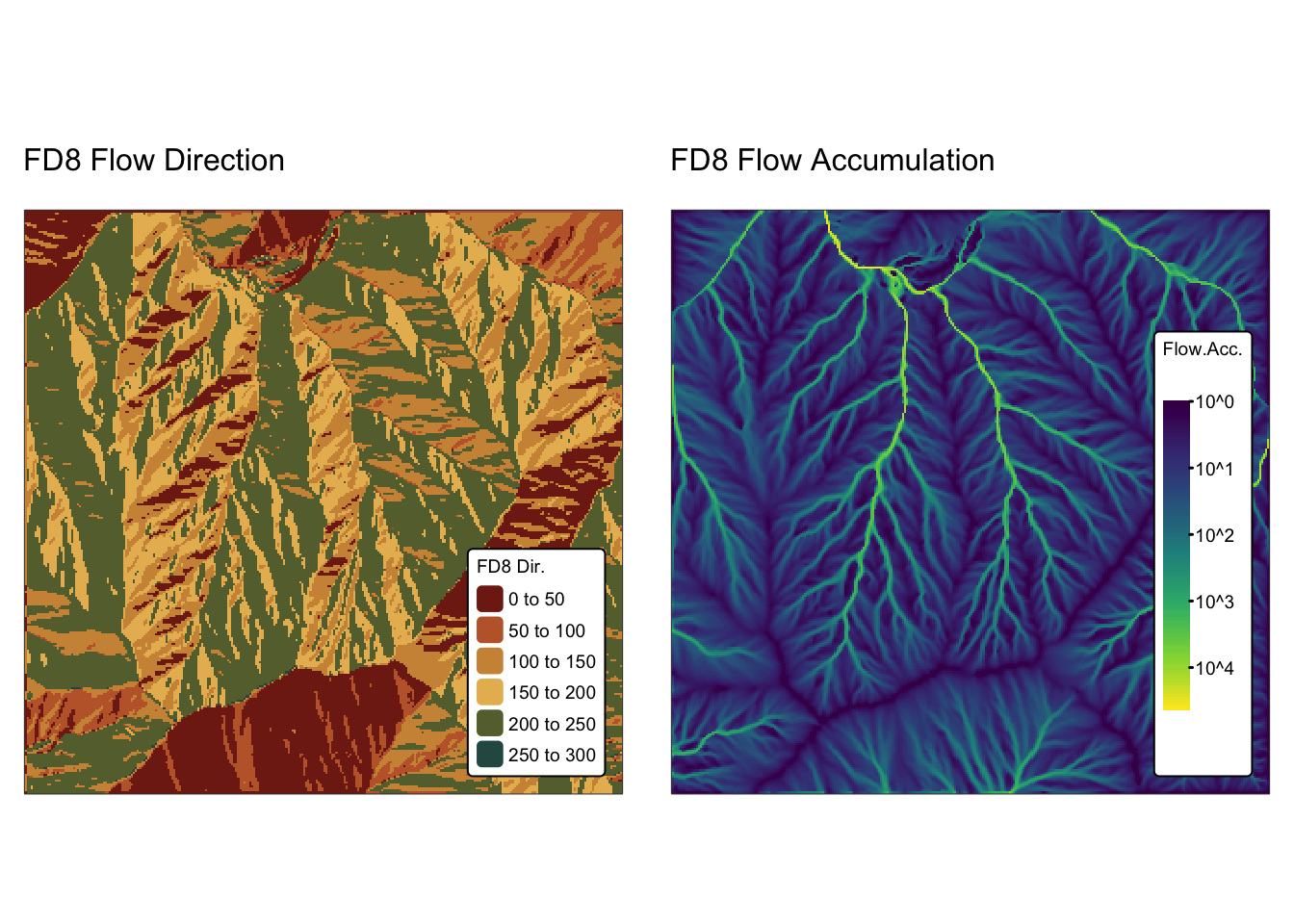
# Plot flow direction
m1 <- bnd_map + tm_shape(r_dinf) + tm_raster("Dinf Dir.",
           col.scale = tm_scale(values = "met.tiepolo")) +
       tm_layout(frame = FALSE,
                 legend.text.size = 0.6,
                 legend.title.size = 0.6,
                 legend.position = c("right", "bottom"),
                 legend.bg.color = "white") +
       tm_title("Dinf Flow Direction", size = 1)

# Plot flow accumulation
m2 <- bnd_map + tm_shape(r_fa_dinf) + tm_raster("Flow.Acc.",
           col.scale = tm_scale_continuous_log10(values = "viridis")) +
       tm_layout(frame = FALSE,
                 legend.text.size = 0.6,
                 legend.title.size = 0.6,
                 legend.position = c("right", "bottom"),
                 legend.bg.color = "white") +
       tm_title("Dinf Flow Accumulation", size = 1)

tmap_arrange(m1, m2, asp = NA)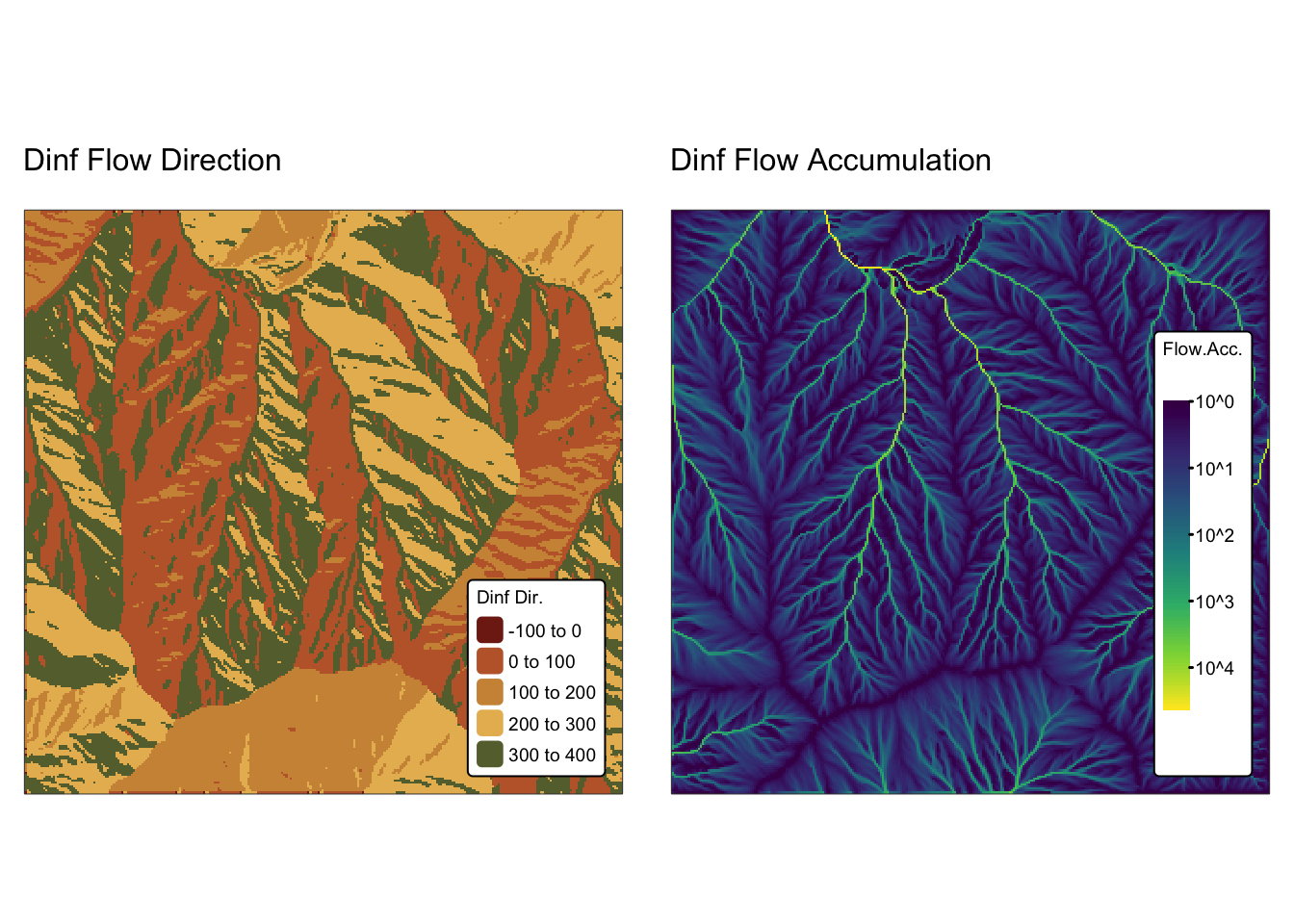
The D8, FD8, and Dinf flow routing methods each generate flow accumulation rasters that exhibit significant differences in the portrayal of drainage networks and water flow patterns (see Fig. 5). These variations stem from the unique algorithms each method employs to determine flow direction. For example, while the FD8 method allows water to diverge and split into multiple flow paths, the Dinf method calculates continuous flow directions rather than confining flow to the eight fixed orientations imposed by the D8 approach.
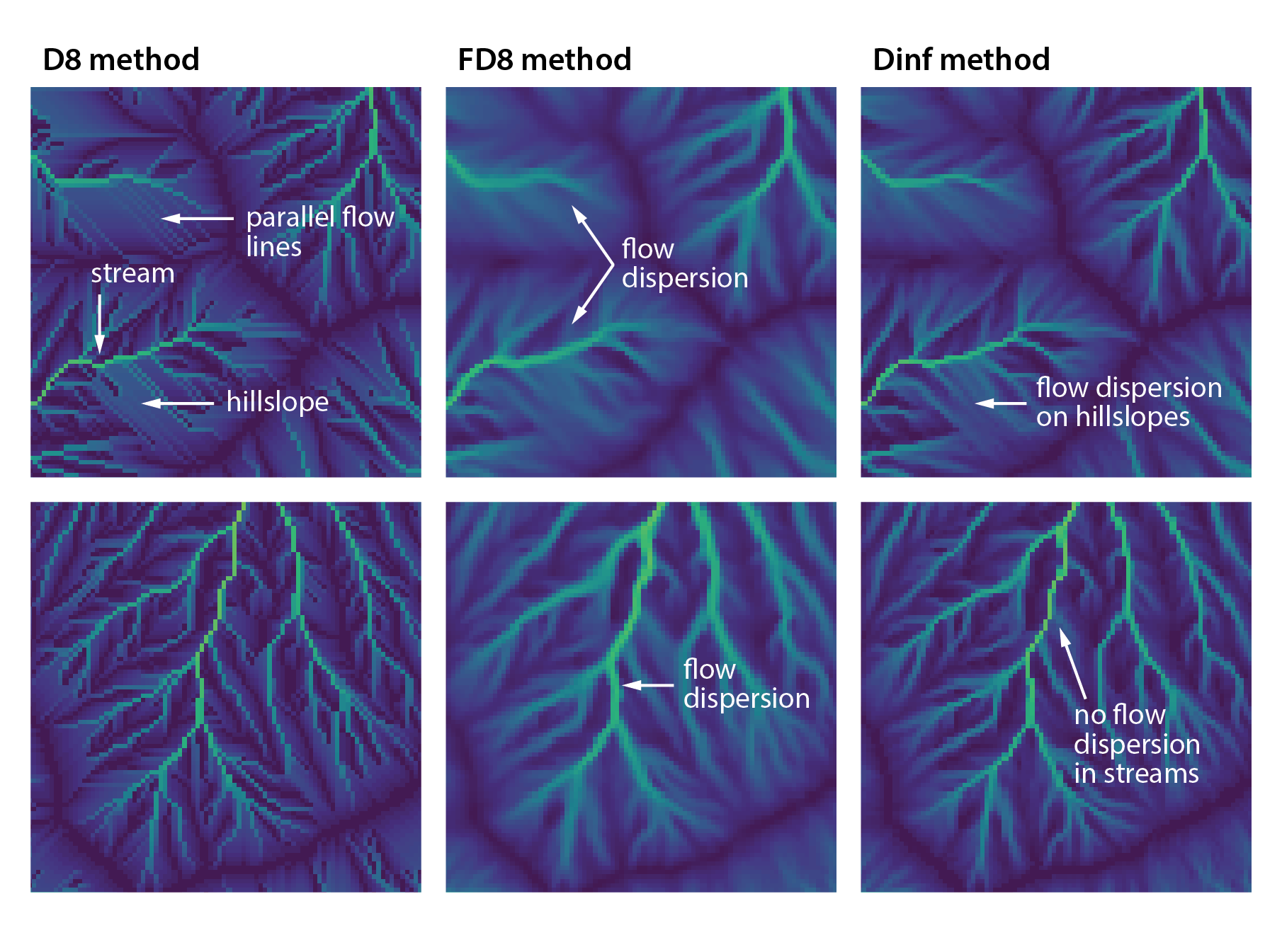
Fig. 5: Detail of flow accumulation rasters calculated from
jp_dem using the D8, FD8, and Dinf flow routing methods.
Delineating watersheds
Watershed delineation is performed using the
Watershed tool, which is invoked through the
wtb_watershed() function. This function requires a D8 flow
direction raster and a pour point file in ESRI
shapefile format. Unlike the watershed() function
in terra, which delineates the watershed for a single
outlet location (pour point), the WhiteboxTools
wtb_watershed() function iterates through all outlet
locations stored in the provided pour point file.
In the next block of code, jp_outlets is exported as an
ESRI shapefile, and watershed delineation is then
carried out using the previously computed D8 flow direction raster
r_d8.
# Export basin outlets as ESRI shapefile
st_write(jp_outlets, "./data/dump/spat3/jp_outlets.shp", delete_dsn = TRUE)
## Deleting source `./data/dump/spat3/jp_outlets.shp' using driver `ESRI Shapefile'
## Writing layer `jp_outlets' to data source
## `./data/dump/spat3/jp_outlets.shp' using driver `ESRI Shapefile'
## Writing 2 features with 3 fields and geometry type Point.# Specify paths to output raster and pour point shapefile
jp_bas_wtb <- "./data/dump/spat3/jp_bas_wtb.tif"
jp_outlets_wtb <- "./data/dump/spat3/jp_outlets.shp"
# Delineate watersheds
wbt_watershed(
d8_pntr = r_d8, # D8 pointer raster file
pour_pts = jp_outlets_wtb, # Pour points (outlet) file
output = jp_bas_wtb, # Output raster file
esri_pntr=TRUE # D8 pointer uses the ESRI style scheme
)
# Read in watershed raster
jp_basins_wtb <- rast(jp_bas_wtb)
names(jp_basins_wtb) <- "Basin ID"Plot results using tmap:
# Plot basins
m1 <- bnd_map + tm_shape(jp_basins_wtb) + tm_raster("Basin ID",
           col.scale = tm_scale_categorical()) +
       tm_layout(frame = FALSE,
                 legend.text.size = 0.7,
                 legend.title.size = 0.7,
                 legend.position = c("right", "bottom"),
                 legend.bg.color = "white") +
         tm_title("Watersheds - whitebox", size = 1)

# Add original drainage basins and outlets for clarity
m2 <- m1 + tm_shape(jp_basins) + tm_borders("black")
m3 <- m2 + tm_shape(jp_outlets) + tm_dots(size = 0.7, "black")

# Show map
m3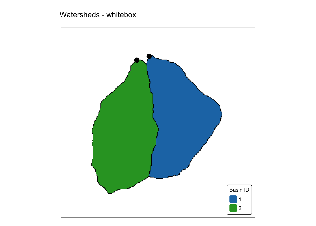
Reassuringly, the two watersheds delineated using
wtb_watershed() are identical to the ones delineated using
terra’s watershed().
Stream network analysis
Stream network analysis involves extracting and characterising the drainage network from a landscape. The process typically includes:
- Stream extraction: by applying a threshold to the flow accumulation grid, cells that form part of the stream network are identified and extracted.
- Stream ordering: once the streams are delineated, techniques like Strahler or Shreve ordering are used to classify the hierarchy of the stream segments.
- Calculating flow lengths: calculating the upstream and downstream distances along a stream network provides insights into the potential velocity and travel time of water.
Stream Ordering Methods
Strahler ordering: streams with no tributaries are assigned a first-order. When two streams of the same order meet, the resulting stream’s order increases by one. If streams of differing orders merge, the higher order is maintained. This method emphasises the hierarchy of branching and is useful for understanding how water flow aggregates in a catchment.
Shreve ordering: instead of a hierarchy based solely on the meeting of like-ordered streams, Shreve’s method sums the contributions (or magnitudes) of all upstream tributaries. this provides a more graduated measure of the cumulative drainage area, reflecting both the number and intensity of tributaries.
Horton ordering: builds upon the Strahler ordering scheme but modifies it by assigning the same order value to all segments along the main trunk of the network, replacing their originally assigned values with the order of the outlet. In contrast, the Strahler ordering scheme does not differentiate the main channel from its tributaries, maintaining a consistent hierarchy based solely on confluences.
Hack ordering: the main stream is assigned an order of one. All tributaries to the main stream are assigned an order of two, tributaries to second-order links are assigned an order of three, and so forth. The trunk or main stream of the network can be defined based on the furthest upstream distance at each bifurcation (i.e., network junction).
In the next block of R code, a stream network is extracted from
jp_dem and the streams are then ordered using the Strahler
and Shreve ordering schemes.
The function wbt_extract_streams() requires a flow
accumulation grid calculated using the D8 flow routing method and a
threshold basin area value, which represents the area at which flow
transitions from a diffusive to an advective regime, leading to the
formation of streams. A commonly used threshold value is 1 square km.
However, given the small size of the basins in jp_dem, we
adopt a threshold area of 0.025 square km for illustrative purposes.
# Specify paths to output rasters
jp_streams_wtb <- "./data/dump/spat3/jp_stream_wtb.tif"
jp_strahler_wtb <- "./data/dump/spat3/jp_strahler_wtb.tif"
jp_shreve_wtb <- "./data/dump/spat3/jp_shreve_wtb.tif"

# Extract streams
# Here we chose a threshold of 1000 pixels = 0.025km2 (5m DEM)
# This is an unrealistically small value but OK for demonstrating how the
# method work. Realistic threshold area values can be calculated using
# slope/area plots or other more advanced methods.
wbt_extract_streams(
    flow_accum = r_fa_d8,       # D8 flow accumulation file
    output = jp_streams_wtb,    # Output raster file
    threshold = 1000,           # Threshold in flow accumulation for channelization
    zero_background=FALSE       # Use NoData for no streams
)

# Do Strahler and Shreve stream ordering
# Other schemes use the same input:
# wbt.horton_stream_order() for Horton ordering
# wbt_hack_stream_order() for Hack ordering
wbt_strahler_stream_order(
    d8_pntr = r_d8,             # D8 pointer raster file,
    streams = jp_streams_wtb,   # Raster streams file
    output = jp_strahler_wtb,   # Output Strahler raster
    esri_pntr=TRUE,             # D8 pointer uses the ESRI style scheme
    zero_background=FALSE       # Use NoData for no streams
)

wbt_shreve_stream_magnitude(
    d8_pntr = r_d8,             # D8 pointer raster file,
    streams = jp_streams_wtb,   # Raster streams file
    output = jp_shreve_wtb,     # Output Shreve raster
    esri_pntr=TRUE,             # D8 pointer uses the ESRI style scheme
    zero_background=FALSE       # Use NoData for no streams
)

# Read in Strahler raster
jp_strahler_wtb <- rast(jp_strahler_wtb)
names(jp_strahler_wtb) <- "Strahler N."

# Read in Shreve raster
jp_shreve_wtb <- rast(jp_shreve_wtb)
names(jp_shreve_wtb) <- "Shreve N."
Plot results using tmap:
# Plot Strahler
m1 <- bnd_map + tm_shape(jp_strahler_wtb) + tm_raster("Strahler N.",
           col.scale = tm_scale_categorical(values = "turbo")) +
       tm_layout(frame = FALSE,
                 legend.text.size = 0.7,
                 legend.title.size = 0.7,
                 legend.position = c("right", "bottom"),
                 legend.bg.color = "white") +
         tm_title("Strahler stream order - whitebox", size = 1)

# Add original drainage basins and outlets for clarity
m2 <- m1 + tm_shape(jp_basins) + tm_borders("black")
m3 <- m2 + tm_shape(jp_outlets) + tm_dots(size = 0.7, "black")

# Plot Shreve
m4 <- bnd_map + tm_shape(jp_shreve_wtb) + tm_raster("Shreve N.",
           col.scale = tm_scale_categorical(values = "turbo")) +
       tm_layout(frame = FALSE,
                 legend.text.size = 0.7,
                 legend.title.size = 0.7,
                 legend.position = c("right", "bottom"),
                 legend.bg.color = "white") +
         tm_title("Shreve stream order - whitebox", size = 1)

# Add original drainage basins and outlets for clarity
m5 <- m4 + tm_shape(jp_basins) + tm_borders("black")
m6 <- m5 + tm_shape(jp_outlets) + tm_dots(size = 0.7, "black")

# Show map
tmap_arrange(m3, m6, asp = NA)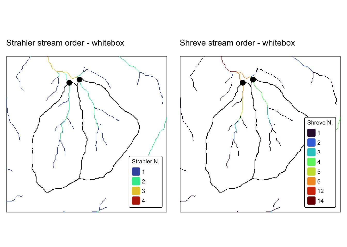
Next, we calculate flow length.
The wbt_max_upslope_flowpath_length() function computes
the maximum length of the flowpaths traversing each grid cell (measured
in map units) in an input digital elevation model. In contrast, the
wbt_downslope_flowpath_length() function determines the
downslope flowpath length from each grid cell in a raster to an outlet
cell—either at the edge of the grid or at the watershed outlet (if a
watershed raster is provided via the watershed
argument).
# Specify paths to output rasters
jp_up_length_wtb <- "./data/dump/spat3/jp_up_len_wtb.tif"
jp_dwn_length_wtb <- "./data/dump/spat3/jp_dwn_len_wtb.tif"

# Calculate flow lengths
wbt_max_upslope_flowpath_length(
    dem = r_filled,              # Conditioned DEM file
    output = jp_up_length_wtb    # Output flow length
)

# Optional:
# watersheds - The optional watershed image can be used to define one
#  or more irregular-shaped watershed boundaries.
# weights - The optional weight image is multiplied by the flow-length
#  through each grid cell.
wbt_downslope_flowpath_length(
    d8_pntr = r_d8,
    output = jp_dwn_length_wtb,
    esri_pntr=TRUE
)

# Read in flow length rasters
jp_up_length_wtb <- rast(jp_up_length_wtb)
names(jp_up_length_wtb) <- "Flow Length"

jp_dwn_length_wtb <- rast(jp_dwn_length_wtb)
names(jp_dwn_length_wtb) <- "Flow Length"
Plot results using tmap:
# Plot upsream length
m1 <- bnd_map + tm_shape(jp_up_length_wtb) + tm_raster("Flow Length",
           col.scale = tm_scale_continuous(values = "viridis")) +
       tm_layout(frame = FALSE,
                 legend.text.size = 0.7,
                 legend.title.size = 0.7,
                 legend.position = c("right", "bottom"),
                 legend.bg.color = "white") +
         tm_title("Upstream Flow Length - whitebox", size = 1)

# Add original drainage basins and outlets for clarity
m2 <- m1 + tm_shape(jp_basins) + tm_borders("black")
m3 <- m2 + tm_shape(jp_outlets) + tm_dots(size = 0.7, "black")

# Plot downstream length
m4 <- bnd_map + tm_shape(jp_dwn_length_wtb) + tm_raster("Flow Length",
           col.scale = tm_scale_continuous(values = "viridis")) +
       tm_layout(frame = FALSE,
                 legend.text.size = 0.7,
                 legend.title.size = 0.7,
                 legend.position = c("right", "bottom"),
                 legend.bg.color = "white") +
         tm_title("Downstream Flow Length - whitebox", size = 1)

# Add original drainage basins and outlets for clarity
m5 <- m4 + tm_shape(jp_basins) + tm_borders("black")
m6 <- m5 + tm_shape(jp_outlets) + tm_dots(size = 0.7, "black")

# Show map
tmap_arrange(m3, m6, asp = NA)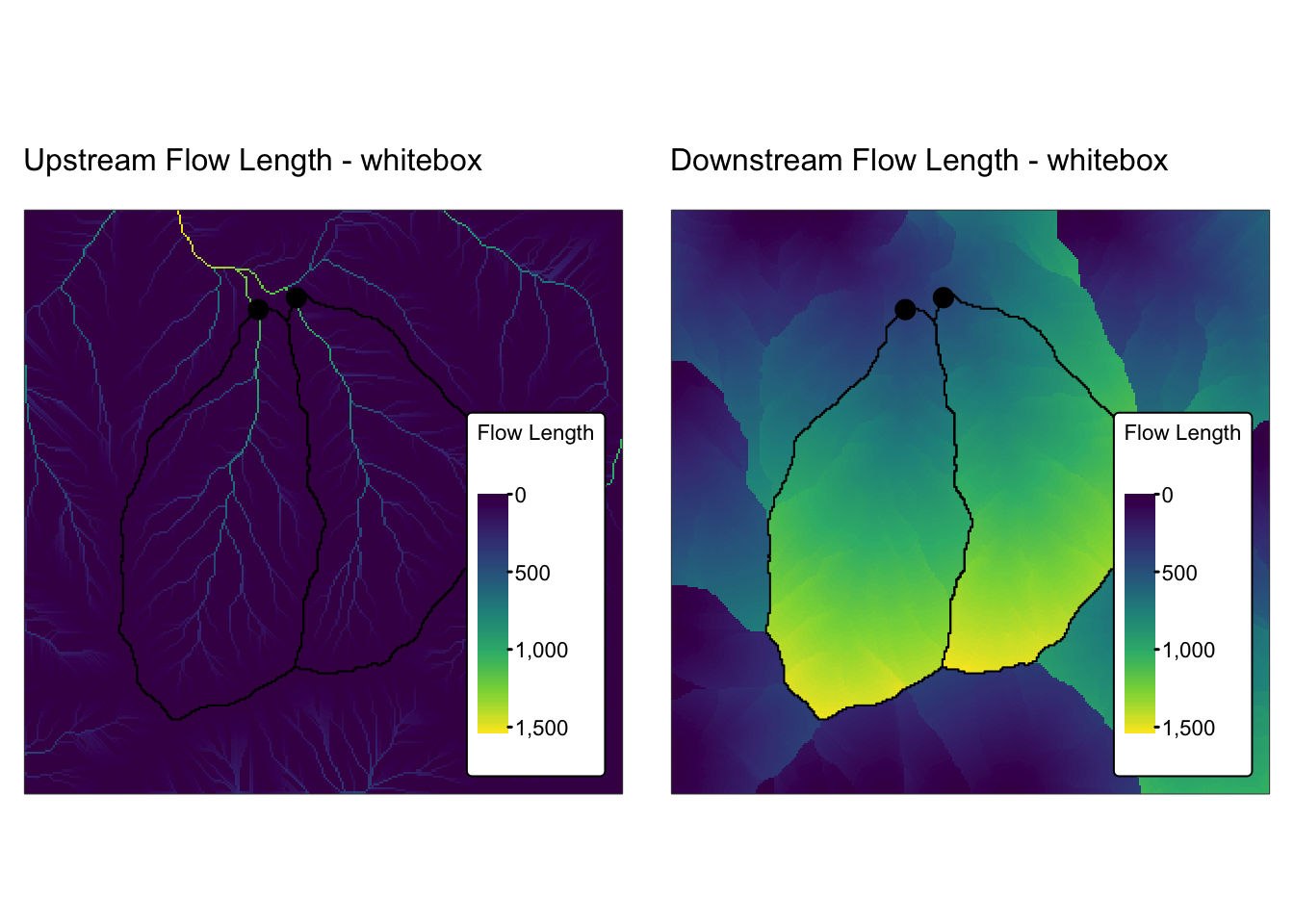
Summary
This practical focused on spatial interpolation and the analysis of
continuous fields. It introduced two powerful packages:
gstat for geostatistical modelling, prediction, and
simulation, and whitebox, an R frontend for
WhiteboxTools, an advanced geospatial data analysis platform.
Additionally, it also introduced the plotly package, an
open-source library that enables the creation of interactive, web-based
data visualisations directly from R by leveraging the capabilities of
the plotly.js JavaScript library.
The first part of the practical demonstrated how to convert a discrete POINT geometry sf object into a continuous terra SpatRaster — a transformation essential for analysing spatial patterns and gradients across a landscape. This section provided a detailed, step-by-step guide to understanding and applying interpolation techniques to generate continuous surfaces from point data.
In the second part, the focus shifted to the analysis of continuous fields using an existing digital elevation model (DEM). This section showcased a range of geospatial operations, including convolution, viewshed analysis, and terrain analysis — techniques that are crucial for applications such as hydrological modelling and landform analysis.
List of R functions
This practical showcased a diverse range of R functions. A summary of these is presented below:
base R functions
all.equal(): compares two R objects for near equality while allowing for minor numerical differences. It returns TRUE if the objects are nearly identical or a description of the differences otherwise.as.data.frame(): coerces its input into a data frame, ensuring a tabular structure for the data. It is especially useful when converting lists, matrices, or other objects into a format amenable to data analysis.as.numeric(): converts its argument into numeric form, which is essential when performing mathematical operations. It is often used to change factors or character strings into numbers for computation.as.vector(): transforms an object into a vector by stripping it of any additional attributes. It is used when a simplified, one-dimensional representation of the data is needed.as(): converts an object from one class to another according to a defined conversion rule. It is an integral part of R’s formal object‐oriented programming system.c(): concatenates its arguments to create a vector, which is one of the most fundamental data structures in R. It is used to combine numbers, strings, and other objects into a single vector.cbind(): binds objects by columns to form a matrix or data frame. It ensures that the input objects have matching row dimensions and aligns them side by side.coef(): extracts the estimated coefficients from a fitted statistical model, such as a linear regression. It is commonly used to summarise model parameters and interpret the relationships between variables.do.call(): calls a specified function with a list of arguments, allowing dynamic construction of function arguments. It is particularly useful when the arguments to a function are stored in a list or when programming with variable numbers of arguments.expand.grid(): generates a data frame from all combinations of supplied vectors or factors. It is frequently used to create parameter grids for simulations or experimental designs.head(): returns the first few elements or rows of an object, such as a vector, matrix, or data frame. It is a convenient tool for quickly inspecting the structure and content of data.I(): inhibits the interpretation of its argument, ensuring that expressions are treated “as is” in formulas. It is useful when you want to include mathematical expressions or operators without R modifying their meaning.length(): returns the number of elements in a vector or list. It is a basic utility for checking the size or dimensionality of an object.lm(): fits linear models to data using the method of least squares, enabling regression analysis. It is widely used for modeling relationships between a dependent variable and one or more independent variables.matrix(): constructs a matrix by arranging a sequence of elements into specified rows and columns. It is fundamental for performing matrix computations and linear algebra operations in R.max(): returns the largest value from a set of numbers or a numeric vector. It is used to identify the upper bound of data values in a dataset.min(): returns the smallest value from a set of numbers or a numeric vector. It is commonly used to determine the lower bound of a dataset.ncol(): returns the number of columns in a matrix or data frame. It helps in understanding the structure and dimensionality of tabular data.nrow(): returns the number of rows in a data frame, matrix, or other two-dimensional object. It provides a quick way to assess the size of tabular data by counting its rows.predict(): generates predicted values from a fitted model object using new data if provided. It is a key tool for model evaluation and forecasting in regression analysis.range(): computes the minimum and maximum values of its input and returns them as a vector of length two. It provides a simple summary of the spread of numeric data.sample(): randomly selects elements from a vector, either with or without replacement. It is indispensable for generating random samples and shuffling data.seq(): generates regular sequences of numbers based on specified start, end, and increment values. It is essential for creating vectors that represent ranges or intervals.set.seed(): sets the seed of R’s random number generator, ensuring reproducibility of random processes. It is crucial for making sure that analyses involving randomness yield consistent results on repeated runs.sqrt(): calculates the square root of its numeric argument. It is a basic arithmetic function often used in mathematical and statistical computations.stop(): generates an error message and stops the execution of the current expression or script. It is used to enforce conditions and halt further computation when something goes wrong.sum(): adds together all the elements in its numeric argument. It is one of the most straightforward arithmetic functions used to compute totals.
dplyr (tidyverse) functions
mutate(): adds new columns or transforms existing ones within a data frame. It is essential for creating derived variables and modifying data within the tidyverse workflow.row_number(): generates a sequential ranking of rows, often used to create unique identifiers. It is particularly useful within grouped operations to order or index rows.
ggplot2 (tidyverse) functions
aes(): defines aesthetic mappings in ggplot2 by linking data variables to visual properties such as color, size, and shape. It forms the core of ggplot2’s grammar for mapping data to visuals.coord_fixed(): sets a fixed aspect ratio between the x and y axes, ensuring that one unit on the x-axis is the same length as one unit on the y-axis. It is important when a true geometric representation is required in a plot.ggplot(): initialises a ggplot object and establishes the framework for creating plots using the grammar of graphics. It allows for incremental addition of layers, scales, and themes to build complex visualizations.geom_abline(): adds a straight line with a specified slope and intercept to a plot. It is often used to display reference lines, such as a line of equality in observed versus predicted plots.geom_point(): adds points to a ggplot2 plot, producing scatter plots that depict the relationship between two continuous variables. It is a fundamental component for visualizing individual observations.geom_smooth(): overlays a smooth line, such as a regression line, on top of a scatter plot. It helps to reveal trends or patterns in the data by fitting a statistical model.labs(): allows you to add or modify labels in a ggplot2 plot, such as titles, axis labels, and captions. It enhances the readability and interpretability of visualizations.scale_x_continuous(): customizes the x-axis scale in a ggplot, including breaks and labels. It allows precise control over the presentation of numeric data on the x-axis.scale_y_continuous(): customizes the y-axis scale in a ggplot, similar toscale_x_continuous(). It ensures that the y-axis meets both visual and analytical requirements.theme(): modifies non-data elements of a ggplot, such as fonts, colors, and backgrounds. It provides granular control over the overall appearance of the plot.
gstat functions
gstat(): creates a geostatistical model object that is used to set up spatial interpolation or variogram analysis. It encapsulates the formula, data, and parameters required for subsequent geostatistical computations.idw(): performs inverse distance weighting interpolation, estimating values at unsampled locations by averaging nearby observations with distance-based weights. It is widely used in spatial analysis when a simple, deterministic method is required.krige(): carries out kriging interpolation, a geostatistical method that provides both predictions and associated uncertainty measures. It uses a variogram model to weigh nearby data points according to spatial correlation.fit.variogram(): fits a theoretical variogram model to empirical variogram data, optimizing parameters such as sill, range, and nugget. It is a critical step in preparing data for kriging by establishing the spatial structure.variogram(): computes the empirical semivariance of spatial data over different lag distances. It is used to quantify the spatial autocorrelation in the data and forms the basis for fitting a variogram model.variogramLine(): generates predicted semivariance values from a fitted variogram model over a specified range of distances. It is commonly used to visualize the theoretical variogram curve against the empirical variogram points.vgm(): defines a theoretical variogram model by specifying its parameters, including the nugget, sill, and range. It provides the model structure needed to perform variogram fitting and subsequent kriging interpolation.
plotly functions
add_surface(): adds a three-dimensional surface layer to an existing plotly visualization. It is typically used to render matrix or grid-based data in 3D, providing an interactive perspective of surfaces.add_trace(): adds an additional layer, or “trace,” to a plotly plot, allowing multiple data series to be overlaid. It supports a variety of plot types, including scatter, line, and 3D markers, for comprehensive visual analysis.layout(): customises the overall layout of a plotly graph by adjusting properties such as axis titles, margins, and the scene settings for 3D plots. It enables detailed fine-tuning of the plot’s appearance and structure.plot_ly(): initializes a new plotly visualization and sets up the base for adding traces and layouts. It is the starting point for creating interactive plots with plotly’s flexible graphical system.
sf functions
st_as_sf(): converts various spatial data types, such as data frames or legacy spatial objects, into an sf object. It enables standardised spatial operations on the data.st_bbox(): computes the bounding box of a spatial object, representing the minimum rectangle that encloses the geometry. It is useful for setting map extents and spatial limits.st_coordinates(): extracts the coordinate matrix from an sf object, providing a numeric representation of spatial locations. It is often used when the coordinates need to be manipulated separately from the geometry.st_crs(): retrieves or sets the coordinate reference system (CRS) of spatial objects. It is essential for ensuring that spatial data align correctly on maps.st_intersection(): computes the geometric intersection between spatial features. It is used to identify overlapping areas or shared boundaries between different spatial objects.st_point(): generates point geometries from a vector of coordinates, representing specific locations in space. It is widely used for mapping individual locations or creating simple spatial objects.st_read(): reads spatial data from a file (such as shapefiles, GeoJSON, or GeoPackages) into an sf object. It is the primary method for importing external geospatial data into R.st_sfc(): creates a simple feature geometry list column from one or more geometries. It is used to construct sf objects from raw geometrical inputs.st_transform(): reprojects spatial data into a different coordinate reference system. It ensures consistent spatial alignment across multiple datasets.st_write(): writes an sf object to an external file in various formats, such as shapefiles or GeoPackages. It is used to export spatial data for sharing or use in other applications.
terra functions
as.matrix(): converts a SpatRaster object into a matrix form, which is useful for further numerical manipulation or plotting. It facilitates the extraction of raster cell values into a standard R matrix.crs(): retrieves or sets the coordinate reference system for spatial objects such as SpatRaster or SpatVector. It is essential for proper projection and alignment of spatial data.extract(): retrieves cell values from a SpatRaster at specified locations given by a SpatVector. It is widely used for sampling raster data based on point or polygon geometries.focal(): applies a moving window (or kernel) function to a SpatRaster, performing local operations such as smoothing or edge detection. It is a powerful tool for spatial filtering and analysing local patterns.flowAccumulation(): calculates the accumulation of flow for each cell in a raster based on a provided flow direction grid. It is essential in hydrological modelling to estimate how water converges across a landscape.rast(): creates a new SpatRaster object or converts data into a raster format. It is the entry point for handling multi-layered spatial data in terra.rasterize(): converts vector data (such as points, lines, or polygons) into a raster format by assigning values to cells based on a specified field. This process is vital for integrating vector and raster data in spatial analyses.terrain(): computes terrain attributes such as slope, aspect, or flow direction from a digital elevation model (DEM). It is a key function in geomorphological and hydrological analyses.vect(): converts various data types into a SpatVector object for vector spatial analysis. It supports points, lines, and polygons for versatile spatial data manipulation.xmin(): returns the minimum x-coordinate value from a spatial object, defining one boundary of its extent. It is a helper function for determining the spatial limits of an object.xmax(): returns the maximum x-coordinate value from a spatial object, indicating the other horizontal limit. It is used alongside xmin() to describe the full horizontal span.ymin(): returns the minimum y-coordinate value of a spatial object, defining the lower boundary of its extent. It assists in establishing the vertical limits for mapping and spatial analysis.ymax(): returns the maximum y-coordinate value of a spatial object, which is the upper limit of its extent. Together with ymin(), it fully characterises the vertical range of spatial data.
tmap functions
tm_borders(): draws border lines around spatial objects on a map. It is often used in combination with fill functions to delineate regions clearly.tm_dots(): plots point features on a tmap, useful for visualizing locations or events. It supports customization of size, color, and shape to enhance map interpretation.tm_fill(): fills spatial objects with color based on data values or specified aesthetics in a tmap. It is a key function for thematic mapping.tm_graticules(): adds graticule lines (latitude and longitude grids) to a map, providing spatial reference. It improves map readability and context.tm_layout(): customises the overall layout of a tmap, including margins, frames, and backgrounds. It provides fine control over the visual presentation of the map.tm_legend(): customises the appearance and title of map legends in tmap. It is used to enhance the clarity and presentation of map information.tm_raster(): adds a raster layer to a map with options for transparency and color palettes. It is tailored for visualizing continuous spatial data.tm_scale_categorical(): applies a categorical color scale to represent discrete data in tmap. It is ideal for mapping data that fall into distinct classes.tm_scale_continuous(): applies a continuous color scale to a raster layer in tmap. It is suitable for representing numeric data with smooth gradients.tm_scale_continuous_log10(): applies a continuous colour scale based on a log10 transformation to a raster layer in tmap. It is useful for visualising data with exponential characteristics or a wide dynamic range.tm_scale_continuous_sqrt(): applies a square root transformation to a continuous color scale in tmap. It is useful for visualizing data with skewed distributions.tm_scale_intervals(): creates a custom interval-based color scale for a raster layer in tmap. It enhances visualization by breaking data into meaningful ranges.tm_shape(): defines the spatial object that subsequent tmap layers will reference. It establishes the base layer for building thematic maps.tm_title(): adds a title and optional subtitle to a tmap, providing descriptive context. It helps clarify the purpose and content of the map.tmap_arrange(): arranges multiple tmap objects into a single composite layout. It is useful for side-by-side comparisons or dashboard displays.
whitebox functions
wbt_init(): initialises the WhiteboxTools environment within R by setting up the necessary configurations and paths. It must be run before any Whitebox geoprocessing functions are used.wbt_aspect(): calculates the aspect (direction of slope) from a digital elevation model (DEM) using WhiteboxTools. It outputs a raster layer that shows the orientation of terrain slopes.wbt_breach_depressions_least_cost(): removes depressions (or sinks) in a DEM by identifying least-cost breach paths, thereby conditioning the DEM for hydrological modelling. It modifies the elevation data so that water can flow more naturally across the surface.wbt_d8_flow_accumulation(): computes the flow accumulation from a D8 flow pointer raster using WhiteboxTools. It calculates how many cells contribute flow to each cell, a key step in watershed analysis.wbt_d8_pointer(): generates a D8 flow direction pointer raster from a DEM using WhiteboxTools. It assigns directional codes to each cell based on the steepest descent path, facilitating subsequent hydrological analyses.wbt_d_inf_flow_accumulation(): calculates flow accumulation using the D-infinity method via WhiteboxTools. It allows water to flow in multiple directions, offering a more dispersed representation of hydrological flow.wbt_d_inf_pointer(): produces a D-infinity flow direction raster from a DEM using WhiteboxTools. It offers a more nuanced and continuous representation of flow direction compared to the discrete D8 method.wbt_downslope_flowpath_length(): computes the downslope flowpath length from each cell in a DEM using WhiteboxTools. It measures the distance water travels from a given cell along the steepest descent to the edge of the basin.wbt_fd8_flow_accumulation(): calculates flow accumulation using the FD8 (multiple flow direction) algorithm via WhiteboxTools. It captures more realistic flow dispersion across complex terrain compared to single-flow methods.wbt_fd8_pointer(): generates an FD8 flow direction raster from a DEM using WhiteboxTools. It produces a directional grid that accounts for flow in multiple directions, enhancing the accuracy of hydrological models.wbt_fill_depressions(): fills depressions in a DEM to eliminate sinks and ensure hydrological connectivity using WhiteboxTools. It raises the elevation of low-lying cells to a level that permits continuous flow.wbt_gaussian_curvature(): calculates the Gaussian curvature of a DEM using WhiteboxTools, providing a measure of the surface’s intrinsic curvature. It helps in identifying areas of convexity or concavity on the landscape.wbt_max_upslope_flowpath_length(): computes the maximum upslope flowpath length from each cell in a DEM using WhiteboxTools. It quantifies the longest distance water travels to reach a given cell, which is important for hydrological modelling.wbt_maximal_curvature(): calculates the maximal curvature of a DEM using WhiteboxTools, indicating the highest rate of change in the slope. It is used in terrain analysis to understand the intensity of curvature in the steepest direction.wbt_mean_curvature(): computes the mean curvature of a DEM using WhiteboxTools by averaging curvature in multiple directions. It provides a generalised measure of the surface curvature for each cell.wbt_minimal_curvature(): calculates the minimal curvature of a DEM using WhiteboxTools, identifying the direction with the least curvature. It complements maximal curvature to give a full picture of terrain shape.wbt_plan_curvature(): computes the plan curvature of a DEM using WhiteboxTools, measuring the curvature in the horizontal (plan) dimension. It is particularly useful for assessing flow convergence or divergence in a landscape.wbt_profile_curvature(): calculates the profile curvature of a DEM using WhiteboxTools, which relates to the curvature along the slope. It helps to understand how acceleration or deceleration of flow occurs on a slope.wbt_shreve_stream_magnitude(): computes stream magnitude using Shreve’s method via WhiteboxTools, summing the contributing flows of a drainage network. It provides a quantitative measure of stream size based on network branching.wbt_strahler_stream_order(): assigns Strahler stream orders to a drainage network using WhiteboxTools, ranking streams by hierarchy. It is a standard method for classifying stream size and network complexity in hydrological studies.wbt_tangential_curvature(): calculates the tangential curvature of a DEM using WhiteboxTools, which measures curvature perpendicular to the slope direction. It is used to assess how the terrain bends laterally, affecting flow dispersion.wbt_watershed(): delineates watershed basins from a flow direction raster using WhiteboxTools. It identifies the catchment areas that drain to specified pour points, essential for hydrological analysis and water resource management.