Trace element soil contamination from smelters in the Illawarra
SCII205: Introductory Geospatial Analysis / Practical No. 8
Alexandru T. Codilean
Last modified: 2025-06-14
![]()
Introduction
In this practical, we will replicate a study by Yasaman Jafari and colleagues that mapped the overall trace element contamination of soils around the former Port Kembla and Kanahooka smelters in the Illawarra region of New South Wales, with a primary focus on copper, lead, zinc, nickel, and arsenic.
Published in Environmental Earth Sciences, the study investigated the regional distribution of trace elements in soil samples collected around the industrial complex at Port Kembla. The findings indicated that the most severe contamination occurred in samples collected near the Port Kembla copper smelter stack and the Kanahooka lead smelter, suggesting that the pollution originated directly from anthropogenic activities.
Spatial interpolation is a robust statistical method used to predict values at unsampled locations based on known sample data. This study serves as an excellent example of applying spatial interpolation in R, utilising packages such as sf for manipulating spatial vector data, terra for efficient handling of raster data, and gstat for conducting spatial interpolation and geostatistical analysis. In this practical exercise, we will replicate the study’s methodology to explore and visualise the spatial distribution of trace element contamination patterns around the Port Kembla and Kanahooka industrial sites.
R packages
The practical will utilise R functions from packages explored in previous sessions.
Spatial data manipulation and analysis:
The sf package: provides a standardised framework for handling spatial vector data in R based on the simple features standard (OGC). It enables users to easily work with points, lines, and polygons by integrating robust geospatial libraries such as GDAL, GEOS, and PROJ.
The terra package: is designed for efficient spatial data analysis, with a particular emphasis on raster data processing and vector data support. As a modern successor to the raster package, it utilises improved performance through C++ implementations to manage large datasets and offers a suite of functions for data import, manipulation, and analysis.
The gstat package: provides a comprehensive toolkit for geostatistical modelling, prediction, and simulation. It offers robust functions for variogram estimation, multiple kriging techniques (including ordinary, universal, and indicator kriging), and conditional simulation, making it a cornerstone for spatial data analysis in R.
Data wrangling:
- The tidyverse: is a collection of R packages designed for data science, providing a cohesive set of tools for data manipulation, visualization, and analysis. It includes core packages such as ggplot2 for visualization, dplyr for data manipulation, tidyr for data tidying, and readr for data import, all following a consistent and intuitive syntax.
Data visualisation:
The tmap package: provides a flexible and powerful system for creating thematic maps in R, drawing on a layered grammar of graphics approach similar to that of ggplot2. It supports both static and interactive map visualizations, making it easy to tailor maps to various presentation and analysis needs.
The plotly package: is an open-source library that enables the creation of interactive, web-based data visualizations directly from R by leveraging the capabilities of the
plotly.jsJavaScript library. It seamlessly integrates with other R packages like ggplot2, allowing users to convert static plots into dynamic, interactive charts with features such as zooming, hovering, and clickable elements.
Resources
- The Geocomputation with R book.
- The sf package documentation.
- The terra package documentation.
- The gstat package documentation.
- The tidyverse library of packages documentation.
- The tmap package documentation.
- The plotly package documentation.
Study methodology and findings
Methods
The methodology employed in the University of Wollongong (UOW) study is detailed in the Jafari et al. paper. Key points are summarised below:
Surface soil samples were collected from 395 suburban locations spanning Port Kembla to Kanahooka and the Windang Peninsula. Samples were taken from the top 5 cm of soil using a plastic hand trowel and stored in plastic bags; in disturbed areas, they were collected near the base of undisturbed, well-established trees. A handheld GPS recorded each sample’s UTM coordinates.
Particle size analysis was carried out using the laser diffraction method (Malvern Mastersizer 2000) to determine mean grain size, sand, silt, clay percentages, sorting, and skewness.
Samples were dried at 60°C for 2 days, crushed, and pressed into pellets for XRF trace element analysis, with all runs verified against certified standards (results within 5% of expected values) and analysed in duplicate. Enrichment factors were calculated as the ratio of mean trace element concentrations in soil samples to those in background samples.
Raster datasets for copper, lead, zinc, nickel, arsenic, and other trace elements were generated by interpolating data from the 395 sample sites using the inverse distance weighted (IDW) method, which assumes that trace element influence diminishes with distance.
Summary of key findings
Sources of contamination
Copper smelting: identified as the major source of Cu and associated elements, with both recent and historical emissions (including fugitive emissions from ore stockpiles) contributing to widespread contamination.
Other industrial processes: steelmaking, coking, base-metal smelting (e.g., at Kanahooka), and power generation (Tallawarra power station) have also contributed, with each process releasing specific trace elements.
Urban and vehicular sources: additional contributions come from urban contamination (e.g. lead from petrol) and non-industrial sources such as runoff and natural weathering.
Spatial distribution
The Port Kembla area shows a more widespread and irregular pattern of contamination due to the long operational history of the smelter (94 years) and the unregulated disposal of industrial waste.
The Kanahooka smelter, despite a shorter operational period (1896 to 1905), resulted in high localised concentrations because of the absence of pollution controls, with different elements dispersing over varying distances.
Deposition and environmental impact
- Atmospheric deposition from smelter emissions is a key transport mechanism, with the prevailing wind direction significantly affecting contaminant spread. Correlations between trace elements and sand content indicate that these contaminants are largely associated with particulate matter.
Guidelines and health concerns:
- When compared with ANZECC/ARMCANZ sediment quality guidelines, large areas — especially near the copper smelter — exceed the high trigger values for contaminants like Cu, Pb, and Zn, suggesting a need for environmental intervention. The study also highlighted specific sites (e.g. the old Port Kembla Public School and slag dump areas) where contamination poses potential public health risks.
Historical vs. modern emissions:
- Earlier industrial practices without proper dust/ash suppression contributed significantly to contamination. Although some soils have been remediated, legacy pollution in older urban areas remains problematic.
Install and load packages
All necessary packages should already be installed. Should this not be the case, execute the following chunk of code:
# Main spatial packages
install.packages("sf")
install.packages("terra")
install.packages("gstat")

# tidyverse for additional data wrangling
install.packages("tidyverse")

# tmap dev version
install.packages("tmap",
    repos = c("https://r-tmap.r-universe.dev",
              "https://cloud.r-project.org"))

# leaflet for dynamic maps
install.packages("leaflet")

# plotly for interactive 3D plots
install.packages("plotly")
Load packages:
Provided datasets
The following datasets are provided as part of this practical exercise:
aoi_smelters: An ESRI shapefile containing POINT geometries that indicate the locations of the Port Kembla and Kanahooka smelters. The Kanahooka smelter operated from 1896 to 1905 and the site that it once occupied has recently undergone partial rehabilitation. The Port Kembla copper refining and smelting plant was decommissioned in 2003.aoi_suburbs: An ESRI shapefile with POLYGON geometries outlining the administrative boundaries of the Wollongong suburbs where the soil samples were collected.trace_metal_data.csv: A comma-separated values (CSV) file that includes the locations of the soil samples along with the measured concentrations of copper, lead, zinc, nickel, and arsenic. The file includes data for 369 of the 395 soil samples reported in the Jafari et al. study.
Both ESRI shapefile datasets use the EPSG:32756 (WGS 84 / UTM zone
56S) coordinate reference system, and the eastings and northings in
heavy_metal_data.csv are also referenced to this CRS.
Load trace element data
The following block of R code loads trace_metal_data.csv
and converts the resulting data frame into an sf
spatial object:
# Path to trace metal file; modify as needed
metal_file <- "./data/data_interp/trace_metal_data.csv"

# Load data and replace missing values with NA
# Here we use read_csv() from readr (tydiverse)
metal_data <- read_csv(metal_file, na = c("", "NA"))

# Convert the data frame into an sf object with point geometries
# Set CRS to EPSG:32756 (WGS 84 / UTM zone 56S)
metal_data_sf <- st_as_sf(metal_data, coords = c("Easting", "Northing"), crs = 32756)

# Inspect the data
head(metal_data_sf)
The next block of code creates a bounding box with the extent of the sample locations. We will use this bounding box when setting up the grid for storing the interpolated values.
# Create the bounding box (this returns a named vector with xmin, ymin, xmax, ymax)
bbox <- st_bbox(metal_data_sf)

# Convert the bounding box into an sf polygon
bbox_sf <- st_as_sfc(bbox)
print(bbox_sf)
## Geometry set for 1 feature
## Geometry type: POLYGON
## Dimension: XY
## Bounding box: xmin: 297688 ymin: 6177297 xmax: 308623 ymax: 6184245
## Projected CRS: WGS 84 / UTM zone 56SLoad smelter and suburb data
The next block of code reads aoi_smelters and
aoi_suburbs as sf spatial objects:
# Path to smelter and suburb data
smelters <- "./data/data_interp/aoi_smelters.shp"
suburbs <- "./data/data_interp/aoi_suburbs.shp"

# Read data as sf objects
smelters_sf <- read_sf(smelters)
suburbs_sf <- read_sf(suburbs)

# Inspect the data
head(smelters_sf)Plot all data layers on an interactive map using
tmap, displaying copper concentrations for the
metal_data_sf dataset.
# Set tmap to view mode (for interactive maps)
tmap_mode("view")

# Create a tmap layer for suburb boundaries
map_suburbs <- tm_shape(suburbs_sf) + tm_borders("darkred")

# Create a tmap layer for a bounding box
map_bbox <- tm_shape(bbox_sf) + tm_borders("black", lty = 2)

# Create a tmap layer for smelters locations with symbols and labels
map_smelters <- tm_shape(smelters_sf) +
        tm_symbols(fill = "Smelter", size = 1, shape = 24)

# Create a tmap layer for metal sample points showing concentration of copper
map_samples <- tm_shape(metal_data_sf) +
        tm_dots(fill = "Cu_ppm", size = 0.5,
                fill.scale = tm_scale(values = "-inferno", style = "jenks"),
                fill.legend = tm_legend(title = "Cu [ppm]")
          )

# Combine all layers to create the final map
map_suburbs + map_bbox + map_samples + map_smelters
The map above shows a wide variation in Cu concentrations, with elevated levels clustered around the two former smelter sites, particularly near the Port Kembla Cu smelter, suggesting a potential link between Cu (and potentially other trace metal) levels and historical smelter activity.
Explore spatial patterns in the data
To investigate the potential relationship between historical smelter activity and trace metal concentrations, we calculated the distance from each sampling site to its nearest smelter and then plot trace metal concentrations against distance.
Calculate distances to nearest smelter sites:
smelters <- smelters_sf
soil_samples <- metal_data_sf
# For each soil sample, find the index of its nearest smelter
# 'st_nearest_feature' from the sf package returns the index of the nearest feature
# in 'smelters' for each feature in 'soil_samples'
nn_indices <- st_nearest_feature(soil_samples, smelters)
# Retrieve the smelter ID corresponding to each nearest smelter index and
# store it in the 'Smelter' field of soil_samples
soil_samples$Smelter <- smelters$Smelter[nn_indices]
# Calculate the distance from each soil sample to its nearest smelter
# 'st_distance' computes the spatial distance
# using by_element = TRUE calculates distances for corresponding pairs
soil_samples$Distance_to_smelter <-
st_distance(soil_samples, smelters[nn_indices, ], by_element = TRUE)
# Convert the distances to numeric values (units depend on the CRS)
soil_samples$Distance_to_smelter <- as.numeric(soil_samples$Distance_to_smelter)
# View the updated soil_samples attribute table
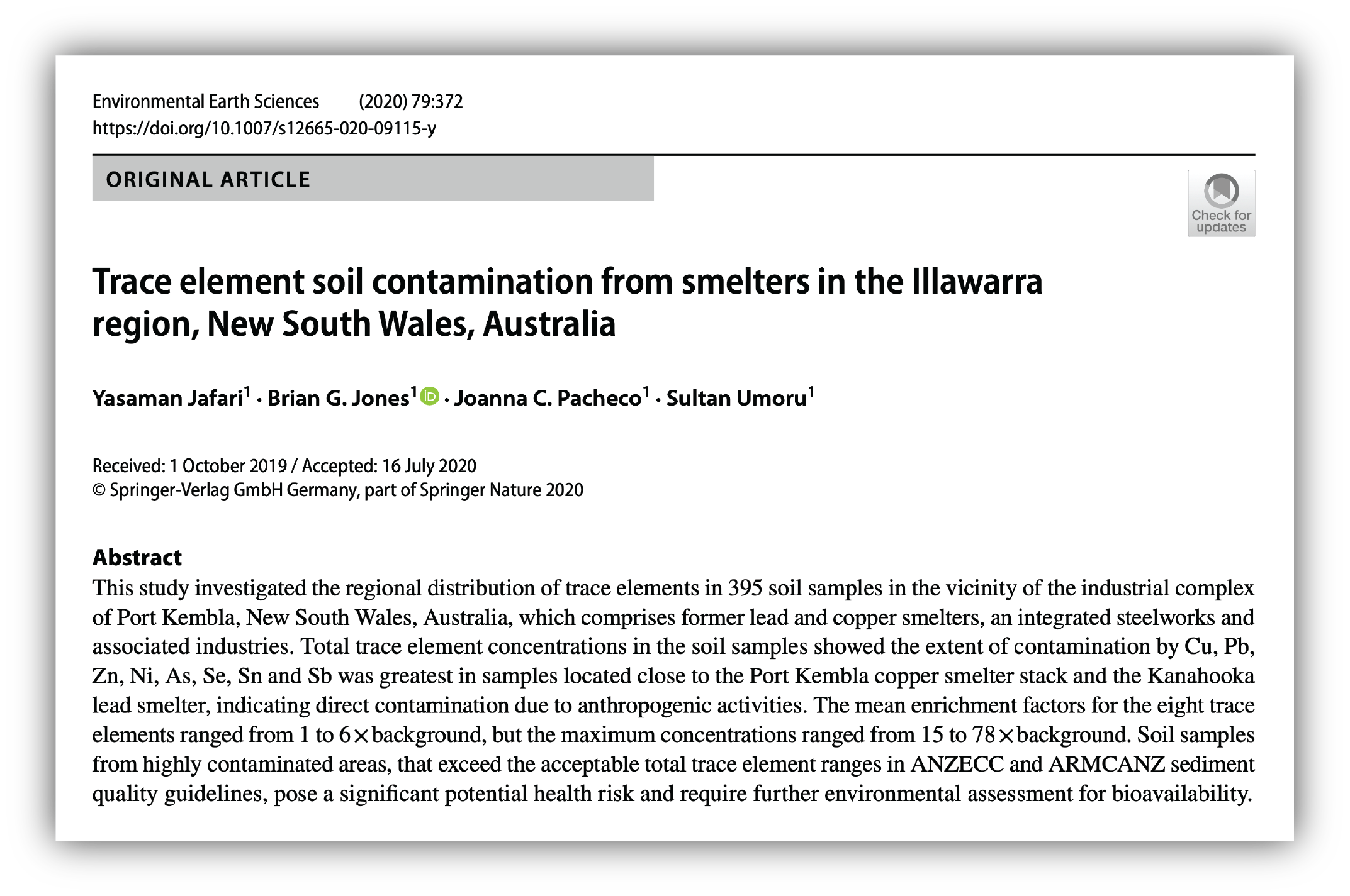
head(soil_samples)Plot metal concentrations agains distance:
# Reshape the soil_samples data from wide to long format
soil_samples_long <- soil_samples %>%
  pivot_longer(
    cols = c(Cu_ppm, Pb_ppm, Zn_ppm, Ni_ppm, As_ppm),  # Specify columns to reshape
    names_to = "Element",        # New column to hold the original column names (elements)
    values_to = "Concentration"  # New column to hold the corresponding values
  )

# Define named vectors to rename facet labels
element_labels <- c(
  "Cu_ppm" = "Copper - Cu",
  "Pb_ppm" = "Lead - Pb",
  "Zn_ppm" = "Zinc - Zn",
  "Ni_ppm" = "Nickel - Ni",
  "As_ppm" = "Arsenic - As"
)

smelter_labels <- c(
  "Copper Smelter Port Kembla" = "Port Kembla Smelter",
  "Kanahooka Smelter" = "Kanahooka Smelter"
)

# Create a faceted plot with renamed facet labels for elements
# - Add a smooth trend line using the LOESS method.
# - The plot is faceted by Element (rows) and Smelter (columns) with free scales
# - Custom facet labels for the elements are applied using the labeller() function
ggplot(soil_samples_long,
       aes(x = Distance_to_smelter, y = Concentration)) +
  geom_point(alpha = 0.6, color = "black", size = 0.6) +
  geom_smooth(method = "loess", colour = "red", se = TRUE, size = 0.5) +
  facet_wrap(~ Element + Smelter, scales = "free_y", ncol = 2,
             labeller = labeller(Element = element_labels, Smelter = smelter_labels)) +
  labs(
    x = "Distance from smelter (m)",  # Label for x-axis
    y = "Concentration [ppm]",        # Label for y-axis
    title = "Trace metal concentrations vs. distance from smelter"  # Plot title
  ) +

# Apply theme customisations to adjust the plot appearance
  theme(
    legend.position = "none",                # Do not show legend
    axis.title = element_text(size = 9),     # Decrease axis label font size
    plot.title = element_text(size = 11),    # Decrease plot title font size
    panel.spacing = unit(0.5, "lines"),      # Increase spacing between facets
    axis.text.x = element_text(size = 8),    # Decrease x-axis value font size
    axis.text.y = element_text(size = 8),    # Decrease y-axis value font size

    # Change the colours of background and strip
    panel.background = element_rect(fill = "#eff1f3"),
    strip.text = element_text(colour = "black"),
    strip.background = element_rect(fill = "white", color = "white")
  )
Despite the variability observed in many of the plots above, there appears to be a general trend of decreasing trace metal concentrations with increasing distance from the two smelter sites, particularly for elements such as As, Cu, and Pb.
Perform spatial interpolation
In their study, Jafari et al. used the inverse distance weighted (IDW) spatial interpolation method to generate rasters of trace metal concentrations. In this practical exercise, we will assess the performance of the IDW method across a range of parameter settings using copper concentration data. We will then identify the optimal parameter values and apply them to interpolate concentrations of the remaining trace metals.
Create grid for interpolation
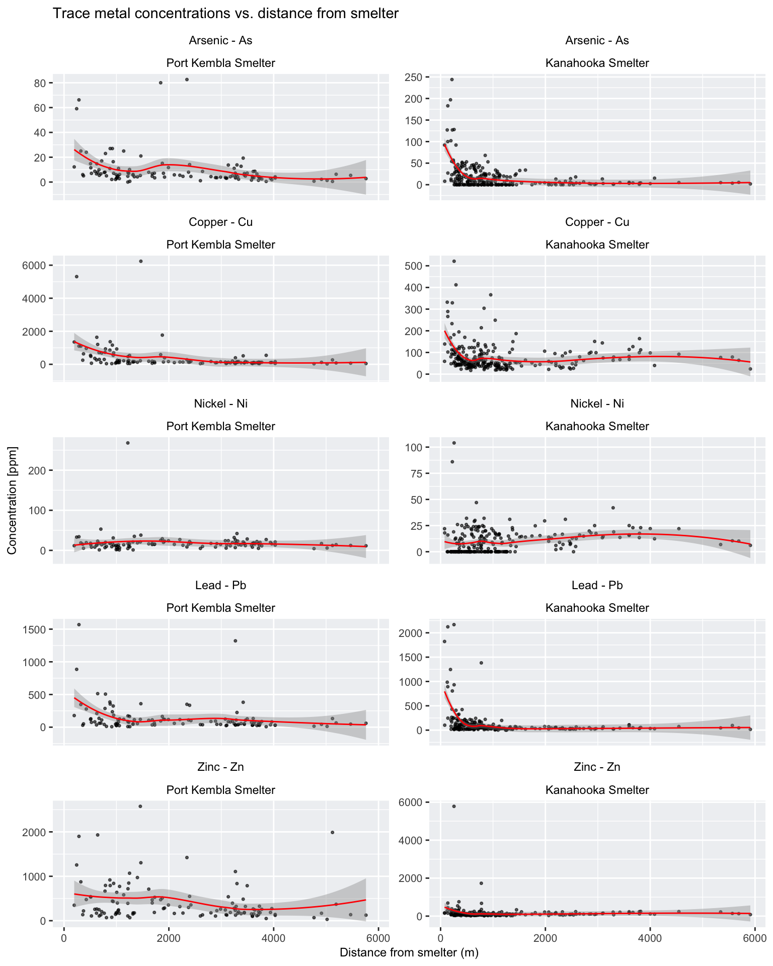
As described in practical exercise no. 4, spatial interpolation is a method used to estimate unknown values at specific locations based on measurements taken at known locations. In geospatial analysis, these specific locations usually refer to a regular grid of cells (magenta squares in the Fig. 1). A new value is calculated for each grid cell (magenta squares) based on the measured values from the proximity of that grid cell (blue triangles). The grid does not need to have a rectangular shape, and can be cropped to the boundary of the area of interest.
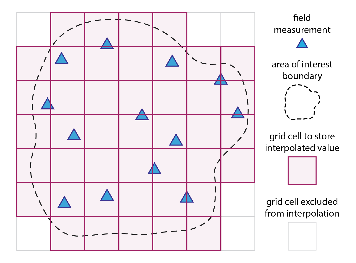
Fig. 1: Spatial interpolation in a nutshell: a mathematical model/function is used to compute a new value for each grid cell (magenta squares) based on the measured values from the proximity of that grid cell (blue triangles).
To minimise extrapolation beyond the spatial extent of the trace
metal data, we calculate an interpolation bounding box by intersecting
the suburb boundaries (from the sf object
suburbs_sf) with bbox_sf, which represents the
bounding box of the trace metal sf object.
# Dissolve polygons in suburbs_sf
# Use the 'STATE_CODE' field as this is common for all suburbs
suburbs_diss <- suburbs_sf %>%
  group_by(STATE_CODE) %>%
  summarise(geometry = st_union(geometry))

# Perform intersection between the dissolved layer and bbox_sf
# Optional: rename attribute column 'STATE_CODE' with bbox_id
bbox_interp <- st_intersection(suburbs_diss, bbox_sf) %>%
   rename(bbox_id = STATE_CODE)
The next block of R code produces a regular grid for interpolation
and crops this to the new bbox_interp sf
polygon object.
# Create a grid based on the bounding box 'bbox_interp'
# We set the spatial resolution to 100 m (108 x 70 cells)
bbox <- st_bbox(bbox_interp)
x.range <- seq(bbox["xmin"], bbox["xmax"], length.out = 108)
y.range <- seq(bbox["ymin"], bbox["ymax"], length.out = 70)
grid <- expand.grid(x = x.range, y = y.range)

# Convert the grid to an sf object and assign the same CRS as the polygon
grid_sf <- st_as_sf(grid, coords = c("x", "y"), crs = st_crs(bbox_interp))

# Crop the grid to the polygon area using an intersection
grid_sf_cropped <- st_intersection(grid_sf, bbox_interp)

# Convert the cropped grid to a Spatial object (gstat requires Spatial objects)
grid_sp <- as(grid_sf_cropped, "Spatial")
Interpolate Cu values with IDW
Inverse distance weighted (IDW) interpolation is a deterministic spatial interpolation method used to estimate values at unmeasured locations based on the values of nearby measured points. The underlying principle is that points closer in space are more alike than those further away.
The method is relatively simple to implement and understand, and it works well when the spatial distribution of known data points is fairly uniform. However, it can sometimes lead to artefacts (e.g., bullseye effects) if data points are clustered or if there are abrupt spatial changes that the method cannot account for.
Each known data point is assigned a weight that is inversely proportional to its distance from the target location (shown by the dark magenta square to the left).
Typically, the weight is calculated using the formula \(w_{i} = {1}/{d^{p}_{i}}\), where \(d_{i}\) is the distance from the known point (blue triangle) to the estimation point (magenta square), and \(p\) is a power parameter that controls how quickly the influence of a point decreases with distance.
The default value for \(p\) in the
idw() function in gstat is 2 (set using
idp = 2). The value of this parameter can be modified, and
in general: values of idp < 2 will produce a smoother
interpolation with distant points having more influence, an values of
idp > 2 will produce a sharper local influence, with
nearby points dominating more.
The estimated value at an unknown location is computed as a weighted average of the known values:
\[z(x,y) = \frac{\sum_{i=1}^{n}w_{i}z_{i}}{\sum_{i=1}^{n}w_{i}}\]
Here, \(z_{i}\) represents the known values at different points and \(w_{i}\) is the weight. The summation is taken over all the points used in the interpolation.
The idw() function in gstat also allows
further customisation by limiting the size of the search radius. This is
achieved by using the nmax and maxdist
parameters:
nmax: the maximum number of nearest neighbours to consider for interpolation.maxdist: the maximum search radius (distance in CRS units) within which points are considered.
The following block of code illustrates how to use these parameters together:
# Perform IDW interpolation with a limited search window
# Default values: idp = 2.0, nmax = Inf, nmin = 0, maxdist = Inf
idw_result <- idw(formula = value_cu ~ 1,
                  locations = cu_sf,
                  newdata = grid_sf,
                  idp = 2,          # Power parameter (changeable)
                  nmax = 10,        # Consider only the 10 nearest points
                  nmin = 0,         # No minimum neighbour requirement
                  maxdist = 50000)  # Maximum search distance (e.g., 50 km)
The next R code block performs IDW interpolation on the copper
concentration values from metal_data_sf using default
values for all parameters:
# Extract coordinates from the 'metal_data_sf' sf object
# These coordinates represent the spatial locations of the observed data
points_coords <- st_coordinates(metal_data_sf)

# Create a data frame 'cu_df' containing:
# - x: The x-coordinate (longitude or easting)
# - y: The y-coordinate (latitude or northing)
# - value_cu: The copper concentration (Cu_ppm) extracted from 'metal_data_sf'
cu_df <- data.frame(x = points_coords[,1], y = points_coords[,2],
                        value_cu = metal_data_sf$Cu_ppm)

# Convert the copper data frame to an sf spatial object.
# The CRS is inherited from 'metal_data_sf' to ensure spatial consistency
cu_sf <- st_as_sf(cu_df, coords = c("x", "y"), crs = st_crs(metal_data_sf))

# Prepare grid data for interpolation:
# Extract the coordinates from 'grid_sf_cropped' which defines the spatial grid
grid_coords <- st_coordinates(grid_sf_cropped)

# Create a data frame 'grid_df_cu' with the grid's x and y coordinates
grid_df_cu <- data.frame(x = grid_coords[,1], y = grid_coords[,2])

# Convert the grid data frame to an sf spatial object.
# Again, the CRS is set to match that of 'grid_sf_cropped'
grid_sf <-
  st_as_sf(grid_df_cu, coords = c("x", "y"), crs = st_crs(grid_sf_cropped))

# Perform Inverse Distance Weighting (IDW) interpolation:
# - formula: value_cu ~ 1 indicates that the copper values are
#   interpolated without additional covariates
# - locations: the observed data points in 'cu_sf'
# - newdata: the grid locations in 'grid_sf' where predictions are required
# - idp: the inverse distance power parameter (set to 2) which influences
#   the weight given to nearby observations; this is the default value
idw_result <-
  idw(formula = value_cu ~ 1, locations = cu_sf, newdata = grid_sf, idp = 2)
## [inverse distance weighted interpolation]# Extract the predicted copper concentration values from the IDW result
# The predictions are stored in the 'var1.pred' column, added to the grid data frame
grid_df_cu$pred <- idw_result$var1.pred
# Convert the prediction grid to a terra SpatRaster using type = "xyz"
# This format interprets the data frame columns as x, y, and z (prediction values)
rast_cu_idw <- rast(grid_df_cu, type = "xyz")
# Assign a Coordinate Reference System (CRS) to the raster
# The CRS is obtained from 'bbox_interp' using its WKT representation
crs(rast_cu_idw) <- st_crs(bbox_interp)$wkt
# Rename the raster layer to "Cu_ppm" to clearly indicate
# that it represents copper concentrations
names(rast_cu_idw) <- "Cu_ppm"Plot the interpolated raster using tmap:
tmap_mode("plot")               # For static maps
map_bbox <- st_bbox(suburbs_sf) # Set map extent to suburbs

# Create custom labels for each smelter site
smelters_sf$CustomLabel <- ifelse(smelters_sf$Smelter == "Copper Smelter Port Kembla",
                                  "P.K.",
                                  "Kanahooka")

# Plot IDW Cu raster
tm_shape(rast_cu_idw, bbox = map_bbox) +
    tm_raster("Cu_ppm",
        col.scale = tm_scale_continuous_log(values = "magma"),
        col.legend = tm_legend(title = "Cu [ppm]")) +
    tm_layout(frame = FALSE,
            legend.text.size = 0.7,
            legend.title.size = 0.7,
            legend.position = c("right", "bottom"),
            legend.bg.color = "white") +

# Add a tmap layer for suburb boundaries
tm_shape(suburbs_sf) + tm_borders("darkred") +

# Add a tmap layer for smelters locations
tm_shape(smelters_sf) +
  tm_symbols(fill = "white", size = 0.5, shape = 21) +
  tm_labels("CustomLabel", size = 0.6, bgcol = "black", col = "white") +

# Add scalebar
tm_scalebar(position = c("left", "top"), width = 10) +

# Add title
tm_title("IDW [default parameter values]", size = 1)
The map above employs a log-transformed colour scale due to the presence of anomalously high Cu concentrations in the immediate vicinity of the former Port Kembla copper smelter site. These anomalously high concentrations are best visualised using a 3D plot:
# Data for plotting
Cu <- rast_cu_idw
sf_points <- metal_data_sf

# Prepare Data for 3D Plotting
# Convert the raster to a matrix for plotly.
Cu_ppm <- terra::as.matrix(Cu, wide = TRUE)

# Flip the matrix vertically so that row order matches the y sequence (ymin to ymax).
Cu_ppm <- Cu_ppm[nrow(Cu_ppm):1, ]

# Define x and y sequences based on the raster extent and resolution.
x_seq_Cu <- seq(terra::xmin(Cu), terra::xmax(Cu), length.out = ncol(Cu_ppm))
y_seq_Cu <- seq(terra::ymin(Cu), terra::ymax(Cu), length.out = nrow(Cu_ppm))

# Extract coordinates from the sf object.
sf_coords <- st_coordinates(sf_points)

# Combine coordinates with the z attribute
sf_df_Cu <- data.frame(X = sf_coords[, "X"],
                       Y = sf_coords[, "Y"],
                       Z = sf_points$Cu_ppm
            )

# Create an Interactive 3D Plot with plotly
# Initialize a plotly surface plot for the raster.
# Use log transformed colour scale
p_Cu <- plot_ly(x = ~x_seq_Cu, y = ~y_seq_Cu, z = ~Cu_ppm) %>%
  add_surface(
        showscale = TRUE,
        colorscale = "Portland",
        opacity = 0.95,
        cmin = log10(min(Cu_ppm, na.rm = TRUE)),
        cmax = log10(max(Cu_ppm, na.rm = TRUE)),
        surfacecolor = log10(Cu_ppm),
        colorbar = list(title = "log₁₀(Cu ppm)")
  )

# Add 'metal_data_sf' to the plot.
p_Cu <- p_Cu %>%
  add_trace(x = sf_df_Cu$X, y = sf_df_Cu$Y, z = sf_df_Cu$Z,
            type = 'scatter3d', mode = 'markers',
            marker = list(size = 3, color = 'blue')
  )

# Modify the layout to control the z-axis range and adjust the vertical exaggeration.
p_Cu <- p_Cu %>% layout(scene = list(
      xaxis = list(title = "Easting"),
      yaxis = list(title = "Northing"),
      zaxis = list(title = "Concentration [ppm]",
      # Alternatively, specify a custom range, e.g., range = c(0, 20)
      range = c(min(sf_df_Cu$Z, na.rm = TRUE), max(sf_df_Cu$Z, na.rm = TRUE))),
      aspectmode = "manual", aspectratio = list(x = 1, y = 1, z = 1))
      )

# Display the plot
p_Cu
Varying idp
In the following example, we generate two interpolated surfaces by
setting idp to 0.5 and 4.0, respectively. Both
configurations should yield smoother surfaces, but the impact of
anomalously large values will differ between the two settings.
# Prepare grid data for interpolation
grid_df_cu05 <- data.frame(x = grid_coords[,1], y = grid_coords[,2])
grid_df_cu4 <- data.frame(x = grid_coords[,1], y = grid_coords[,2])

# Perform IDW interpolation with idp = 0.5
idw_result_05 <-
  idw(formula = value_cu ~ 1, locations = cu_sf, newdata = grid_sf, idp = 0.5)
## [inverse distance weighted interpolation]# Perform IDW interpolation with idp = 4.0
idw_result_4 <-
idw(formula = value_cu ~ 1, locations = cu_sf, newdata = grid_sf, idp = 4.0)## [inverse distance weighted interpolation]# Extract predicted values
grid_df_cu05$pred <- idw_result_05$var1.pred
grid_df_cu4$pred <- idw_result_4$var1.pred
# Convert the prediction grid to a terra SpatRaster using type = "xyz"
rast_cu_idw05 <- rast(grid_df_cu05, type = "xyz")
rast_cu_idw4 <- rast(grid_df_cu4, type = "xyz")
# Assign a CRS and set variable names
crs(rast_cu_idw05) <- st_crs(bbox_interp)$wkt
crs(rast_cu_idw4) <- st_crs(bbox_interp)$wkt
names(rast_cu_idw05) <- "Cu_ppm"
names(rast_cu_idw4) <- "Cu_ppm"Plot the interpolated rasters using tmap:
map_bbox <- st_bbox(suburbs_sf) # Set map extent to suburbs

# Create the first map (with idp = 0.5)
map1 <- tm_shape(rast_cu_idw05, bbox = map_bbox) +
  tm_raster("Cu_ppm",
            col.scale = tm_scale_continuous_log(values = "magma"),
            col.legend = tm_legend(title = "Cu [ppm]")) +
  tm_layout(frame = FALSE,
            legend.text.size = 0.7,
            legend.title.size = 0.7,
            legend.position = c("right", "bottom"),
            legend.bg.color = "white") +
  tm_shape(suburbs_sf) + tm_borders("darkred") +
  tm_shape(smelters_sf) +
  tm_symbols(fill = "white", size = 0.5, shape = 21) +
   tm_labels("CustomLabel", size = 0.6, bgcol = "black", col = "white") +
  tm_scalebar(position = c("left", "top"), width = 10) +
  tm_title("IDW [idp = 0.5]", size = 1)

# Create the second map (with idp = 4.0)
map2 <- tm_shape(rast_cu_idw4, bbox = map_bbox) +
  tm_raster("Cu_ppm",
            col.scale = tm_scale_continuous_log(values = "magma"),
            col.legend = tm_legend(title = "Cu [ppm]")) +
  tm_layout(frame = FALSE,
            legend.text.size = 0.7,
            legend.title.size = 0.7,
            legend.position = c("right", "bottom"),
            legend.bg.color = "white") +
  tm_shape(suburbs_sf) + tm_borders("darkred") +
  tm_shape(smelters_sf) +
  tm_symbols(fill = "white", size = 0.5, shape = 21) +
   tm_labels("CustomLabel", size = 0.6, bgcol = "black", col = "white") +
  tm_scalebar(position = c("left", "top"), width = 10) +
  tm_title("IDW [idp = 4.0]", size = 1)

# Show maps
map1 # IDW with p = 0.5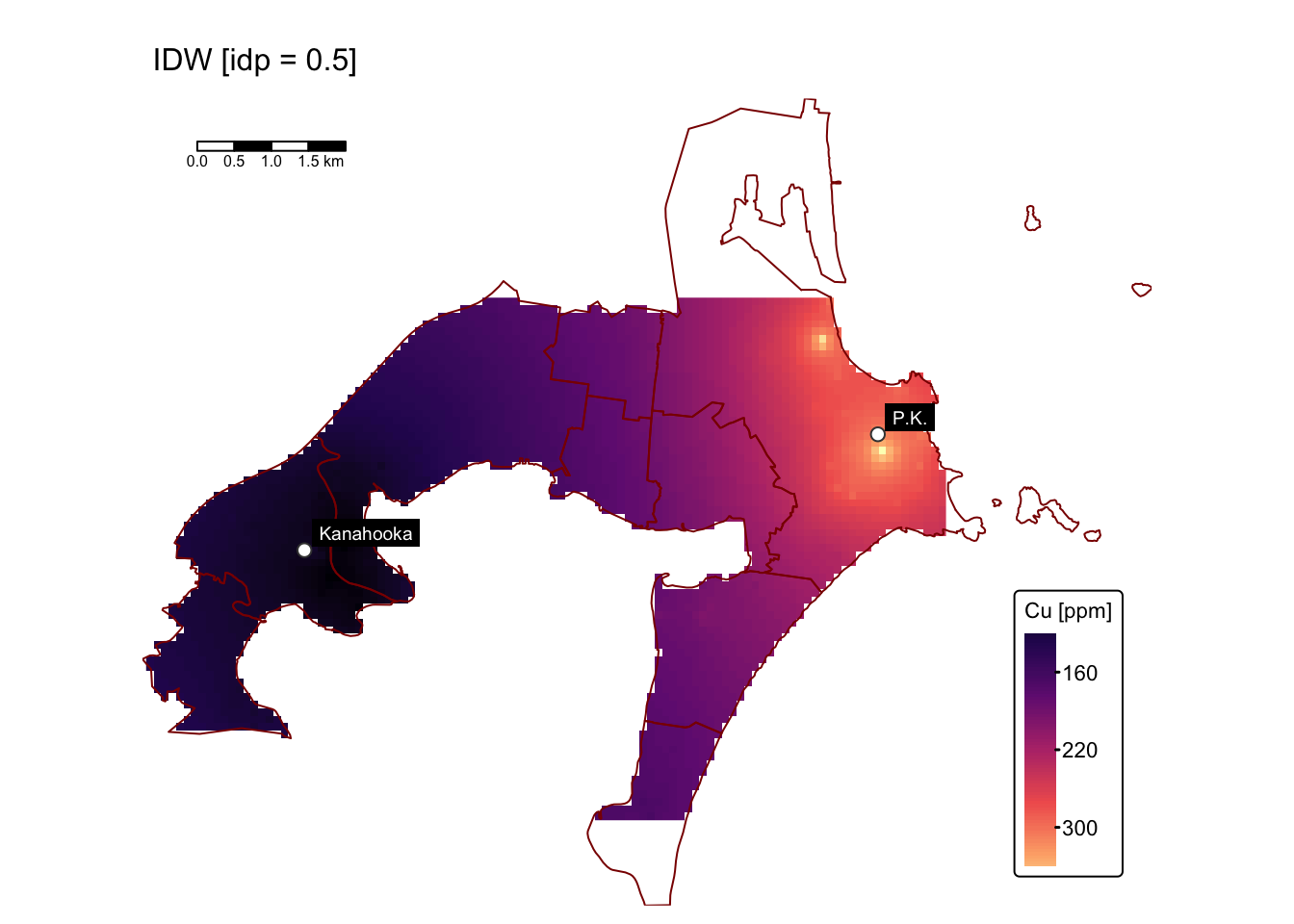

Interpolating with idp = 0.5 produces a surface that
mitigates the influence of the extremely high Cu concentrations near the
Port Kembla site. This is evident from the reduced maximum predicted
values (~300 ppm), in contrast to the raw data where maximum Cu levels
exceed 6000 ppm. However, the predicted surface may also underestimate
or overestimate Cu levels throughout the study area.
Interpolating with idp = 4.0 produces a surface that,
like the one obtained with the default idp value, exhibits bullseye
effects. However, these effects seem more subtle and gradual.
Varying nmax and maxdist
In the following code block, we perform interpolation using
idp = 4.0 while adjusting nmax and
maxdist. First, we set nmax = 10,
maxdist = 500; then we set nmax = 20,
maxdist = 2000:
# Prepare grid data for interpolation
grid_df_small <- data.frame(x = grid_coords[,1], y = grid_coords[,2])
grid_df_large <- data.frame(x = grid_coords[,1], y = grid_coords[,2])

# Perform IDW interpolation with idp = 4.0, nmax = 10, maxdist = 500
idw_result_small <-
  idw(formula = value_cu ~ 1,
      locations = cu_sf,
      newdata = grid_sf,
      idp = 4.0,        # Power parameter (changeable)
      nmax = 10,        # Consider only the 10 nearest points
      nmin = 0,         # No minimum neighbour requirement
      maxdist = 500     # Search radius 1 km
  )
## [inverse distance weighted interpolation]# Perform IDW interpolation with idp = 4.0, nmax = 20, maxdist = 2000
idw_result_large <-
idw(formula = value_cu ~ 1,
locations = cu_sf,
newdata = grid_sf,
idp = 4.0, # Power parameter (changeable)
nmax = 20, # Consider all nearest points
nmin = 0, # No minimum neighbour requirement
maxdist = 2000 # Search radius 5 km
)## [inverse distance weighted interpolation]# Extract predicted values
grid_df_small$pred <- idw_result_small$var1.pred
grid_df_large$pred <- idw_result_large$var1.pred
# Convert the prediction grid to a terra SpatRaster using type = "xyz"
rast_cu_small <- rast(grid_df_small, type = "xyz")
rast_cu_large <- rast(grid_df_large, type = "xyz")
# Assign a CRS and set variable names
crs(rast_cu_small) <- st_crs(bbox_interp)$wkt
crs(rast_cu_large) <- st_crs(bbox_interp)$wkt
names(rast_cu_small) <- "Cu_ppm"
names(rast_cu_large) <- "Cu_ppm"Plot the results using tmap:
map_bbox <- st_bbox(suburbs_sf) # Set map extent to suburbs

# Create the first map (idp = 4.0, nmax = 10, maxdist = 500)
map1 <- tm_shape(rast_cu_small, bbox = map_bbox) +
  tm_raster("Cu_ppm",
            col.scale = tm_scale_continuous_log(values = "magma"),
            col.legend = tm_legend(title = "Cu [ppm]")) +
  tm_layout(frame = FALSE,
            legend.text.size = 0.7,
            legend.title.size = 0.7,
            legend.position = c("right", "bottom"),
            legend.bg.color = "white") +
  tm_shape(suburbs_sf) + tm_borders("darkred") +
  tm_shape(smelters_sf) +
  tm_symbols(fill = "white", size = 0.5, shape = 21) +
  tm_labels("CustomLabel", size = 0.6, bgcol = "black", col = "white") +
  tm_scalebar(position = c("left", "top"), width = 10) +
  tm_title("IDW [idp = 4.0, nmax = 10, maxdist = 500]", size = 1)

# Create the second map (idp = 4.0, nmax = 20, maxdist = 2000)
map2 <- tm_shape(rast_cu_large, bbox = map_bbox) +
  tm_raster("Cu_ppm",
            col.scale = tm_scale_continuous_log(values = "magma"),
            col.legend = tm_legend(title = "Cu [ppm]")) +
  tm_layout(frame = FALSE,
            legend.text.size = 0.7,
            legend.title.size = 0.7,
            legend.position = c("right", "bottom"),
            legend.bg.color = "white") +
  tm_shape(suburbs_sf) + tm_borders("darkred") +
  tm_shape(smelters_sf) +
  tm_symbols(fill = "white", size = 0.5, shape = 21) +
  tm_labels("CustomLabel", size = 0.6, bgcol = "black", col = "white") +
  tm_scalebar(position = c("left", "top"), width = 10) +
  tm_title("IDW [idp = 4.0, nmax = 20, maxdist = 2000]", size = 1)

# Show maps
map1 # IDW with idp = 4.0, nmax = 10, maxdist = 500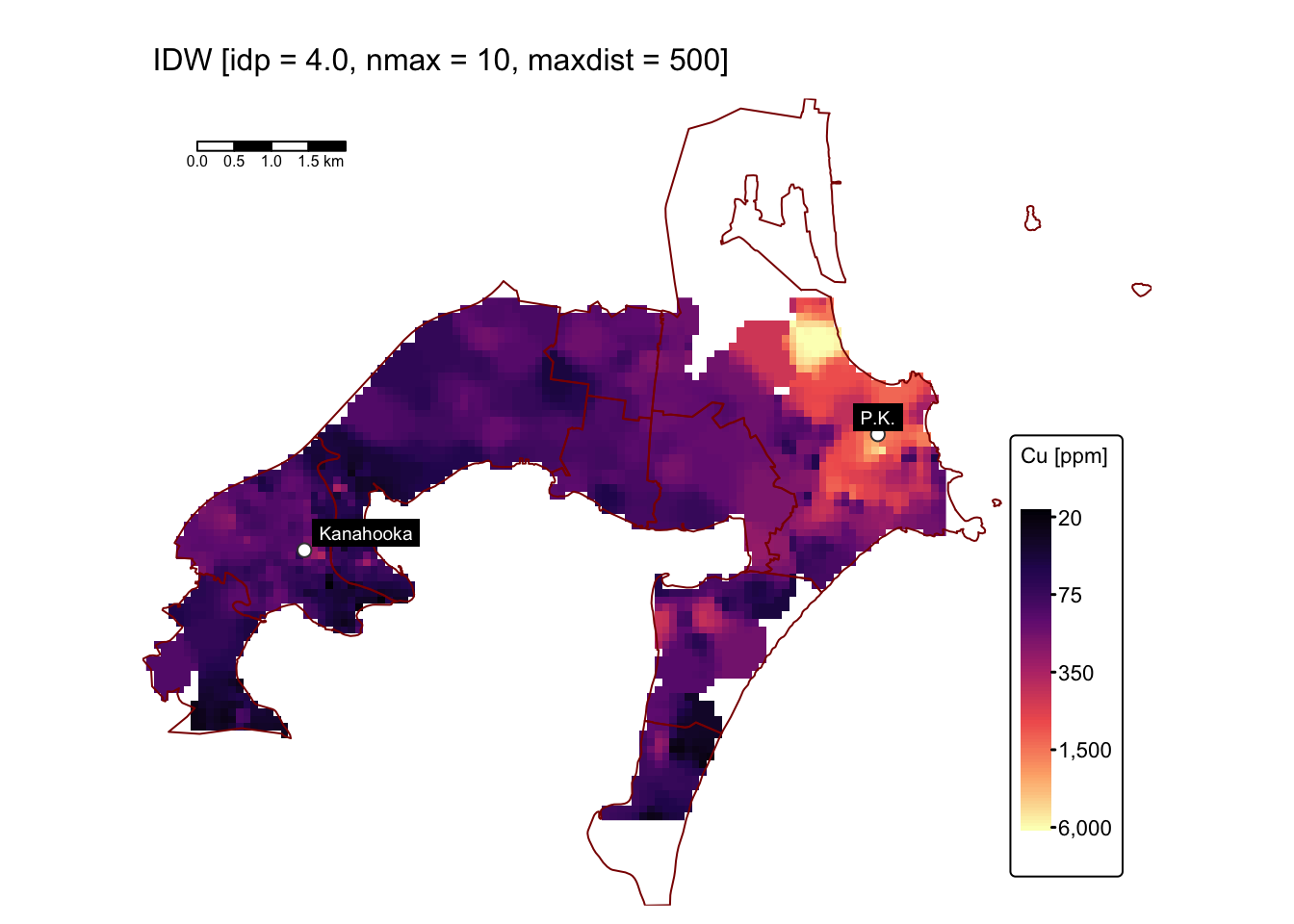
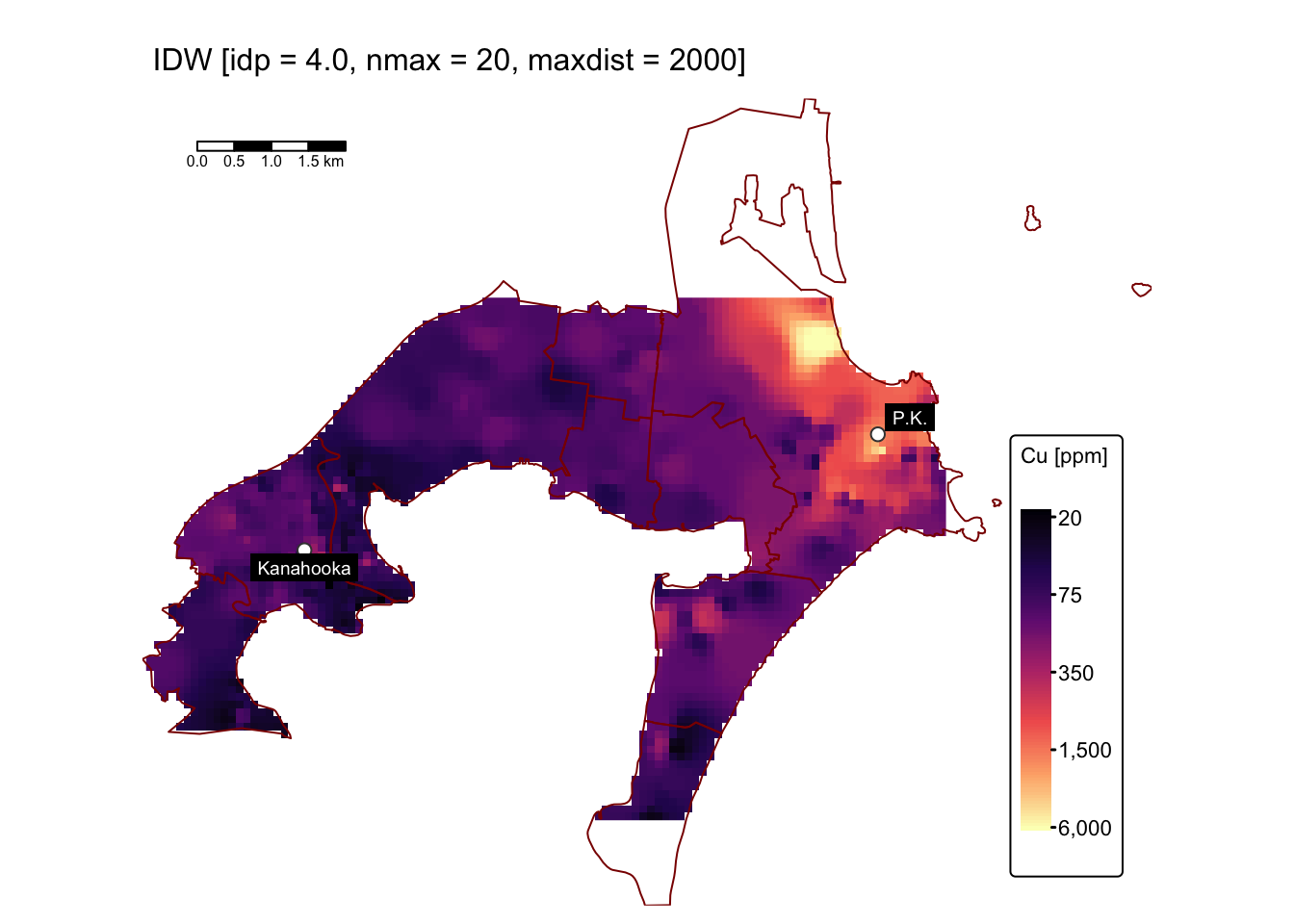
The predicted surfaces shown above closely resemble the one generated
using idp = 4.0 and default values for nmax
and maxdist, differing only slightly in the area
surrounding the anomalously high Cu concentrations near the former Port
Kembla smelter site.
Evaluate method performance
In practical
exercise no. 4 we randomly divided the point dataset used for
spatial interpolation into two equal subsets — a training set
for performing the interpolation and a testing set for
evaluating the performance of each method. Since
metal_data_sf contains only 369 data points, we will assess
the performance of our IDW interpolations using five-fold
cross-validation rather than a complete 50/50 training/testing
split.
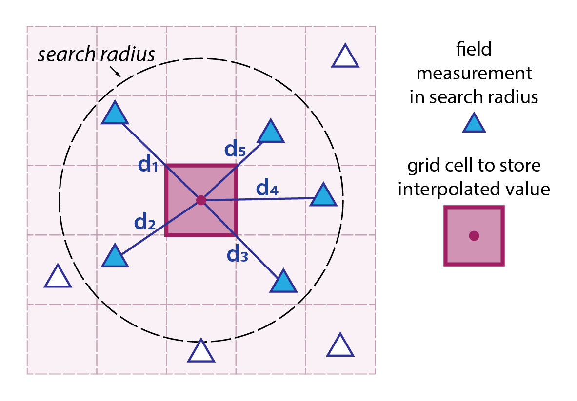
Five-fold cross-validation
Five-fold cross-validation is a robust method used in machine learning and statistics to assess a model’s ability to generalise to unseen data. It involves dividing the entire dataset into five equally sized subsets, or “folds”. Below is a detailed breakdown of this method:
Data partitioning: the dataset is first shuffled to ensure that any inherent order does not bias the results. It is then split into five folds, each containing roughly the same number of data points.
Iterative process: for each of the five iterations, one fold is reserved as the test set while the remaining four folds are combined to form the training set. This means every data point is used exactly once for testing and four times for training.
Model evaluation: the model is trained on the training set and then evaluated on the test set in each iteration. This yields five sets of performance metrics, such as accuracy, precision, recall, or RMSE, depending on the problem.
Performance aggregation: the final performance is typically the average of the metrics from the five iterations. Additionally, the standard deviation of these metrics can offer insight into the model’s consistency across different data splits.
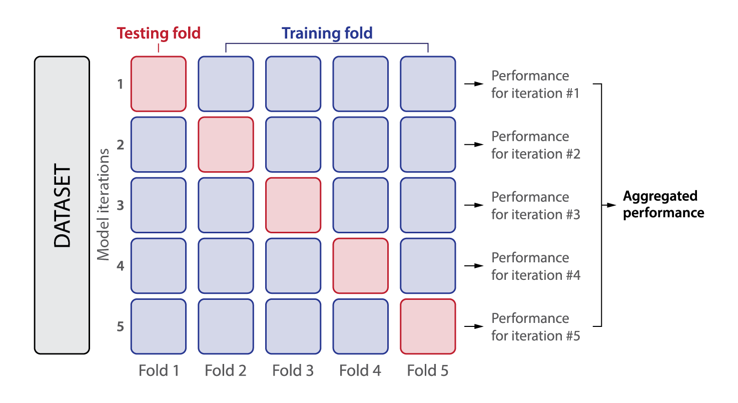
Fig. 2: Principles of five-fold cross-validation. The dataset is evenly divided into five folds, with each fold comprising 20% of the data. In each iteration, one fold is designated as the test set, while the remaining four folds serve as the training set.
The method provides a more reliable estimate of model performance compared to a single train-test split, especially when dealing with smaller datasets. It also helps in detecting overfitting by ensuring the model is tested on every data point. However, five-fold cross-validation is computationally more expensive than a single split since the model must be trained and evaluated five times.
Performance metrics
RMSE (Root Mean Squared Error) and MAE (Mean Absolute Error) are two widely used metrics to evaluate the accuracy of predictions from a model by comparing the predicted values against the observed values. RMSE might give a more sensitive indication of poor predictions in the presence of large errors, whereas MAE offers a straightforward average error that is more robust to anomalies. In practice, comparing both can give a fuller picture of model performance and error distribution.
Root Mean Squared Error (RMSE)
RMSE is defined as the square root of the mean of the squared differences between the predicted values (\(\hat{y}_i\)) and the observed values (\(y_i\)):
\[\text{RMSE} = \sqrt{\frac{1}{n}\sum_{i=1}^{n}\left(y_i-\hat{y}_i\right)^2}\]
Key Properties:
Units: RMSE has the same units as the original data, which makes it directly interpretable in the context of the measurements.
Sensitivity to outliers: because the errors are squared before averaging, RMSE gives more weight to larger errors. This means that RMSE is very sensitive to outliers or extreme values. If your data contain outliers, RMSE might increase considerably, signalling that the model is performing poorly on those specific cases.
Optimisation and differentiability: RMSE (or its squared form, the Mean Squared Error) is often used in optimisation routines because it is differentiable. This property makes it attractive for many regression methods and machine learning algorithms that rely on gradient-based optimisation.
Interpretation: RMSE provides a measure of the average magnitude of the error. In many contexts, a lower RMSE indicates a better fit of the model to the data. It is particularly useful when large errors are undesirable.
Mean Absolute Error (MAE)
MAE is calculated as the average of the absolute differences between the predicted values and the observed values:
\[\text{MAE} = \frac{1}{n}\sum_{i=1}^{n}\left|y_i-\hat{y}_i\right|\]
Key Properties:
Units: like RMSE, MAE is measured in the same units as the data, which allows for direct interpretation of the error magnitude.
Robustness to outliers: MAE treats all errors linearly without squaring them, which means that it does not exaggerate the impact of large errors as much as RMSE does. This can be particularly advantageous when your data contain outliers or when a balanced view of error magnitude is required.
Interpretability: since MAE is a straightforward average of absolute differences, it is easy to understand and communicate. A lower MAE signifies that, on average, the predictions are closer to the actual values.
Optimisation considerations: unlike RMSE, MAE is not differentiable at zero error. This non-differentiability can sometimes pose challenges for certain optimisation algorithms, although specialised methods are available to handle this issue.
Evaluate IDW results
The following block of R code performs a five-fold cross-validation on all five IDW interpolations done above.
# Set random seed for reproducibility
set.seed(123)

# Add a fold indicator for 5-fold cross validation
cu_sf$fold <- sample(rep(1:5, length.out = nrow(cu_sf)))

# Define the five interpolation methods with their parameter settings
# For methods where a parameter is not specified, we leave it as NULL.
# Note: The default IDW in gstat uses idp = 2.
methods <- list(
  "#1 [default]" = list(idp = NULL, nmax = NULL, maxdist = NULL),
  "#2 [idp=0.5]" = list(idp = 0.5, nmax = NULL, maxdist = NULL),
  "#3 [idp=4.0]" = list(idp = 4.0, nmax = NULL, maxdist = NULL),
  "#4 [idp=4.0,nmax=10,maxdist=500]" = list(idp = 4.0, nmax = 10, maxdist = 500),
  "#5 [idp=4.0,nmax=20,maxdist=2000]" = list(idp = 4.0, nmax = 20, maxdist = 2000)
)

# Create an empty data frame to store predictions and observations
results_df <- data.frame(method = character(),
                         fold = integer(),
                         observed = numeric(),
                         predicted = numeric(),
                         stringsAsFactors = FALSE)

# Perform 5-fold cross validation for each interpolation method
for (i in 1:5) {
  # Split data into training (all folds except i) and testing (fold i)
  training <- cu_sf[cu_sf$fold != i, ]
  testing  <- cu_sf[cu_sf$fold == i, ]

  # Loop over each interpolation method
  for (method_name in names(methods)) {
    params <- methods[[method_name]]

    # Use default idp = 2 if not provided (for Interpolation 1)
    idp_val <- ifelse(is.null(params$idp), 2, params$idp)

    # Perform IDW interpolation on the testing set using the training data.
    # If nmax and maxdist are provided, include them.
    if (!is.null(params$nmax) & !is.null(params$maxdist)) {
      idw_res <- idw(formula = value_cu ~ 1,
                     locations = training,
                     newdata = testing,
                     idp = idp_val,
                     nmax = params$nmax,
                     maxdist = params$maxdist)
    } else {
      idw_res <- idw(formula = value_cu ~ 1,
                     locations = training,
                     newdata = testing,
                     idp = idp_val)
    }

    # Extract predicted and observed values from the testing set
    predicted_vals <- idw_res$var1.pred
    observed_vals  <- testing$value_cu

    # Append the results for this fold and method
    temp_df <- data.frame(method = method_name,
                          fold = i,
                          observed = observed_vals,
                          predicted = predicted_vals,
                          stringsAsFactors = FALSE)

    results_df <- rbind(results_df, temp_df)
  }
}
## [inverse distance weighted interpolation]
## [inverse distance weighted interpolation]
## [inverse distance weighted interpolation]
## [inverse distance weighted interpolation]
## [inverse distance weighted interpolation]
## [inverse distance weighted interpolation]
## [inverse distance weighted interpolation]
## [inverse distance weighted interpolation]
## [inverse distance weighted interpolation]
## [inverse distance weighted interpolation]
## [inverse distance weighted interpolation]
## [inverse distance weighted interpolation]
## [inverse distance weighted interpolation]
## [inverse distance weighted interpolation]
## [inverse distance weighted interpolation]
## [inverse distance weighted interpolation]
## [inverse distance weighted interpolation]
## [inverse distance weighted interpolation]
## [inverse distance weighted interpolation]
## [inverse distance weighted interpolation]
## [inverse distance weighted interpolation]
## [inverse distance weighted interpolation]
## [inverse distance weighted interpolation]
## [inverse distance weighted interpolation]
## [inverse distance weighted interpolation]# Calculate RMSE and MAE for each interpolation method across all folds
error_metrics <- results_df %>%
group_by(method) %>%
summarise(RMSE = sqrt(mean((observed - predicted)^2, na.rm = TRUE)),
MAE = mean(abs(observed - predicted), na.rm = TRUE))
# Print the error metrics
print(error_metrics)## # A tibble: 5 × 3
## method RMSE MAE
## <chr> <dbl> <dbl>
## 1 #1 [default] 442. 127.
## 2 #2 [idp=0.5] 453. 140.
## 3 #3 [idp=4.0] 519. 147.
## 4 #4 [idp=4.0,nmax=10,maxdist=500] 584. 158.
## 5 #5 [idp=4.0,nmax=20,maxdist=2000] 523. 148.Based on the RMSE and MAE values in the table, the IDW method with
default parameters (i.e., idp = 2.0,
nmax = Inf, nmin = 0, and
maxdist = Inf) produces the surface that best fits the Cu
concentration data. Nevertheless, with RMSE values ranging from 442 to
584 ppm, all five interpolation methods perform poorly.
This is further illustrated by the following plots, which show the predicted versus observed values in black and the one-to-one line in red:
# Create a scatter plot (predicted vs observed) for each interpolation method using ggplot2
ggplot(results_df, aes(x = observed, y = predicted)) +
  geom_point(alpha = 0.6, color = "black", size = 0.8) +
  geom_abline(slope = 1, intercept = 0, linetype = "dashed", colour = "red") +
  facet_wrap(~ method, scales = "free") +
  labs(title = "Five-fold cross-validation: predicted vs. observed Cu concentration values",
       x = "Observed values [Cu ppm]",
       y = "Predicted values [Cu ppm]") +
  scale_x_log10() +
  scale_y_log10() +

# Apply theme customisations to adjust the plot appearance
  theme(
    legend.position = "none",                # Do not show legend
    axis.title = element_text(size = 9),     # Decrease axis label font size
    plot.title = element_text(size = 11),    # Decrease plot title font size
    panel.spacing = unit(0.5, "lines"),      # Increase spacing between facets
    axis.text.x = element_text(size = 8),    # Decrease x-axis value font size
    axis.text.y = element_text(size = 8),    # Decrease y-axis value font size

    # Change the colours of background and strip
    panel.background = element_rect(fill = "#eff1f3"),
    strip.text = element_text(colour = "black"),
    strip.background = element_rect(fill = "white", color = "white")
  )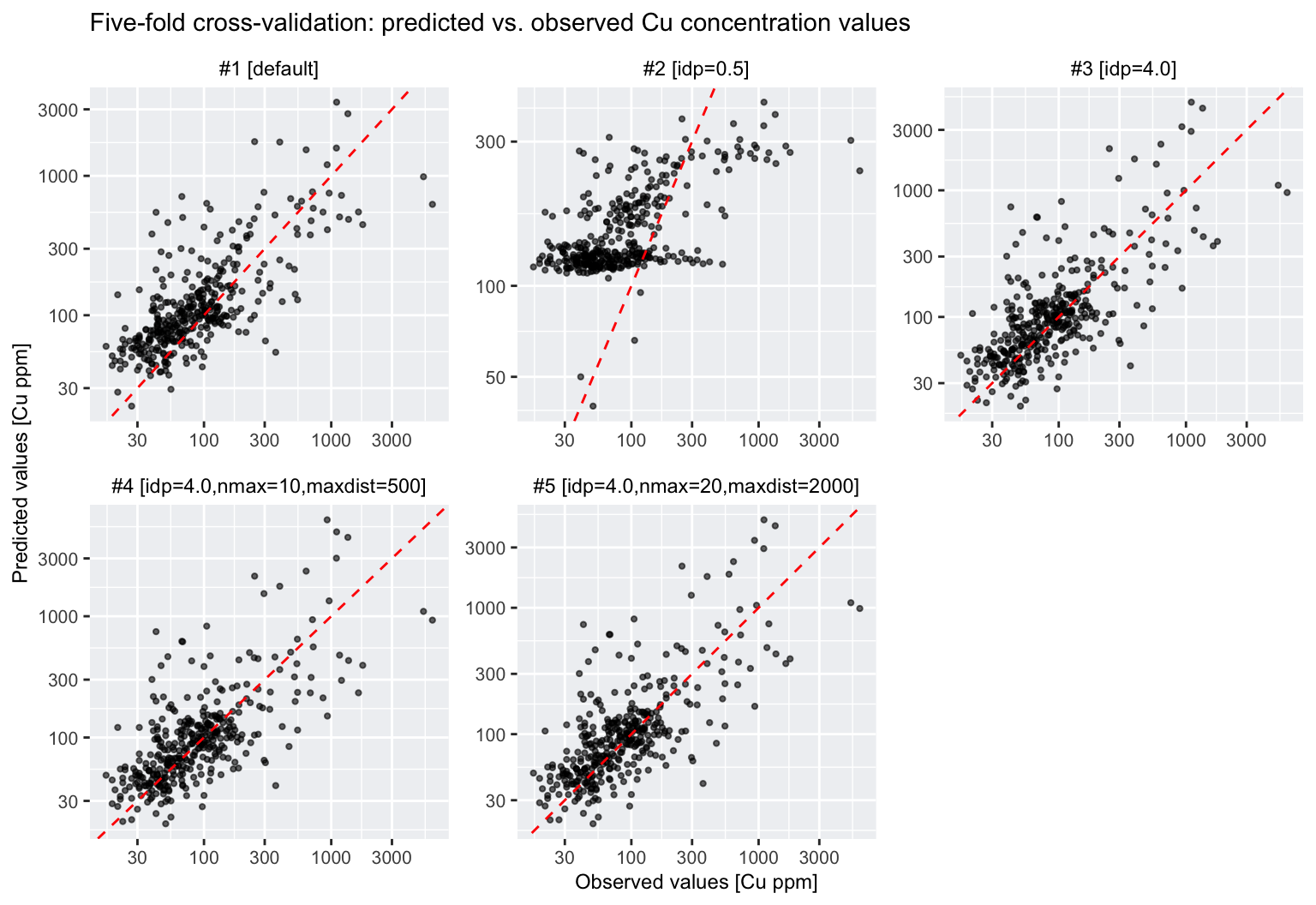
Note that the above plots use logarithmic axis scales and so the scatter around the one-to-one line is substantial.
Interpolate As, Ni, Pb, and Zn
The following block of R code uses the IDW method with default
parameters (i.e., idp = 2.0, nmax = Inf,
nmin = 0, and maxdist = Inf) to interpolate
the As, Ni, Pb, and Zn concentration values from
metal_data_sf:
# Define the vector of attribute names
attributes <- c("As_ppm", "Ni_ppm", "Pb_ppm", "Zn_ppm")

# Create an empty list to store the resulting rasters
rast_list <- list()

# Loop through each attribute and perform IDW interpolation
for (attr in attributes) {

  # Extract coordinates from the metal_data_sf object
  points_coords <- st_coordinates(metal_data_sf)

  # Create a data frame for the current attribute
  attr_df <- data.frame(x = points_coords[, 1],
                        y = points_coords[, 2],
                        value = metal_data_sf[[attr]])

  # Convert the data frame to an sf spatial object using the same CRS as metal_data_sf
  attr_sf <- st_as_sf(attr_df, coords = c("x", "y"), crs = st_crs(metal_data_sf))

  # Prepare grid data for interpolation:
  grid_coords <- st_coordinates(grid_sf_cropped)
  grid_df <- data.frame(x = grid_coords[, 1], y = grid_coords[, 2])

  # Convert the grid data frame to an sf object with the same CRS as grid_sf_cropped
  grid_sf <- st_as_sf(grid_df, coords = c("x", "y"), crs = st_crs(grid_sf_cropped))

  # Perform Inverse Distance Weighting (IDW) interpolation:
  # The formula value ~ 1 means no covariates are used
  idw_result <- idw(formula = value ~ 1,
                    locations = attr_sf,
                    newdata = grid_sf,
                    idp = 2)

  # Add the predicted values (from idw_result$var1.pred) to the grid data frame
  grid_df$pred <- idw_result$var1.pred

  # Convert the prediction grid to a terra SpatRaster using type = "xyz"
  rast_attr <- rast(grid_df, type = "xyz")

  # Assign the CRS from bbox_interp (using its WKT representation)
  crs(rast_attr) <- st_crs(bbox_interp)$wkt

  # Rename the raster layer to the current attribute name
  names(rast_attr) <- attr

  # Store the raster in the list using the attribute name as key
  rast_list[[attr]] <- rast_attr
}
## [inverse distance weighted interpolation]
## [inverse distance weighted interpolation]
## [inverse distance weighted interpolation]
## [inverse distance weighted interpolation]# Combined raster in a stack
idw_stack <- rast(rast_list)
# Check the resulting stack
print(idw_stack)## class : SpatRaster
## dimensions : 70, 107, 4 (nrow, ncol, nlyr)
## resolution : 100.7944, 100.6957 (x, y)
## extent : 297888.4, 308673.4, 6177247, 6184295 (xmin, xmax, ymin, ymax)
## coord. ref. : WGS 84 / UTM zone 56S (EPSG:32756)
## source(s) : memory
## names : As_ppm, Ni_ppm, Pb_ppm, Zn_ppm
## min values : 0.03129952, 0.260673, 7.509737, 37.5685
## max values : 175.66712356, 166.880194, 2019.477300, 2421.9299Plot maps using tmap by looping through the list of
rasters in rast_list:
# Define the map extent
map_bbox <- st_bbox(suburbs_sf)
# Define elements and their full names
elements <- c("As", "Ni", "Pb", "Zn")
full_names <- c(As = "Arsenic", Ni = "Nickel", Pb = "Lead", Zn = "Zinc")
# Create an empty list to store maps
map_list <- list()
# Loop over each element to build the corresponding map
for (elem in elements) {
map_list[[elem]] <- tm_shape(idw_stack[[paste0(elem, "_ppm")]], bbox = map_bbox) +
tm_raster(paste0(elem, "_ppm"),
col.scale = tm_scale_continuous_log(values = "magma"),
col.legend = tm_legend(title = paste0(elem, " [ppm]"))) +
tm_layout(frame = FALSE,
legend.text.size = 0.7,
legend.title.size = 0.7,
legend.position = c("right", "bottom"),
legend.bg.color = "white") +
tm_shape(suburbs_sf) + tm_borders("darkred") +
tm_shape(smelters_sf) +
tm_symbols(fill = "white", size = 0.5, shape = 21) +
tm_labels("CustomLabel", size = 0.6, bgcol = "black", col = "white") +
tm_scalebar(position = c("left", "top"), width = 10) +
tm_title(paste0(full_names[elem], " concentration [ppm]"), size = 1)
}
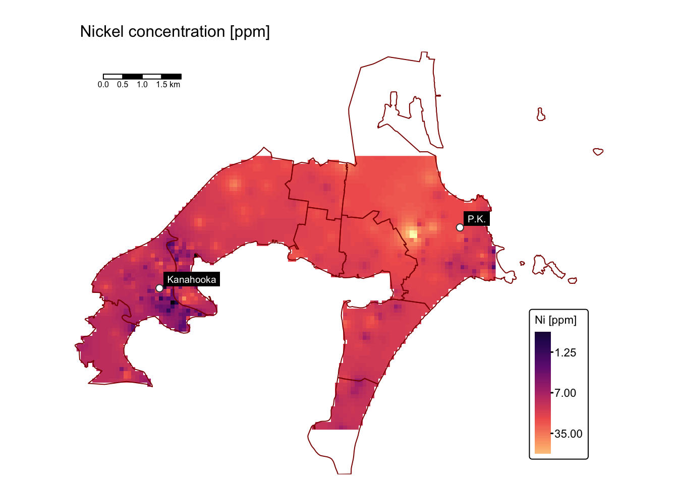
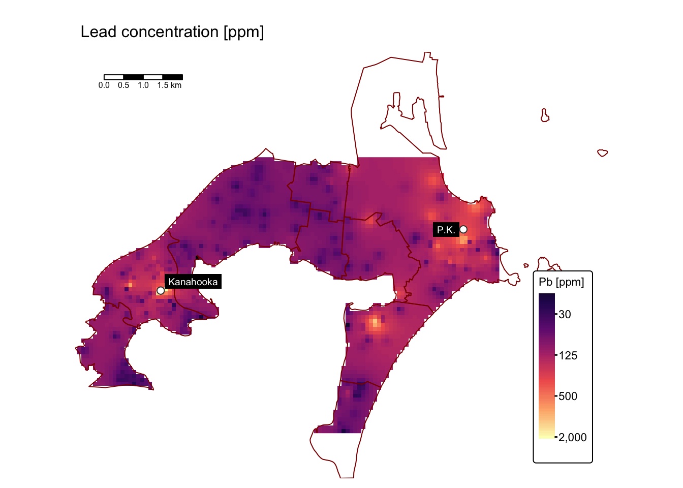
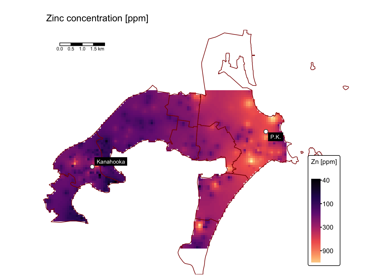
map_list$As # Arsenic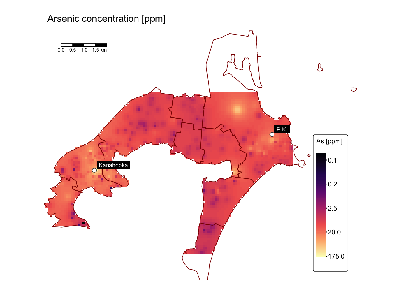
Assess soil contamination levels
Calculate enrichment values
Understanding the spatial distribution of Cu, As, Ni, Pb, and Zn in soils is only partly informative because these trace elements occur naturally. Their concentrations are closely linked to the type of underlying rock and the surface weathering processes that have occurred. Consequently, calculating enrichment factors based on background values provides more meaningful insights.
The Jafari et al. study measured the concentrations of these trace elements in representative bedrock samples, yielding the following background values:
Element | Cu | As | Ni | Pb | Zn |
|---|---|---|---|---|---|
Concentration [ppm] | 80 | 5 | 12 | 20 | 80 |
Next, we calculate the enrichment values for each trace element by dividing its corresponding raster data by the background values provided in the table above.
# Create a named list of raster objects for each element
raster_list <- list(
  Cu = rast_cu_idw,
  As = rast_list$As_ppm,
  Ni = rast_list$Ni_ppm,
  Pb = rast_list$Pb_ppm,
  Zn = rast_list$Zn_ppm
)

# Define the corresponding background values as a named vector
background_values <- c(Cu = 80, As = 5, Ni = 12, Pb = 20, Zn = 80)

# Initialise an empty list to store the enrichment rasters
enrichment_list <- list()

# Loop over each element to calculate enrichment, assign CRS and variable names
for (element in names(raster_list)) {
  enrichment <- raster_list[[element]] / background_values[element]
  crs(enrichment) <- st_crs(bbox_interp)$wkt
  names(enrichment) <- paste0(element)
  # Save the result
  enrichment_list[[paste0(element, "_enrichment")]] <- enrichment
}

# Combined raster in a stack
enrichment_stack <- rast(enrichment_list)

# Check the resulting stack
print(enrichment_stack)
## class : SpatRaster
## dimensions : 70, 107, 5 (nrow, ncol, nlyr)
## resolution : 100.7944, 100.6957 (x, y)
## extent : 297888.4, 308673.4, 6177247, 6184295 (xmin, xmax, ymin, ymax)
## coord. ref. : WGS 84 / UTM zone 56S (EPSG:32756)
## source(s) : memory
## names : Cu_enrichment, As_enrichment, Ni_enrichment, Pb_enrichment, Zn_enrichment
## min values : 0.2537564, 0.006259904, 0.02172275, 0.3754869, 0.4696063
## max values : 73.8253581, 35.133424712, 13.90668287, 100.9738650, 30.2741233Plot enrichment rasters using tmap:
# Define the map extent
map_bbox <- st_bbox(suburbs_sf)

# Define elements and their full names
elements <- c("Cu", "As", "Ni", "Pb", "Zn")
full_names <- c(Cu = "Copper", As = "Arsenic", Ni = "Nickel", Pb = "Lead", Zn = "Zinc")

# Set the names for each layer to be used as facet labels.
names(enrichment_stack) <- paste0(full_names[elements], " enrichment value")

# Create the faceted map
tm_shape(enrichment_stack, bbox = map_bbox) +
  tm_raster(col.scale = tm_scale_continuous_sqrt(values = "turbo"),
            col.legend = tm_legend(title = "Sample ppm\ndivided by\nbackground",
                                   position = tm_pos_out("right", "center")),
            col.free = FALSE) +  # Add one common legend

  # Add suburbs and smelters
  tm_shape(suburbs_sf) + tm_borders("darkred") +
  tm_shape(smelters_sf) + tm_symbols(fill = "white", size = 0.5, shape = 21) +
  tm_labels("CustomLabel", size = 0.7, col = "red") +

  # Add scalebar and customise map
  tm_scalebar(position = c("left", "top"), width = 10) +
  tm_layout(frame = FALSE,
            legend.text.size = 0.7,
            legend.title.size = 0.7,
            legend.position = c("right", "bottom"),
            legend.bg.color = "white",
            panel.label.bg.color = 'linen') +

  # Plot each raster as a facet
  tm_facets(ncol = 2, free.scales = FALSE)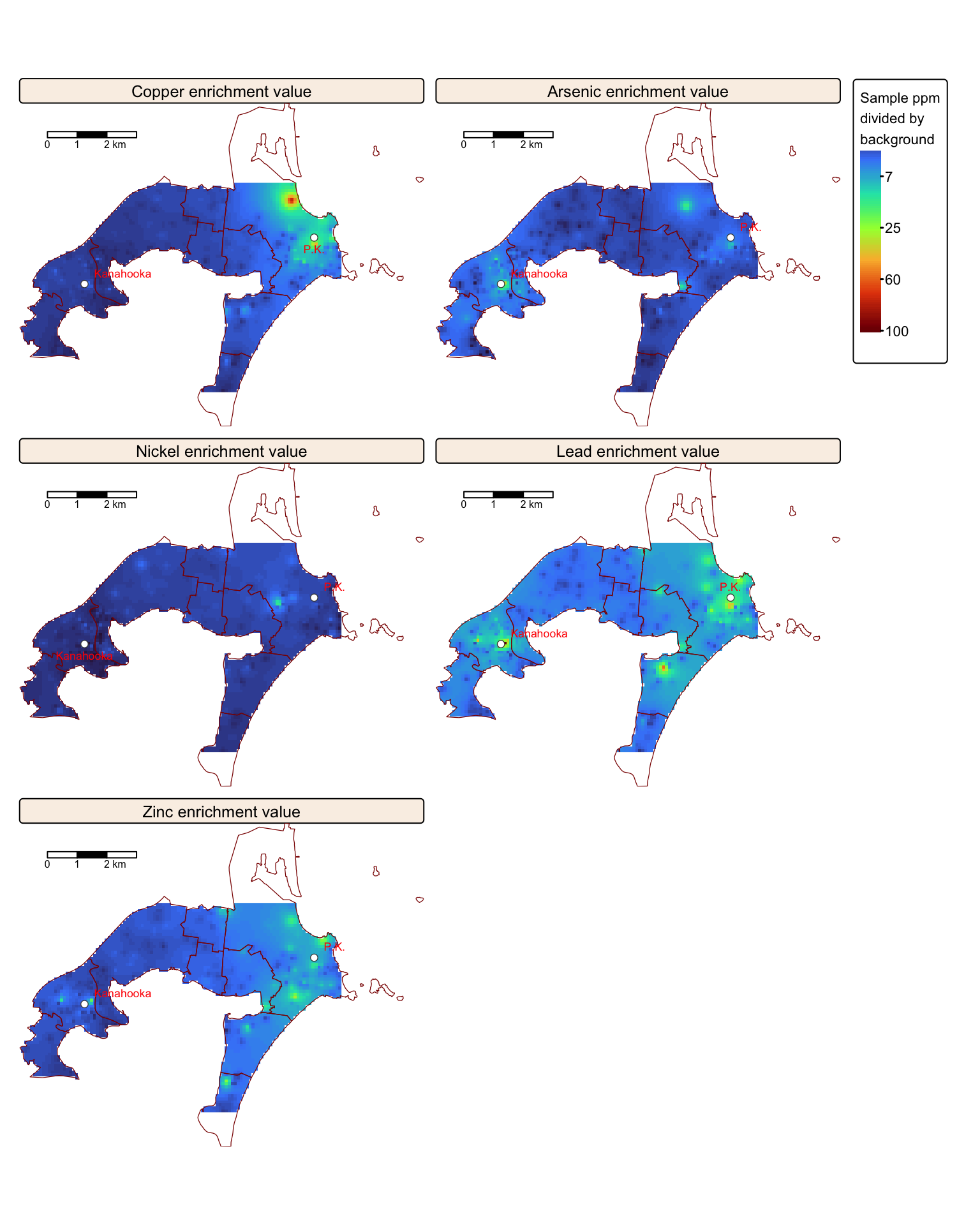
Substantial enrichment is observed, especially for Cu, Pb, and Zn, in the vicinity of the former Port Kembla and Kanahooka smelter sites.
Compare to government guidelines
Another informative way of mapping the interpolated rasters is to compare then against ANZECC/ARMCANZ sediment quality guidelines, such as those published in a recent CSIRO Land and Water Science Report by Stuart L. Simpson and colleagues.
The report outlines sediment quality guideline (SQG) values for both trigger and high levels of contamination for various trace elements. In this context, trigger values are benchmark concentrations used to assess whether the levels of contaminants in sediments may pose a risk to aquatic life or human health. They serve as screening thresholds: if measured concentrations exceed these values, adverse biological effects are possible, warranting further investigation or remediation. Conversely, high-level values refer to contaminant concentrations that are considerably above the trigger thresholds. When sediment contaminant levels reach these high values, there is a strong likelihood of ecological impairment, often necessitating immediate, more comprehensive risk assessments and potential remediation measures.
The recommended ANZECC/ARMCANZ sediment quality guideline values for both trigger and high levels of Cu, As, Ni, Pb, and Zn contamination are provided in the following table:
Element | Cu | As | Ni | Pb | Zn |
|---|---|---|---|---|---|
Trigger value [ppm] | 65 | 20 | 21 | 50 | 200 |
High value [ppm] | 270 | 70 | 52 | 220 | 410 |
In the following block of R code, we reclassify the interpolated Cu, As, Ni, Pb, and Zn rasters based on the ANZECC/ARMCANZ guidelines for trigger and high trace metal contamination levels for each element:
# Function to create a reclassification matrix from breakpoints and classes
create_reclass_matrix <- function(breaks, classes) {
  matrix(cbind(breaks[-length(breaks)], breaks[-1], classes), ncol = 3)
}

# Define reclassification parameters for each element
# We have 6 classes: 1 = 'below background', 2 = 'above trigger', 3 = 'trigger to high',
# 4 = '1 to 2 × high', 5 = '2 to 3 × high', and 6 = 'above 3 × high'
reclass_params <- list(
  Cu = list(breaks = c(0, 80, 270, 540, 810, 10000), classes = c(1, 3, 4, 5, 6)),
  As = list(breaks = c(0, 5, 20, 70, 140, 280, 10000), classes = c(1, 2, 3, 4, 5, 6)),
  Ni = list(breaks = c(0, 12, 21, 52, 104, 156, 10000), classes = c(1, 2, 3, 4, 5, 6)),
  Pb = list(breaks = c(0, 20, 50, 220, 440, 660, 10000), classes = c(1, 2, 3, 4, 5, 6)),
  Zn = list(breaks = c(0, 80, 200, 410, 820, 1230, 10000), classes = c(1, 2, 3, 4, 5, 6))
)

# Define a list of raster objects for each element
rasters <- list(
  Cu = rast_cu_idw,
  As = idw_stack$As_ppm,
  Ni = idw_stack$Ni_ppm,
  Pb = idw_stack$Pb_ppm,
  Zn = idw_stack$Zn_ppm
)

# Reclassify each raster using the corresponding parameters
classified_rasters <- lapply(names(rasters), function(el) {
  params <- reclass_params[[el]]
  r_matrix <- create_reclass_matrix(params$breaks, params$classes)
  r_class <- classify(rasters[[el]], r_matrix)
  names(r_class) <- "sqg_class"
  r_class
})
names(classified_rasters) <- names(rasters)

# Combine the classified rasters into a single stack
sqg_stack <- rast(classified_rasters)
Plot the reclassified rasters with tmap:
# Define the map extent
map_bbox <- st_bbox(suburbs_sf)

# Define elements and their full names
elements <- c("Cu", "As", "Ni", "Pb", "Zn")
full_names <- c(Cu = "Copper", As = "Arsenic", Ni = "Nickel", Pb = "Lead", Zn = "Zinc")

# Set the names for each layer to be used as facet labels.
names(sqg_stack) <- paste0(full_names[elements], " levels")

# Create the faceted map
tm_shape(sqg_stack, bbox = map_bbox) +
   tm_raster(col.scale =
        tm_scale_categorical(values = c("#41485f", "#8b8b99", "#f7c267",
                                        "#d39a2d", "#b64f32", "#591c19" ),
        labels = c("background", "< trigger", "trigger to high",
                   "1 to 2 × high", "2 to 3 × high", "> 3 × high")),
        col.legend =
          tm_legend(title = "Concentration level",
          position = tm_pos_out("right", "center")),
        col.free = FALSE) +  # Add one common legend

  # Add suburbs and smelters
  tm_shape(suburbs_sf) + tm_borders("darkred") +
  tm_shape(smelters_sf) + tm_symbols(fill = "white", size = 0.5, shape = 21) +
  tm_labels("CustomLabel", size = 0.7, col = "red") +

  # Add scalebar and customise map
  tm_scalebar(position = c("left", "top"), width = 10) +
  tm_layout(frame = FALSE,
            legend.text.size = 0.7,
            legend.title.size = 0.7,
            legend.position = c("right", "bottom"),
            legend.bg.color = "white",
            panel.label.bg.color = 'linen') +

  # Plot each raster as a facet
  tm_facets(ncol = 2, free.scales = FALSE)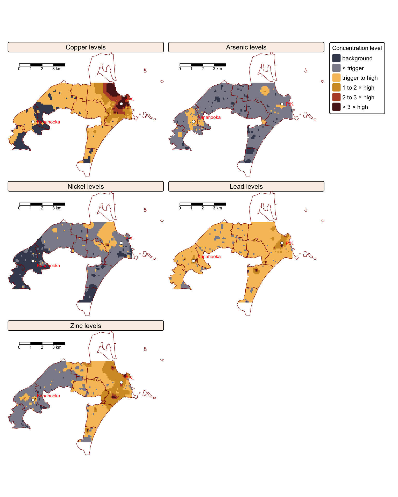
The maps above compare trace element concentrations in soils around Port Kembla and Kanahooka against Australian sediment quality standards (ANZECC/ARMCANZ guidelines). Significant contamination exceeding SQG high values, especially for copper (Cu), lead (Pb), and zinc (Zn), occurs widely in Port Kembla and around the Kanahooka smelter site, as also reported in the Jafari et al. study.
The SQG high value indicates a threshold requiring environmental intervention due to risks to ecological and human health. Certain areas, particularly near industrial zones, slag dumps, and sites like the old Port Kembla Public School, show contamination more than three times above this contamination level, presenting substantial health risks through gardening, recreation, and children’s direct soil ingestion.
Areas with contamination levels between SQG trigger and high values need regular monitoring for potential risks from metal bioavailability. Despite soil replacement efforts near Kanahooka, older urban areas further from original smelter locations still exhibit elevated metal concentrations. Notably, regions southeast of the Port Kembla copper smelter contain significantly high levels, posing specific risks related to vegetable gardening and child health.
Summary
In this practical, we replicated a UOW study by Yasaman Jafari and colleagues that mapped trace element contamination in soils around the former Port Kembla and Kanahooka smelters in the Illawarra region of New South Wales, focusing on copper, lead, zinc, nickel, and arsenic. The study analysed soil samples from Port Kembla’s industrial complex and found severe contamination near the copper and lead smelters, suggesting direct anthropogenic pollution. This study served as an excellent example of applying spatial interpolation in R, utilising packages such as sf for manipulating spatial vector data, terra for efficient handling of raster data, and gstat for conducting spatial interpolation and geostatistical analysis. In the practical exercise, we replicated the study’s methodology to explore and visualise the spatial distribution of trace element contamination patterns around the Port Kembla and Kanahooka industrial sites.
List of R functions
This practical showcased a diverse range of R functions. A summary of these is presented below:
base R functions
abs(): returns the absolute value of its numeric input by removing any negative sign. It is commonly used when only the magnitude of a number is required.as(): converts an object from one class to another according to a defined conversion rule. It is an integral part of R’s formal object‐oriented programming system.as.data.frame(): coerces its input into a data frame, ensuring a tabular structure for the data. It is especially useful when converting lists, matrices, or other objects into a format amenable to data analysis.as.numeric(): converts its argument into numeric form, which is essential when performing mathematical operations. It is often used to change factors or character strings into numbers for computation.as.vector(): transforms an object into a vector by stripping it of any additional attributes. It is used when a simplified, one-dimensional representation of the data is needed.c(): concatenates its arguments to create a vector, which is one of the most fundamental data structures in R. It is used to combine numbers, strings, and other objects into a single vector.cbind(): binds objects by columns to form a matrix or data frame. It ensures that the input objects have matching row dimensions and aligns them side by side.data.frame(): creates a table-like structure where each column can hold different types of data. It is a primary data structure for storing and manipulating datasets in R.expand.grid(): generates a data frame from all combinations of supplied vectors or factors. It is frequently used to create parameter grids for simulations or experimental designs.head(): returns the first few elements or rows of an object, such as a vector, matrix, or data frame. It is a convenient tool for quickly inspecting the structure and content of data.ifelse(): evaluates a condition for each element of a vector and returns one value if the condition is true and another if it is false. This vectorised function simplifies conditional operations across datasets.is.null(): checks whether an object is NULL, indicating the absence of a value. It is often used to test for uninitialised or missing objects in code.lapply(): applies a function to each element of a list and returns a list of the same length with the results. It is a key tool in R’s functional programming paradigm for iterative processing.length(): returns the number of elements in a vector or list. It is a basic utility for checking the size or dimensionality of an object.list(): creates an ordered collection that can store elements of different types and sizes. It is a flexible data structure that can hold vectors, matrices, data frames, and even other lists.log10(): computes the base‑10 logarithm of its numeric input, which is useful for scaling data. It is often used in data transformations, especially when dealing with exponential growth or wide-ranging values.matrix(): constructs a matrix by arranging a sequence of elements into specified rows and columns. It is fundamental for performing matrix computations and linear algebra operations in R.max(): returns the largest value from a set of numbers or a numeric vector. It is used to identify the upper bound of data values in a dataset.mean(): calculates the arithmetic average of a numeric vector, representing the central tendency of the data. It is a basic statistical measure frequently used in data analysis.min(): returns the smallest value from a set of numbers or a numeric vector. It is commonly used to determine the lower bound of a dataset.ncol(): returns the number of columns in a matrix or data frame. It helps in understanding the structure and dimensionality of tabular data.nrow(): returns the number of rows in a data frame, matrix, or other two-dimensional object. It provides a quick way to assess the size of tabular data by counting its rows.names(): retrieves or sets the names attribute of an object, such as the column names of a data frame or the element names of a list. It is crucial for managing and accessing labels within R data structures.paste0(): concatenates strings without any separator, forming a single character string. It is useful for dynamically generating labels, file names, or messages.print(): outputs the value of an R object to the console. It is useful for debugging and ensuring that objects are displayed correctly within functions.rep(): replicates the values in its input a specified number of times, creating repeated sequences. It is often used to generate test data or to extend vectors for alignment in operations.rbind(): combines R objects by rows, stacking them vertically to form a new matrix or data frame. It is especially useful for merging datasets that share the same column structure.seq(): generates regular sequences of numbers based on specified start, end, and increment values. It is essential for creating vectors that represent ranges or intervals.set.seed(): sets the seed of R’s random number generator, ensuring reproducibility of random processes. It is crucial for making sure that analyses involving randomness yield consistent results on repeated runs.sqrt(): calculates the square root of its numeric argument. It is a basic arithmetic function often used in mathematical and statistical computations.stop(): generates an error message and stops the execution of the current expression or script. It is used to enforce conditions and halt further computation when something goes wrong.sum(): adds together all the elements in its numeric argument. It is one of the most straightforward arithmetic functions used to compute totals.
grid functions
unit(): constructs unit objects that specify measurements for graphical parameters, such as centimeters or inches. It is often used in layout and annotation functions for precise control over plot elements.
dplyr (tidyverse) functions
%>%(pipe operator): passes the output of one function directly as the input to the next, creating a clear and readable chain of operations. It is a hallmark of the tidyverse, promoting an intuitive coding style.rename(): changes column names in a data frame to make them more descriptive or consistent. It is an important tool for data cleaning and organization.summarise(): reduces multiple values down to a single summary statistic per group in a data frame. When used withgroup_by(), it facilitates the computation of aggregates such as mean, sum, or count.
ggplot2 (tidyverse) functions
aes(): defines aesthetic mappings in ggplot2 by linking data variables to visual properties such as color, size, and shape. It forms the core of ggplot2’s grammar for mapping data to visuals.element_rect(): specifies the styling of rectangular elements in a ggplot, such as panel backgrounds or borders. It is used withintheme()to define properties like fill colour, border colour, and line width.element_text(): sets the visual properties of text elements in a ggplot, including font size, colour, and style. It is integral totheme()for customising titles, axis labels, and annotations.facet_wrap(): splits a ggplot2 plot into multiple panels based on a factor variable, allowing for side-by-side comparison of subsets. It automatically arranges panels into a grid to reveal patterns across groups.ggplot(): initialises a ggplot object and establishes the framework for creating plots using the grammar of graphics. It allows for incremental addition of layers, scales, and themes to build complex visualizations.geom_abline(): adds a straight line with a specified slope and intercept to a plot. It is often used to display reference lines, such as a line of equality in observed versus predicted plots.geom_point(): adds points to a ggplot2 plot, producing scatter plots that depict the relationship between two continuous variables. It is a fundamental component for visualizing individual observations.geom_smooth(): overlays a smooth line, such as a regression line, on top of a scatter plot. It helps to reveal trends or patterns in the data by fitting a statistical model.labs(): allows you to add or modify labels in a ggplot2 plot, such as titles, axis labels, and captions. It enhances the readability and interpretability of visualizations.scale_x_log10(): applies a logarithmic transformation (base 10) to the x-axis scale, which can help in visualising data with a wide range or exponential growth. It makes subtle trends more apparent by compressing large values.scale_y_log10(): applies a logarithmic transformation (base 10) to the y-axis scale, which can help in visualising data with a wide range or exponential growth. It makes subtle trends more apparent by compressing large values.theme(): modifies non-data elements of a ggplot, such as fonts, colors, and backgrounds. It provides granular control over the overall appearance of the plot.
gstat functions
idw(): performs inverse distance weighting interpolation, estimating values at unsampled locations by averaging nearby observations with distance-based weights. It is widely used in spatial analysis when a simple, deterministic method is required.
plotly functions
add_surface(): adds a three-dimensional surface layer to an existing plotly visualization. It is typically used to render matrix or grid-based data in 3D, providing an interactive perspective of surfaces.add_trace(): adds an additional layer, or “trace,” to a plotly plot, allowing multiple data series to be overlaid. It supports a variety of plot types, including scatter, line, and 3D markers, for comprehensive visual analysis.layout(): customises the overall layout of a plotly graph by adjusting properties such as axis titles, margins, and the scene settings for 3D plots. It enables detailed fine-tuning of the plot’s appearance and structure.plot_ly(): initializes a new plotly visualization and sets up the base for adding traces and layouts. It is the starting point for creating interactive plots with plotly’s flexible graphical system.
readr (tidyverse) functions
read_csv(): reads a CSV file into a tibble (a modern version of a data frame) while providing options for handling missing values and specifying column types. It is optimized for speed and ease-of-use, making data import straightforward in the tidyverse.
sf functions
read_sf(): reads vector spatial data from formats like shapefiles or GeoJSON into R as an sf object. It simplifies the import of geographic data for spatial analysis.st_as_sf(): converts various spatial data types, such as data frames or legacy spatial objects, into an sf object. It enables standardised spatial operations on the data.st_as_sfc(): converts objects into simple feature geometry list-columns, which store geometric information. It is used to create spatial objects from basic geometry definitions such as points or polygons.st_bbox(): computes the bounding box of a spatial object, representing the minimum rectangle that encloses the geometry. It is useful for setting map extents and spatial limits.st_coordinates(): extracts the coordinate matrix from an sf object, providing a numeric representation of spatial locations. It is often used when the coordinates need to be manipulated separately from the geometry.st_crs(): retrieves or sets the coordinate reference system (CRS) of spatial objects. It is essential for ensuring that spatial data align correctly on maps.st_distance(): calculates the spatial distance between geometries in sf objects, returning values in the units of the CRS. It is essential for proximity analysis, such as determining nearest neighbours or computing travel distances.st_intersection(): computes the geometric intersection between spatial features. It is used to identify overlapping areas or shared boundaries between differ.st_nearest_feature(): finds the nearest feature in one sf object for each feature in another, returning the index of the closest match. It is valuable for spatial matching and for linking related datasets.st_transform(): reprojects spatial data into a different coordinate reference system. It ensures consistent spatial alignment across multiple datasets.st_union(): merges multiple spatial geometries into a single combined geometry. It is useful for dissolving boundaries and creating aggregate spatial features.
terra functions
as.matrix(): converts a SpatRaster object into a matrix form, which is useful for further numerical manipulation or plotting. It facilitates the extraction of raster cell values into a standard R matrix.classify(): reclassifies the values in a raster based on a provided reclassification matrix, effectively transforming continuous data into categorical classes. This is particularly helpful for interpreting spatial patterns or for thematic mapping of raster data.crs(): retrieves or sets the coordinate reference system for spatial objects such as SpatRaster or SpatVector. It is essential for proper projection and alignment of spatial data.rast(): creates a new SpatRaster object or converts data into a raster format. It is the entry point for handling multi-layered spatial data in terra.xmin(): returns the minimum x-coordinate value from a spatial object, defining one boundary of its extent. It is a helper function for determining the spatial limits of an object.xmax(): returns the maximum x-coordinate value from a spatial object, indicating the other horizontal limit. It is used alongside xmin() to describe the full horizontal span.ymin(): returns the minimum y-coordinate value of a spatial object, defining the lower boundary of its extent. It assists in establishing the vertical limits for mapping and spatial analysis.ymax(): returns the maximum y-coordinate value of a spatial object, which is the upper limit of its extent. Together with ymin(), it fully characterises the vertical range of spatial data.
tmap functions
tm_borders(): draws border lines around spatial objects on a map. It is often used in combination with fill functions to delineate regions clearly.tm_dots(): plots point features on a tmap, useful for visualizing locations or events. It supports customization of size, color, and shape to enhance map interpretation.tm_facets(): arranges multiple maps into facets based on a grouping variable, enabling side‑by‑side comparisons. It is particularly useful for exploring differences across categories within a dataset.tm_labels(): adds text labels to map features based on specified attributes in tmap. It is useful for annotating spatial data to improve map readability.tm_layout(): customises the overall layout of a tmap, including margins, frames, and backgrounds. It provides fine control over the visual presentation of the map.tm_legend(): customises the appearance and title of map legends in tmap. It is used to enhance the clarity and presentation of map information.tm_pos_out(): positions map elements such as legends or scale bars outside the main map panel. It helps reduce clutter within the map area.tm_raster(): adds a raster layer to a map with options for transparency and color palettes. It is tailored for visualizing continuous spatial data.tm_scale_categorical(): applies a categorical color scale to represent discrete data in tmap. It is ideal for mapping data that fall into distinct classes.tm_scale_continuous(): applies a continuous color scale to a raster layer in tmap. It is suitable for representing numeric data with smooth gradients.tm_scale_continuous_log10(): applies a continuous colour scale based on a log10 transformation to a raster layer in tmap. It is useful for visualising data with exponential characteristics or a wide dynamic range.tm_scale_continuous_sqrt(): applies a square root transformation to a continuous color scale in tmap. It is useful for visualizing data with skewed distributions.tm_scalebar(): adds a scale bar to a tmap to indicate distance. It can be customised in terms of breaks, text size, and position.tm_shape(): defines the spatial object that subsequent tmap layers will reference. It establishes the base layer for building thematic maps.tm_symbols(): adds point symbols to a map with customizable shapes, sizes, and colors based on data attributes. It is useful for plotting locations with varying characteristics.tm_title(): adds a title and optional subtitle to a tmap, providing descriptive context. It helps clarify the purpose and content of the map.tmap_mode(): switches between static (“plot”) and interactive (“view”) mapping modes in tmap. It allows users to choose the most appropriate display format for their needs.
tidr (tidyverse) functions
pivot_longer(): reshapes data from a wide to a long format by gathering multiple columns into key-value pairs. It is essential for tidying data, making it easier to work with for analysis and visualisation.